by Fiona Moore
Here it is, nearly 1970! What does the UK have to look forward to in the next decade? Already we’ve got a new Doctor Who, a new all-live-action series from the Andersons, and a new currency is coming in. I hope we’ll join the common market and help build a revived Europe. I for one am feeling optimistic.
Meanwhile, what is my favourite provocative pop artist up to? Miss Ono and her husband have launched a festive anti-war campaign, with a giant poster in Piccadilly Circus (and eleven other cities around the world) reading WAR IS OVER IF YOU WANT IT. It makes a change from adverts for American soft drinks and I appreciate the sentiment.
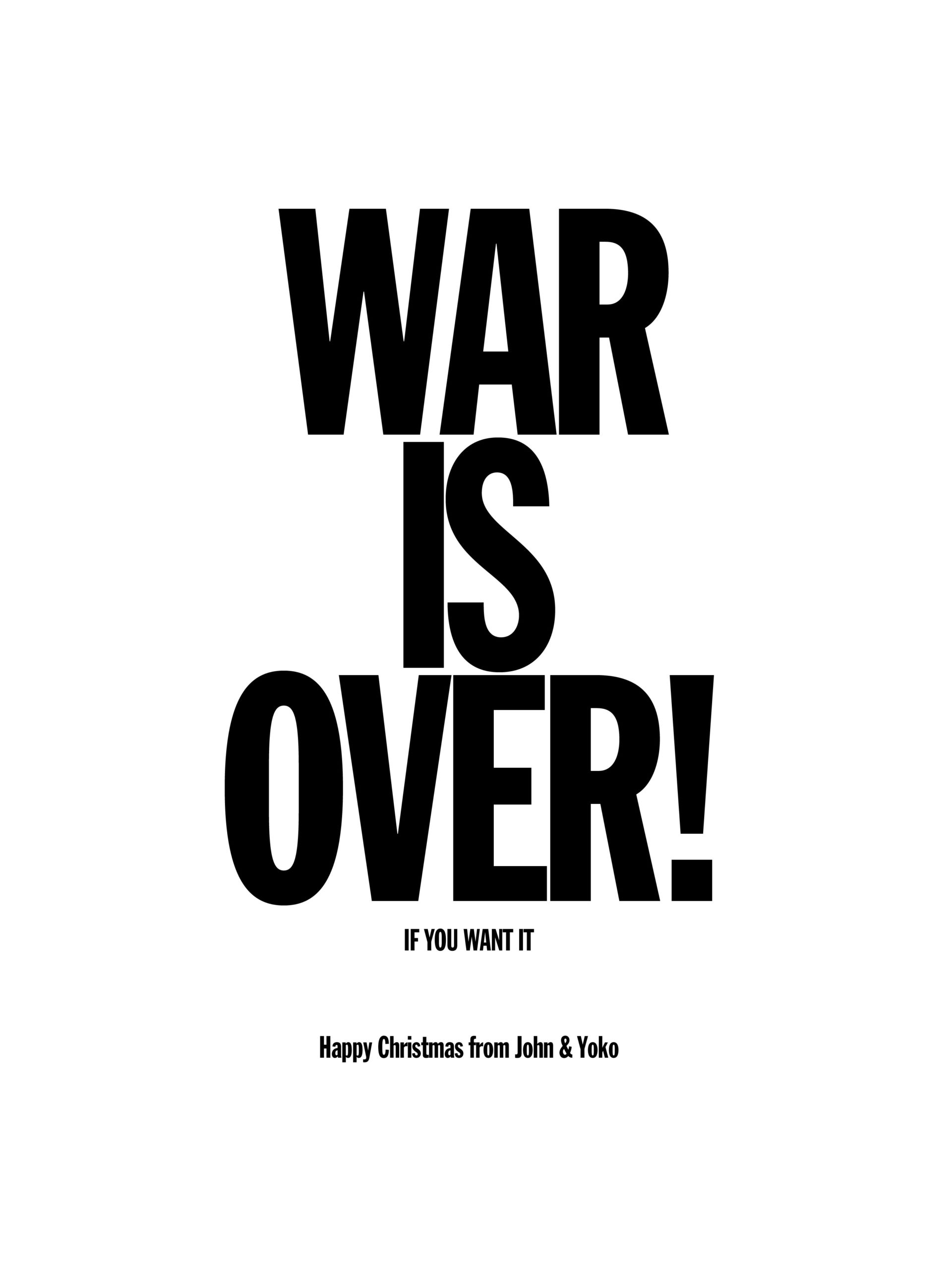 None of the photos I took turned out, but here's the art for the poster.
On to New Worlds. Who are making up for the last couple of issues by giving us some actual SF, with actual illustrations. There’s even a story by a woman! It’s not Pam Zoline though; she’s contributing to this issue, but as an illustrator not a writer. I’ll take what I can get.
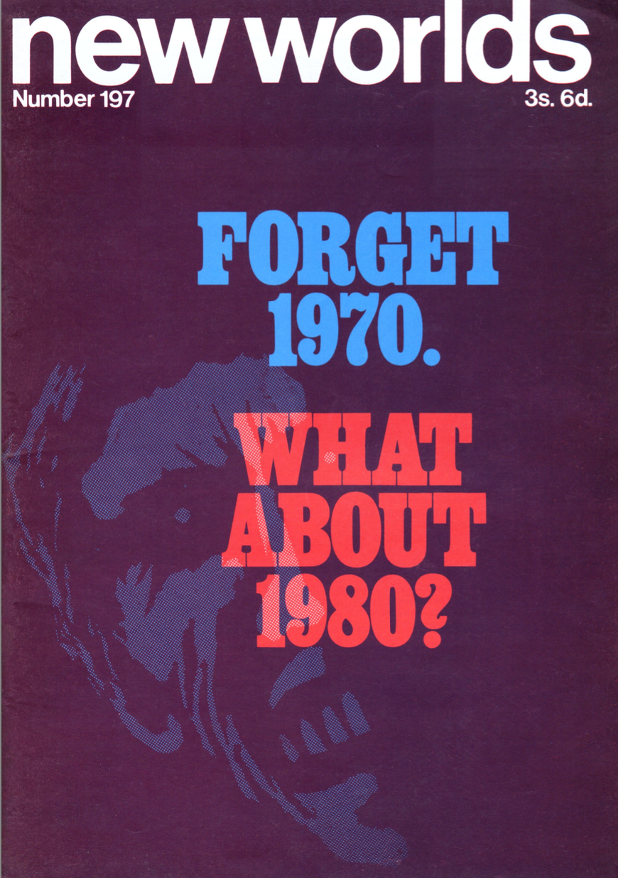 Cover by R. Glyn Jones.
Lead-In
Saying (rightly) that the media is overwhelmed with predictions of 1970, which are becoming “as dull as the next moonshot” the editors are celebrating their theme of looking forward to 1980. How many (if any) of the stories actually follow the theme? Let’s find out!
Michael Butterworth: Concentrate 3
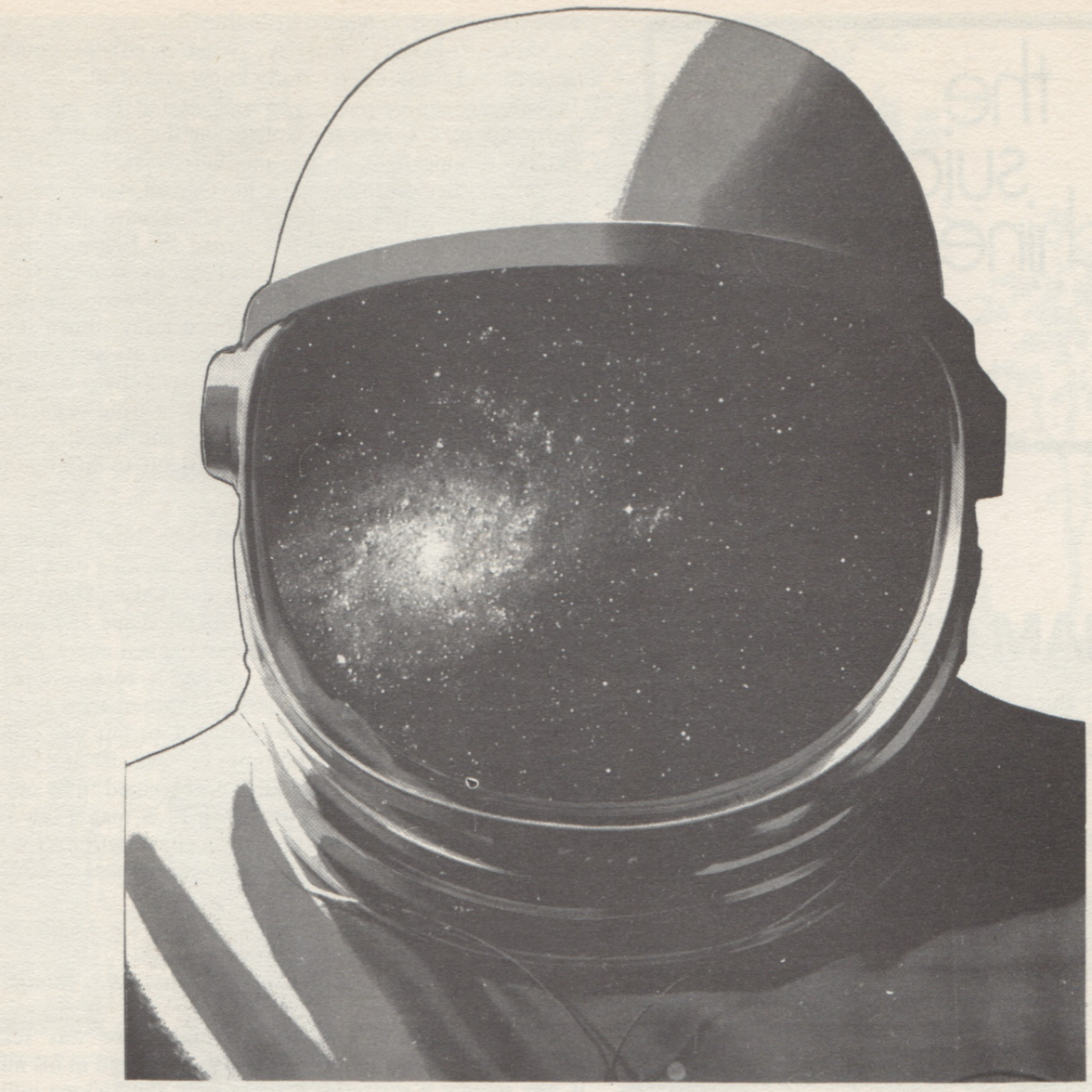 Illustration by Charles Platt.
A very short prose piece followed by a poem. I like the imagery of an astronaut freaking out with the feeling of stars crawling over his face but otherwise it seems to read like several opening lines mashed together. Nothing to do with 1980. Two stars.
Graham Charnock: The Suicide Machines
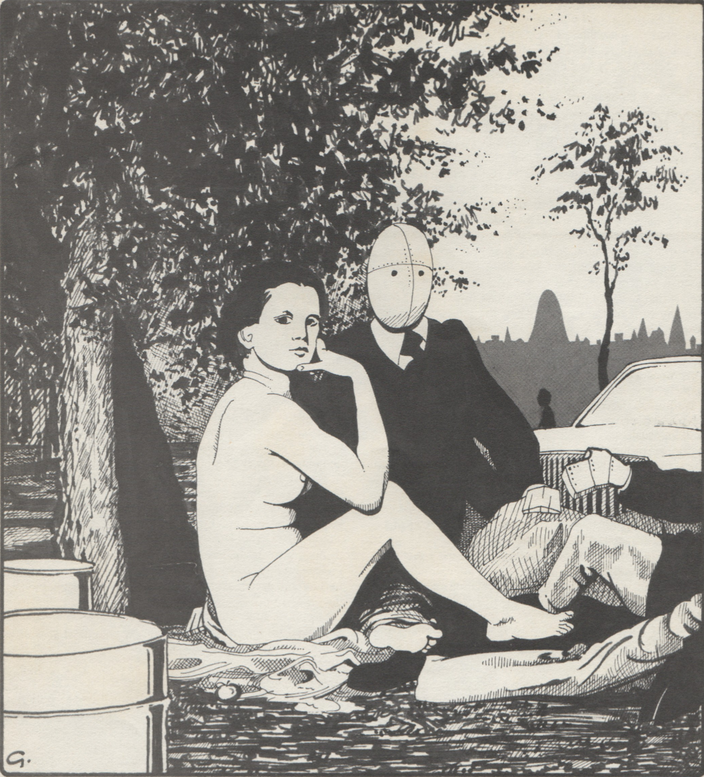 Illustration by R. Glyn Jones, who gets everywhere this issue.
A more developed imagining of a near-future Britain, in an Oxford which has been given fully over to tourism by dull and tedious businesspeople, with “feedies”, a sort of android, as guides and entertainers. Jaded with sex, they seek instead to force the feedies to commit suicide for their pleasure. No indication that this takes place in 1980. Three stars.
R. Glyn Jones: Two Poems, Six Letters
As the title says. Two quatrains, containing only six letters. Not sure the experiment does all that much. Nothing to do with 1980. One star.
Ed Bryant: Sending the Very Best
A fun short piece about near-future man buying a holographic sensory-stimulation greeting card, which leaves the reader wondering wickedly about the recipient and the occasion. Nothing to do with 1980. Four stars.
Hilary Bailey: Baby Watson 1936-1980
 Photo by Gabi Nasemann.
This is one of the standout stories for me this issue, if one of the least SF (though one of the only ones to involve 1980). It’s a story in the Heat Death of the Universe vein, making the familiar strange by looking at the lives of ordinary women, with the same surname and born in the same year. It’s a sad story for me, highlighting the way in which the scientific and creative potential of women is squandered on a world not yet ready to accept them as equals. Five stars.
Harlan Ellison: The Glass Teat
 Design by unknown artist.
Ellison saves himself some work by writing his usual TV column, but as if it were 1980. Although I wouldn’t have known that if the Lead-In hadn’t told me. It’s a 1980 where the US is at war in various developing nations, has a liar for a President, and is subject to rampant acts of terrorism at the hands of its own citizens. I suppose it’s a “if this goes on…” piece. Two stars.
John Clark: What is the Nature of the Bead-Game?
 Photo by Roy Cornwall.
An experimental essay, containing 25 statements and questions the writer apparently posed at the 1969 Third International Writers’ Conference. The aim appears to be the usual New Worlds trick of juxtaposing sentences and having the reader discern meaning from the juxtaposition. Nothing to do with 1980. Three stars.
Michael Moorcock: The Nature of the Catastrophe
Nice to see Jerry Cornelius back with us, though I confess after the efforts of other writers Moorcock’s original version is a little disappointing. Too few descriptions of Jerry’s clothes, I think. There’s a brief mention of 1980 in order to keep this in with the theme, though there are also brief mentions of 1931, 1969, 1970, 1936 and many other years. Otherwise it’s just your usual Cornelius stuff. Two stars.
Thomas M. Disch: Four Crosswords of Graded Difficulty
Not really my favourite Disch (ha ha) of the year. Experimental poems; the first one made me laugh but the others seemed not very interesting. Nothing to do with 1980. One star.
J.G. Ballard: Coitus 80: A Description of the Sexual Act in 1980
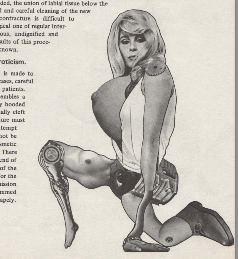 Illustration by Charles Platt.
Familiar Ballard stuff this: a brief description of a sexual encounter interspersed with clinical descriptions of plastic surgery related to the genitals and breasts, in order to convey a sense of scientific alienation behind a simple, familiar act. I confess I hadn’t thought what goes into a vaginoplasty or phalloplasty before. It at least takes place in 1980. Three stars.
Brian W. Aldiss: The Secret of Holman-Hunt
A mock essay about an incredible breakthrough taking place in 1980 (yes!). The narrator discovers a way of unlocking the potential of the mind using the art of pre-Raphaelite painter William Holman-Hunt. No more implausible than The Stars My Destination, I suppose, but it failed to hold my attention. Two stars.
John T. Sladek: 198-, a Tale of ‘Tomorrow’
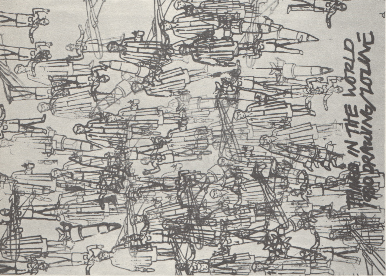 Illustration by Pam Zoline.
Sladek gives us a plausibly dystopian 1980s where computers can call each other up from anywhere in the world, where people’s fertility and happiness are controlled by drugs, and where everything is made of plastic. I find this vision of the future sadly compelling, though of course Sladek has to remind us that he’s Sladek through cutting the columns up and putting them out of order and sideways. Four stars.
M John Harrison, The Nostalgia Story
Another of these stories that are made up of disconnected snippets with the reader invited to make their own connections. One of these is entitled “Significant Moments of 1980” so I suppose it’s on theme. Two stars.
Joyce Churchill: Big Brother is Twenty-One
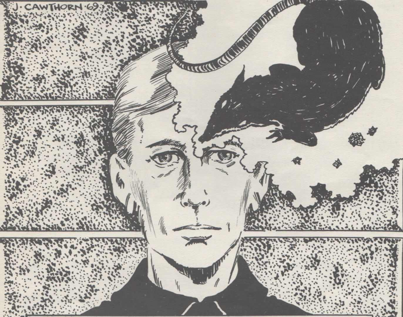 Illustration by James Cawthorn.
A short essay on Nineteen Eighty-Four, concluding that Huxley was closer to the mark than Orwell: the coming dystopia will most likely be a capitalist one in which we convince ourselves we are happy through the acquisition of material goods, rather than a socialist one based on a war footing. Not exactly looking forward to 1980, but at this point I’ll stretch the definition. Four stars.
Jack Trevor Story: The Wind in the Snottygobble Tree part 3
 Photo by Roy Cornwall.
This isn’t getting any better as it goes on, though Story is making it clearer what the situation is with his protagonist (he’s not actually a secret agent, just pretending he is, however, in doing so, he’s wound up being mistaken for a genuine one). Nothing to do with 1980. One star.
Book Reviews: M John Harrison and John Clute (rendered as “John Cute” in the table of contents)
The usual suspects review the usual volumes. Nothing to do with 1980.
Obituary for James Colvin
Spoof obituary for a pseudonym of Barrington J. Bayley and Michael Moorcock. Nothing to do with 1980.
Out of 17 items, eight actually have something to do with the 1980s, broadly defined, and only five have anything to do with 1980 specifically. Nonetheless, this does feel like a more SF-related and livelier New Worlds than we’ve had in a while. Perhaps the new decade will give them a new lease on life? We can only hope!
[New to the Journey? Read this for a brief introduction!]
Follow on BlueSky

![[February 2, 1970] Deceptive Appearances (March 1970 <i>IF</i>)](https://galacticjourney.org/wp-content/uploads/2025/01/IF-1970-03-Cover-479x372.jpg)

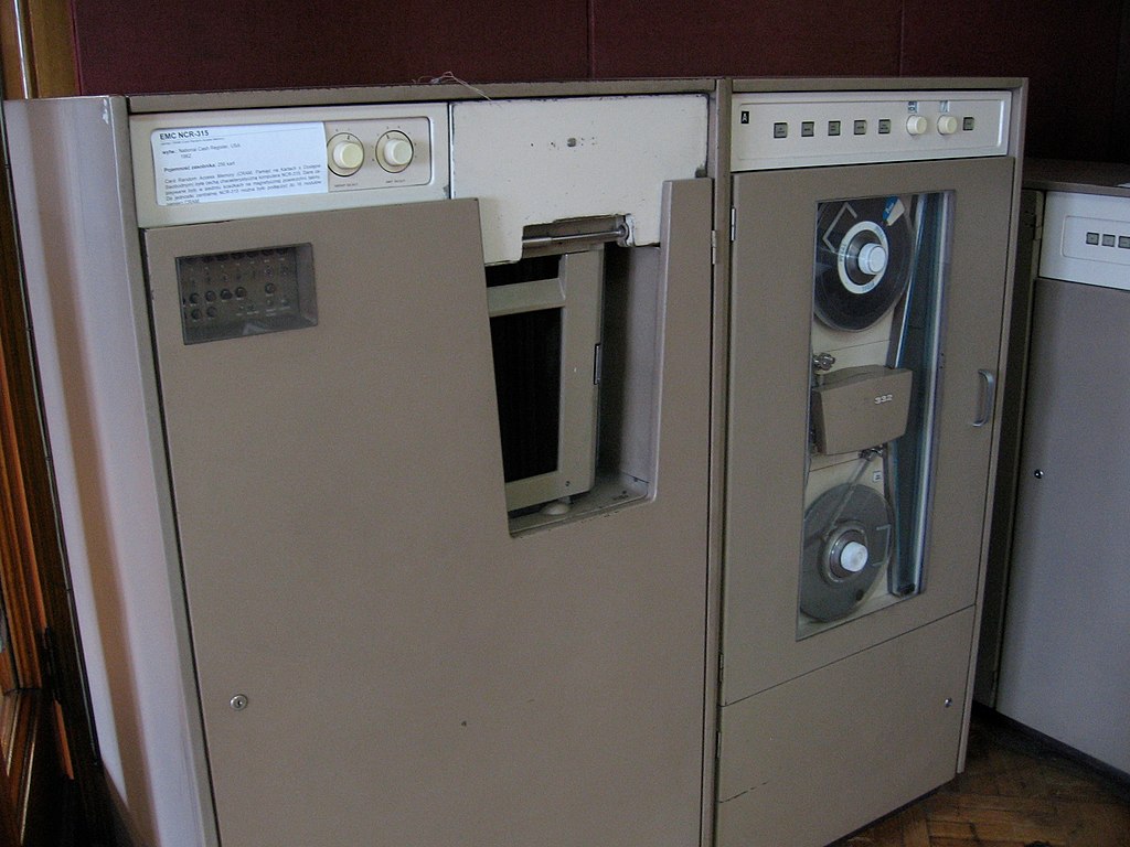 The arbiter, an NCR 315.
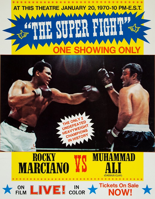 Movie poster for the event. That “LIVE!” is a little deceptive, which is something else Ali is complaining about.
 Art actually for “SOS,” rather than just suggested by. Maybe because it’s by Mike Gilbert, not the overworked Jack Gaughan.
![[January 14, 1970] Root Rot (February 1970 <i>Venture</i>)](https://galacticjourney.org/wp-content/uploads/2025/01/Venture-1970-02-Cover-483x372.jpg)
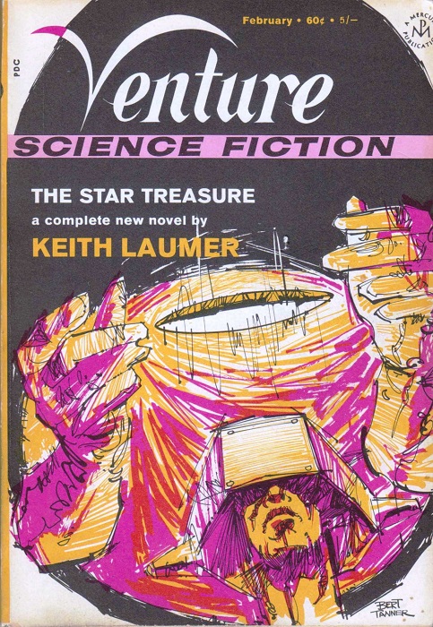 A not very representational image for Laumer’s new story. Art by Bert Tanner
![[January 2, 1970] Under Pressure (February 1970 <i>IF</i>)](https://galacticjourney.org/wp-content/uploads/2024/12/IF-1970-02-Cover-500x372.jpg)
 Dr. Edward D. Goldberg of the Scripps Institute of Oceanography in La Jolla, California
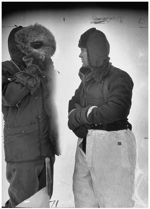 Col. Fletcher (r.) on his ice island in 1952. This was the most recent photo of him I could find.
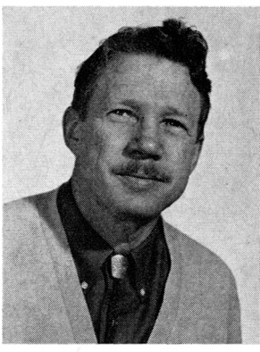 Dr. William W. Kellogg of the National Center for Atmospheric Research, in Boulder, Colorado
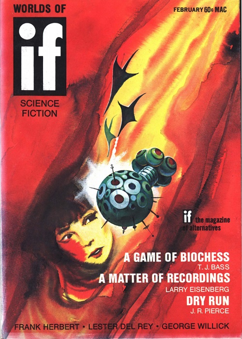 Cover by Gaughan. Supposedly suggested by Whipping Star, but it looks more like it illustrates Pressure Vessel to me.
![[December 31, 1969] …for spacious skies (January 1970 <i>Analog</i>)](https://galacticjourney.org/wp-content/uploads/2024/12/691231cover-672x372.jpg)

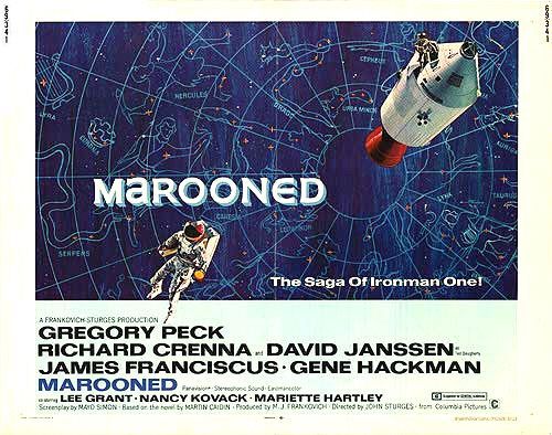
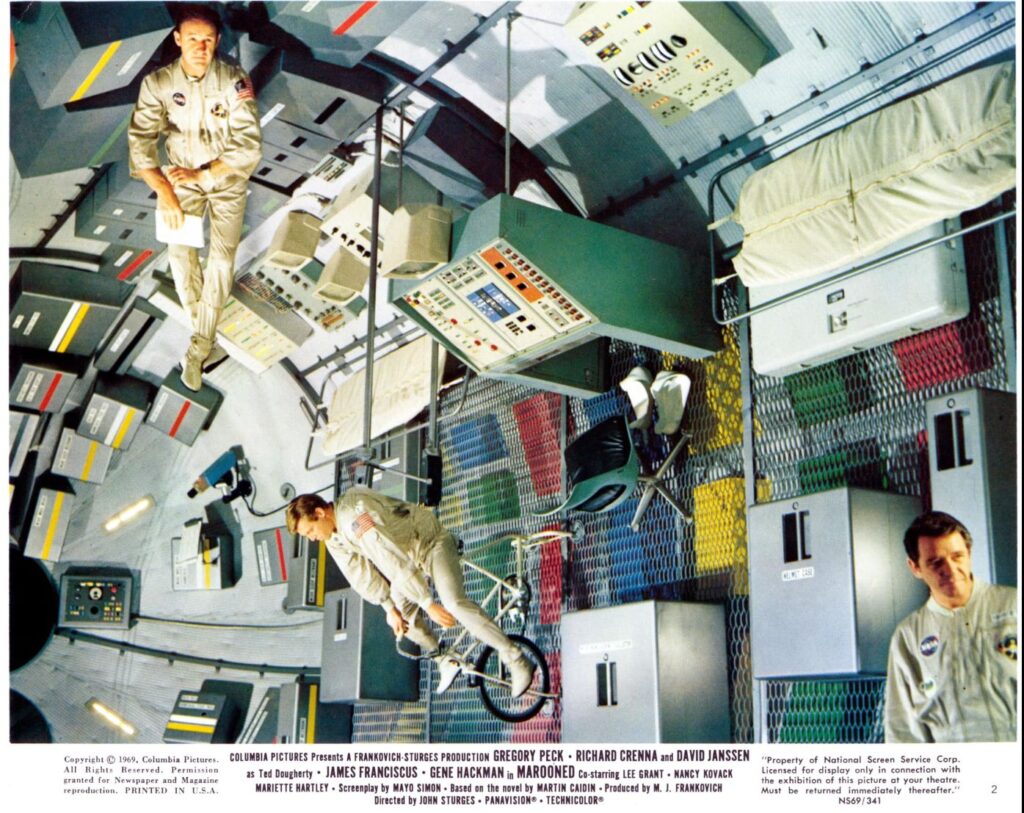
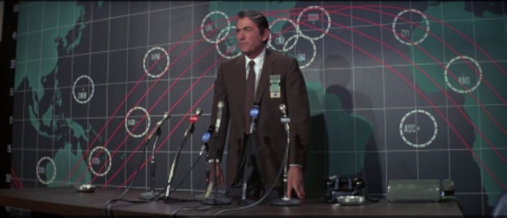
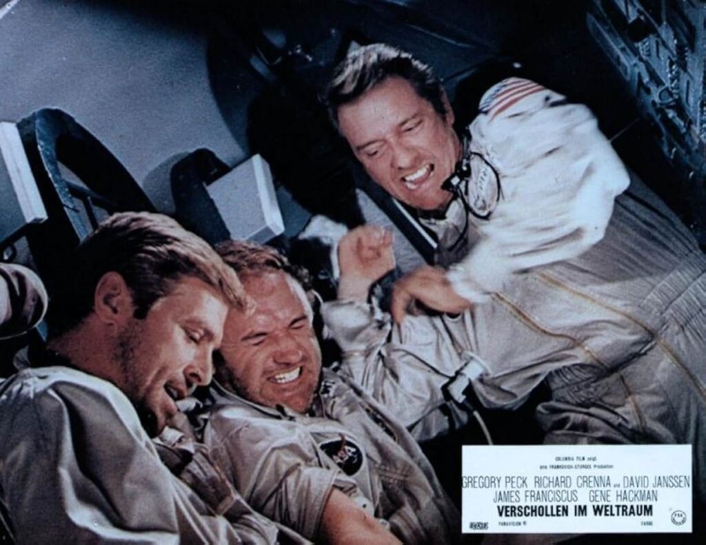
![[December 28, 1969] Cinemascope: Two if by Sea, Three if by Space! (<i>Captain Nemo and the Underwater City</i> and <i>Marooned</i>)](https://galacticjourney.org/wp-content/uploads/2024/12/691228posters-672x372.jpg)
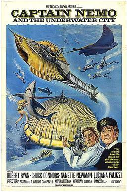
 Nemo's guests are less than thrilled at their accommodation.
 There's also some nice modelwork, even if it's often hard to see.


![[December 26, 1969] A Wreath of Stars (the best science fiction of 1969!)](https://galacticjourney.org/wp-content/uploads/2024/12/691226stars-672x372.jpg)

![[December 24, 1969] At Last The 1980 Show: <i>New Worlds</i>, January 1970](https://galacticjourney.org/wp-content/uploads/2024/12/NW19701-cover-672x372.png)

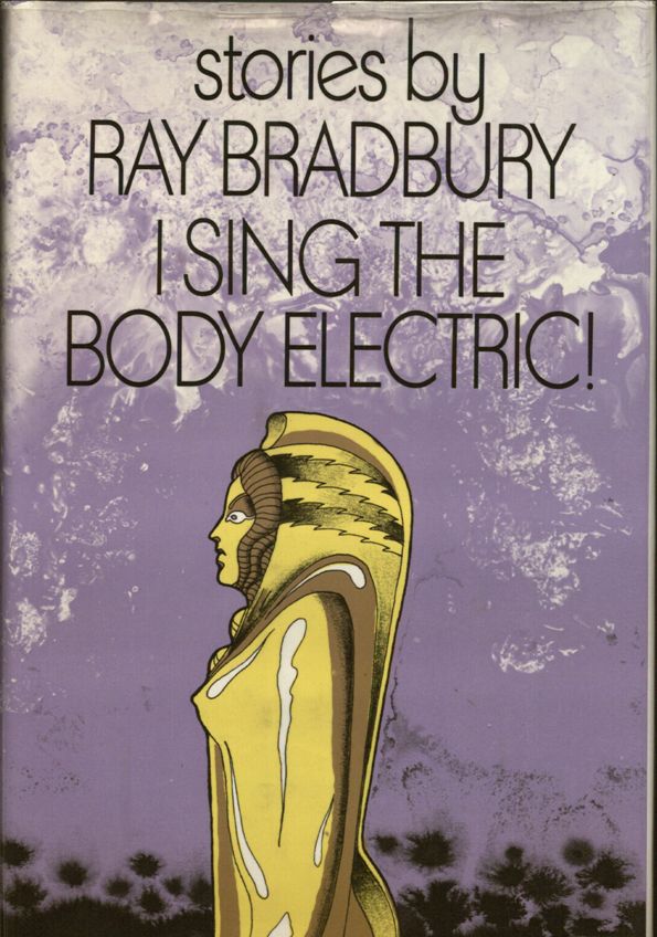
![[December 22nd, 1969] Safety On! (<i>I Sing the Body Electric!</i> by Ray Bradbury)](https://galacticjourney.org/wp-content/uploads/2024/12/Bradbury-Cover-595x372.jpg)
![[December 20, 1969] Stars above, stars at hand (January 1970 <i>Fantasy and Science Fiction</i>)](https://galacticjourney.org/wp-content/uploads/2024/12/691220fsfcover-406x372.jpg)
![[December 18, 1969] Everyman's Sports (ski outfits of 1969!)](https://galacticjourney.org/wp-content/uploads/2024/12/Vogue-matching-knit-ski-suits-e1734384341861-672x372.jpg)