
by David Levinson
Voyages into the known
Readers over 30 may remember Thor Heyerdahl and his Kon-Tiki expedition of 1947. He hoped to prove that the Pacific islands had been reached from South America before Polynesians got there from the west. The balsa log raft he built eventually ran aground in the Tuamotu archipelago in French Polynesia, demonstrating that such a voyage was at least possible. However, most archaeologists and anthropologists consider it far more likely that any contact between Polynesia and the Americas (there is some highly inconclusive evidence) was initiated by the Polynesian people, who have a proven track record of crossing vast distances into the unknown.
In any case, Heyerdahl has inspired a number of imitators hoping to travel farther, including some attempts to travel west to east. On May 29th, Spanish sailor Vital Alsar Ramirez started his second attempt to sail from Ecuador to Australia. The first attempt in 1966 failed after 143 days when the raft was rendered no longer seaworthy by teredo worms.
The new raft, dubbed La Balsa, has one major improvement over the Kon-Tiki: a moving keelboard. This will allow the raft to be steered toward more favorable currents, where Kon-Tiki could only drift with assistance from the simple square sail. Such keelboards are known to Ecuadoran natives and so are a perfectly reasonable addition. Best of luck to the four men aboard.
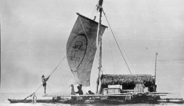 La Balsa puts to sea.
Speaking of Thor Heyerdahl, his current interest is in demonstrating that ancient Egyptians could have reached the Americas in reed boats. His first attempt last year aboard the Ra got within about 100 miles of the islands of the Caribbean before it became so waterlogged it began to break apart. Now he’s giving it another go.
The Ra II features a tether to keep the stern high, which should help keep the boat from suffering the fate of its predecessor. This is something the original ought to have had; such tethers are clearly visible in ancient Egyptian depictions of reed boats. The crew also plan to take marine samples along the way to study ocean pollution. The Ra II set out from Morocco on May 17th.
Of course, as with the Kon-Tiki, proving that such a voyage could have been made won’t prove that it was. The Egyptians were never great sailors, generally contracting ocean navigation out to more maritime cultures of the eastern Mediterranean. Still, best of luck to Heyerdahl and his crew as well.
 The Ra II under way. Note the tether keeping the stern high.
Polishing the family silver
Science fiction has a lot of tried and true plots, some better than others. But good writing can occasionally make a hackneyed, sub-par plot something better, and bad writing can turn an intriguing concept into a slog. Fortunately, this month’s IF has a lot more of the former.
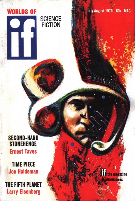 Suggested by “Time Piece”. Art by Gaughan
Second-Hand Stonehenge, by Ernest Taves
After an argument with his wife, a computer scientist from M.I.T. sends away for a replica Stonehenge. He regrets it the next morning and stops payment on the check, but it arrives at his family property in New Hampshire that summer anyway. In spite of, or maybe because of, the end of his marriage, he builds the thing, and on the summer solstice of the following year, something appears in the center of the structure as the sun rises.
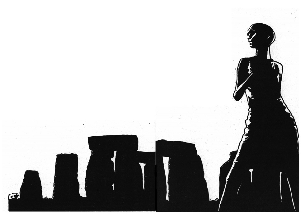 Just what is the purpose of Stonehenge anyway? Art by Gaughan
Everything about this story is wrong. The plot went out of fashion in the 40s and was considered silly even earlier, it’s too long, and the end of the protagonist’s unhappy marriage is treated as an afterthought. Despite all that, I really liked it. Somehow it works.
A low four stars.
The Fifth Planet, by Larry Eisenberg
Early in his psychiatric residency at a mental hospital, a young doctor hears a wild tale from a patient: a story of aliens, the destruction of a planet between Mars and Jupiter recorded in ancient Sumerian tablets, and a secret society persecuting him for uncovering the truth. Gradually, the doctor comes to wonder if some of it might be true.
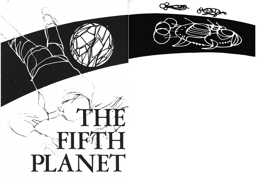 Art uncredited, but it looks like Gaughan to me
Here’s another hoary old plot that went out of favor long ago. Larry Eisenberg makes it work, which is a surprise if you mostly associate him with those awful Emmett Duckworth stories. There’s just enough uncertainty to make you wonder if the doctor has fallen into a folie à deux with the patient.
Three stars.
Time Piece, by Joe Haldeman
It’s often said that those who join the military, whether they go to war or not, are never really able to go home, because they no longer fit in with the old patterns. It’s not a strange concept to science fiction; Heinlein’s dealt with it a couple of times, at least tangentially. How much more difficult would it be for those engaged in an interstellar war fought at relativistic speeds?
 Art uncredited, but probably Gaughan
Joe Haldeman’s protagonist is not quite 30 or over 400 years old, depending on how you count. He’s already survived more missions than most, but retiring means returning to a world he doesn’t understand and that doesn’t understand him. The dilemma is the whole of this story, but I suspect Haldeman could examine the problem in much greater depth.
Four stars.
Equals Four, by Piers Anthony
Accidental, interstellar dentist Dr. Dillingham is settling into his new role as an administrator at the Galactic University of Dentistry, but he needs an assistant. He tries out several candidates while on a tricky field assignment.
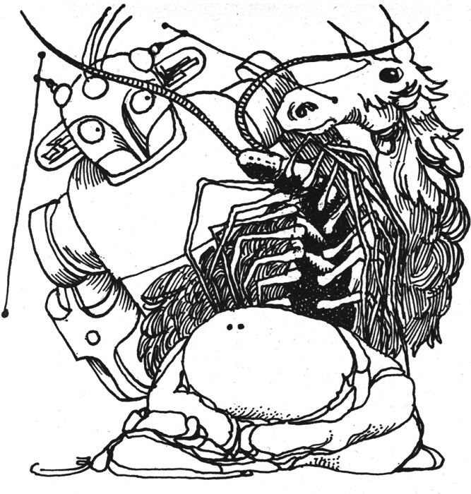 Some candidates for the position. Art by Gaughan
Piers Anthony has some unfortunate tics when it comes to female characters. Apart from esthetic, unattached, and female being part of the job requirements for the assistant, they don’t show up here at all. The stories in this series are trifles, but they’ve grown on me. I’d much rather see more like this from Anthony than some of his more “mature” work.
Three stars.
The Communication Machine, by Lee Harding
 Art uncredited, probably Gaughan
What would be the effect on poetry of a machine that enables perfect communication? That is the question faced by a celebrated poet when an old friend shows him his new invention. This one has a subtle sting in its tail.
Three stars.
What’s Become of Screwloose?, by Ron Goulart
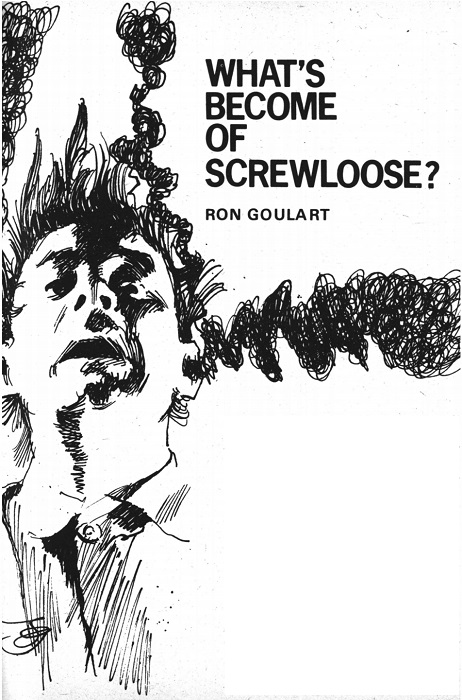 Art by Gaughan
Ron Goulart may be best known for his stories of machinery and computers gone wildly awry. With very rare exceptions, they tend to be wacky comedies. This tale of a private detective searching for a missing heiress sure looks like it’s going to be another comedy, what with the title and starting with a dishwasher trying to kill the protagonist. This time, however, the satire bites hard, and the heart of the story isn’t smothered by all the silliness.
A low four stars.
Grandfather Pelts, by Neal Barrett, Jr.
A smuggler specializing in furs comes to Pharallel IV, where the natives sport beautiful pelts and are known for storing the hides of their ancestors. He’s surprised by a human customs officer who’s an old foe, but he has a long con planned.
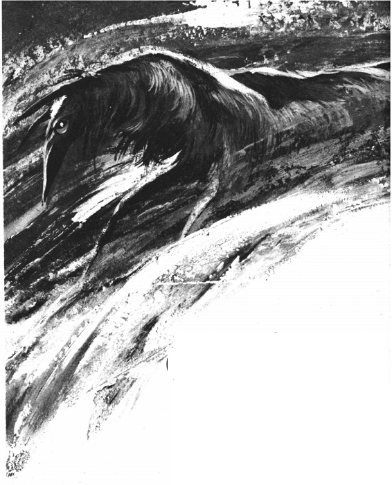 The Pharallellians resemble elephant-sized Russian wolfhounds. Art uncredited
Barrett tells this familiar story in a workmanlike fashion. It goes where you expect it to, though probably not in the way you thought. There’s just enough here to keep things interesting.
Three stars.
The Misspelled Magician (Part 2 of 2), by David Gerrold and Larry Niven
In Part 1, a human scientist came to an alien world and managed to violate most local customs. That installment ended with the wizard Shoogar working a mighty curse on the human Purple’s “flying nest” to minimal effect.
The locals flee, expecting Purple’s retribution to be terrible. Only narrator Lant stays behind to help Shoogar prepare for the duel that must come. And only one person ever walks away from a duel between wizards.
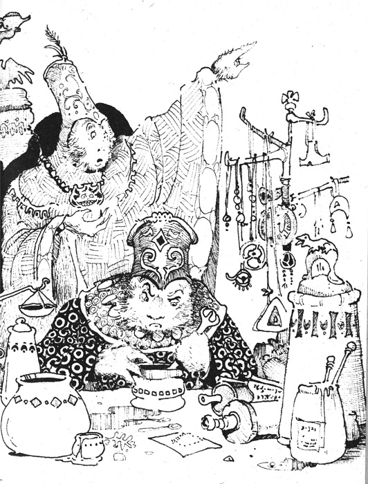 Shoogar prepares a spell while Lant looks on. Art by Kirk
As before, this is a well-told examination of Arthur C. Clarke’s assertion that sufficiently advanced technology is indistinguishable from magic. Unfortunately, the joke names are ramped up even further. The world orbits the twin suns of Virn and Ouells; we learn that Elcin, the god of thunder and lighting, is small of stature; and so on and so forth. The locals’ horrible treatment of women is also presented without comment as right and natural.
But worst of all, perhaps, is that the whole thing feels incomplete. The duel ends and the story’s over, boom. It feels like there’s a lot missing.
Three stars, a little higher for this part, about average for the whole, maybe less if you can’t tolerate the humor.
Dark, Dark, the Dead Star, by Jack Dann and George Zebrowski
The second tale from this new duo brings us a survivor of the first interstellar expedition, locked in a coma. He relives the accident that left him this way, while we also get occasional commentary from two people in his hospital room.
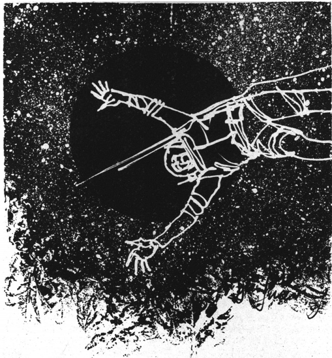 Art by Gaughan
This is a moody piece with some ambition, but I’m not sure it succeeds. There’s nothing wrong with it, really, it just fails to evoke the things the authors clearly hope to make the reader feel.
Three stars.
Reading Room, by Lester del Rey

Lester del Rey begins this month’s column with a discussion of the difference between schmaltz and kitsch. He seems to consider any use of emotion to be schmaltz, which I don’t really agree with, but it’s the basis for the rest of his reviews. First up is Poul Anderson’s Satan’s World. He finds it lacking, as many reviewers have, but he seems to like it more than our own Traveler did.
Next up is Cliff Simak’s Out of Their Minds. Lester feels this one tips over into kitsch, while my colleague Brian liked it. I didn’t get the feeling del Rey necessarily thought it was bad, just overdone.
In the Ace double of The Winds of Darkover/The Anything Tree, he’s again at odds with our reviewer. He found the Bradley novel to be acceptable kitsch, while Winona gave it a mere two stars. On the other hand, he thought The Anything Tree was good reading, but not worth recommending, while Winona gave it four stars.
Edmond Hamilton’s Return to the Stars gets called a fun read, but not Hamilton’s best work. That’s roughly in line with various Journey reviewers who gave the pieces that make up the novel two or three stars.
The lengthy book column wraps up with two books we haven’t covered. The first is The Yellow Fraction, by Rex Gordon. Del Rey finds this one interesting, but in need of good editorial advice and some emotional content. A Piece of Resistance, by Clive Egleton hasn’t been marketed as science fiction, but deals with an England that has been conquered by Russia. Lester finds no redeeming value in this one.
Summing up
This turned out to be a pretty good issue. Three 4-star stories, though one of them has no real right to be one; that’s just how it hit me. At worst, it’s a high three stars. The other two definitely deserve their ratings, and if Haldeman can write more like “Time Piece,” he has a bright future ahead of him. The serial was disappointing, less than the sum of its authors. Still, I’ve been worried about a drop-off in quality lately, but this is more like those early Jakobsson issues. There may be a dance in the old girl yet.




I think IF combining with GALAXY was a mighty strange move for the two magazines. They didn't seem to have much in common. Reminds me of funny doings in the magazine industry. A lot like that was going on back then. Shifty Kangaroo is the way I saw it.
Thor Heyerdahl was a real records breaker, all right. He was more like what gets written about than a writer. A historical adventurer with his own concept of doings. One of his sidekicks wrote a smaller follow-up called KON-TIKI AND I. He had his own view of the significance of the voyage.
Thanks for tuning in!
Thor, can you dig it?
Omg, a Goulart story worth reading? (I know, he has his fans but I bounce off his work). Is it better than his normal fare (seems like it) or are you a fan of his normal fare?
I think if you don't like Goulart, then you won't like this. It has all of his usual tics, they're just expressed a little better.