by Gideon Marcus
Fish or fowl?
Not too long ago, I picked up an interesting-looking game from a local hobby store. Sitting next to a number of other "bookshelf" games with leatherette-style boxes designed to look pretty all lined up, dimensioned like overlarge volumes—as opposed to more luridly covered diversions like Monopoly or Clue—was something called Feudal.
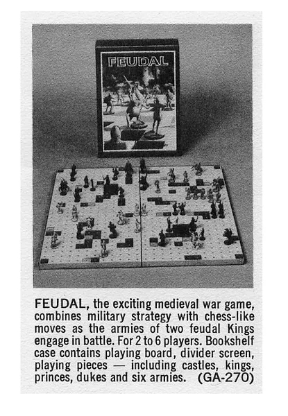
A 1970 catalog entry for the game
From the ad I'd seen in the paper, as well as the cover art, I'd thought it was some kind of wargame. Certainly, the ad called it such. But from the picture of the pieces and gameboard on the back, I gathered it was a new variant of chess.
The truth is somewhere in between…
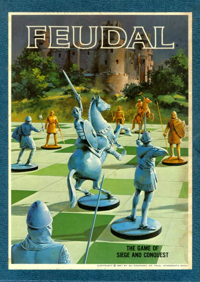
Box top
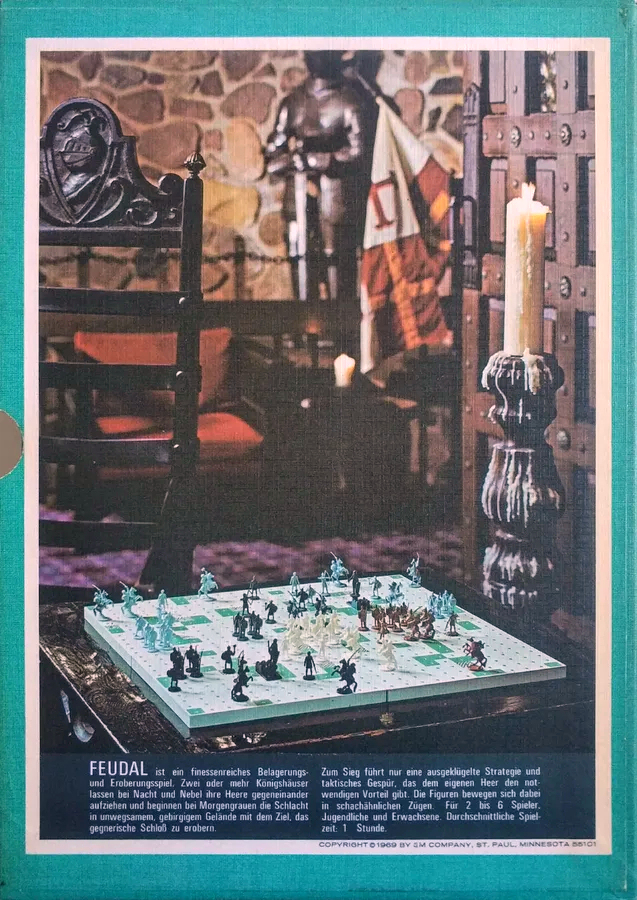
Box reverse
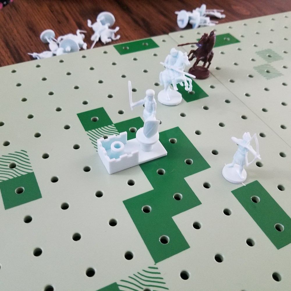
While Feudal ostensibly seats up to 6 players, it is at its heart, a two player game. Each player starts with a castle piece, capture of which loses it for the owner. Castles may be set up anywhere on the board, and they can only be entered (and taken) by way of their unwalled Castle Green.
Protecting this Castle are three "Royalty" pieces and any number of 10-piece "Armies"—one is standard, playing with two or three is offered as "exciting". Each unit, as in chess, has specific movement capabilities. For instance, the ones on horses may move any number of squares in any direction. An army's two Sergeants may move up to 12 spaces diagonally or 1 space horizontally/vertically, whereas an army's four Pikeman are the opposite, moving 12 spaces horizontally/vertically or 1 space diagonally. The lowly lone Squire moves one space horizontally/vertically followed by a space diagonally—functionally equivalent to a chess knight. The King moves one or two spaces in any direction. Finally, the sole Archer shoots or moves up to three spaces in any direction.
A unit is captured (eliminated) when an enemy walks into it (or an archer shoots it). No dice are rolled. No Combat Results Table is consulted.
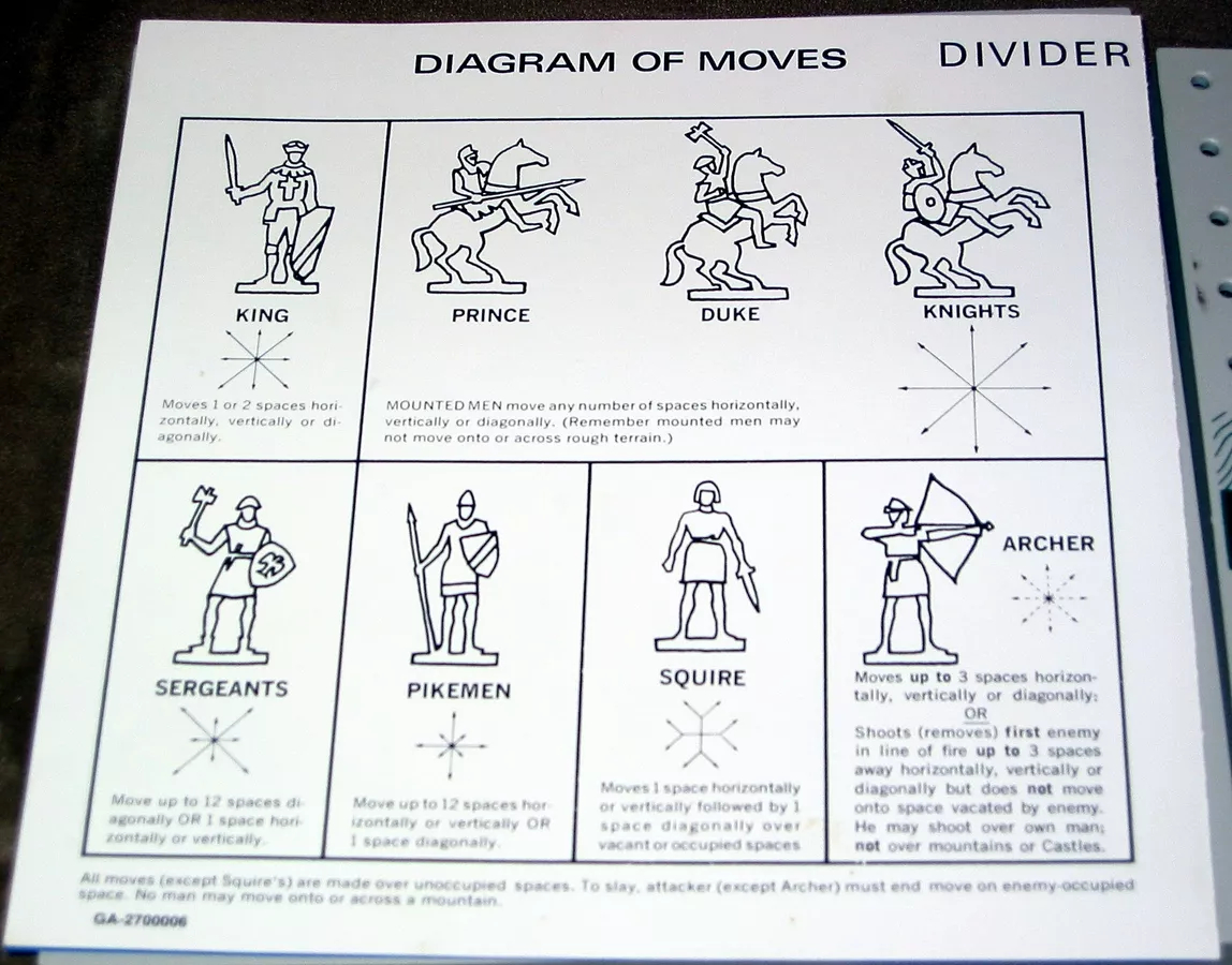
Map divider and piece summary
Sounds a lot like chess, doesn't it? Ah, but look at the board. You'll note that it has terrain markings on it, like a wargame.

Game board with divider
The squares with wavy lines are "rough" (one would think they'd be forest) and the dark green squares denote mountains. Horsies cannot move across rough terrain, and no unit can move across a mountain or the walled ends of a Castle. Also, archers cannot shoot over mountains or castles.
To enter a Castle and win the game, a unit must stop on the Castle Green and next turn, march inside. Thus, the defender has a turn to stop the siege. The other way to win is to eliminate all of the opponent's "royalty" (comprising the King and two of the mounted units)
Unlike chess, a player may move every piece in his/her control every turn. However, like chess, the player must move at least one unit in each army each turn.
Units are set up blind—that's what the divider is for—a la Stratego. They may be placed anywhere that they can move (Castles may be set up anywhere).
And that's all there is to Feudal.
Tally Ho!
Janice and I played a couple of games to completion, and I think I'm starting to get a handle on this game. She won the first one, and I won the second, both of us making blunders that mostly canceled each other out. In the end, I think it's who went first that made the biggest difference.
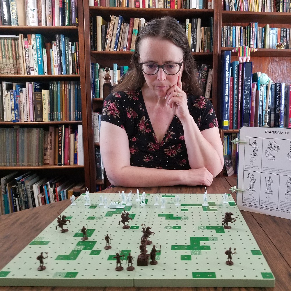
Just after setup, Janice considers her first move
That's because the player who goes first has a slight advantage. Making use of the blind set-up, they can sometimes pick off units for whom there is no good counterattack revenge, either on the first or second turns. Of course, the player going second gets to pick which side of the map is used, and that means a better-defended castle. On the third hand, a cramped defensive arrangement can be hard to maneuver in.
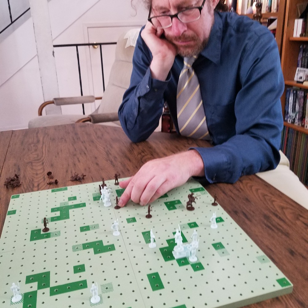
If I look glum, note the number of my dead pieces behind the board
It's a tricky game at first, particularly minding all the diagonals through which the Sergeants and mounted troops can attack. The infinite movement of the horsemen vs. the 12 space limit for Pikemen and Sergeants is notable, although the fact that horses can't move through rough mitigates that. In the end, the Sergeants are more powerful than the Pikemen because diagonal movement is 44% greater than horizontal movement (geometry!) and because so many of the terrain features have diagonal cut-throughs.
After Battle Report
He is the Castle Green Preservation Society…
Feudal feels very chess-like to me, and because it is impossible to maneuver into position to kill without making yourself vulnerable, few deaths occur without some kind of counterattack. Thus, by the end of the game, few pieces are left standing. Janice argues that Feudal feels more like a wargame, albeit a simplistic one. After all, if chess straddles the line between abstract games like checkers and Othello, and simple wargames like Tactics II, then Feudal surely must reside in wargame territory.
Either way, it was a fun diversion, and I wouldn't mind a rematch at some point, now that I am starting to understand things. It may turn out that play is stereotyped and dull after a while, or it may be that there are hidden gems of strategy.
Get yourself a copy and see what you think!
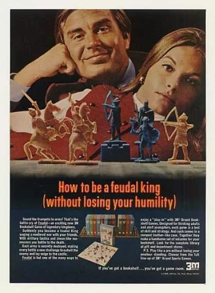
A 1969 advertisement for the game
[New to the Journey? Read this for a brief introduction!]
Follow on BlueSky


![[August 22, 1970] Falling From Great Heights (World Cinema: The Stolen Airship & Herostratus)](https://galacticjourney.org/wp-content/uploads/2025/08/WC-Titles.png)


![[August 20, 1970] Hour of the Horde meets The Star Virus (August 1970 Galactoscope)](https://galacticjourney.org/wp-content/uploads/2025/08/700820covers-672x372.jpg)
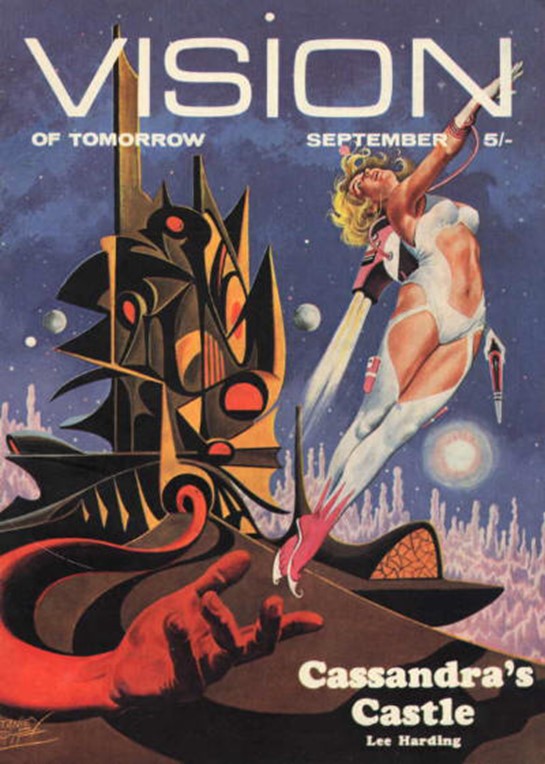
![(August 16, 1970) It All Comes Tumbling Down [<i>Vision of Tomorrow #12</i>]](https://galacticjourney.org/wp-content/uploads/2025/08/VOT2-545x372.jpg)
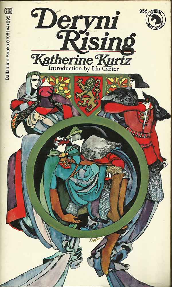
![[August 14, 1970] Intrigue, Murder and Magic: <i>Deryni Rising</i> by Katherine Kurtz](https://galacticjourney.org/wp-content/uploads/2025/08/Kurtz-Rising-600x372.jpg)

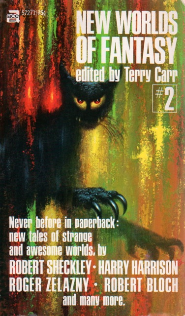
![[August 12, 1970] New Worlds of Fantasy #2](https://galacticjourney.org/wp-content/uploads/2025/08/700810newworldsoffantasycover-376x372.jpg)

![[August 10, 1970] Orn-ery (September 1970 <i>Amazing</i>)](https://galacticjourney.org/wp-content/uploads/2025/08/amz-0970-cover-480x372.png)


![[August 8, 1970] Wargaming is square again… (3M's <i>Feudal</i>)](https://galacticjourney.org/wp-content/uploads/2025/08/700808feudalcover-638x372.jpg)

![[August 6, 1970] A Spooky Spook: <i>Larry Brent</i> by Dan Shocker](https://galacticjourney.org/wp-content/uploads/2025/08/sgk_na_019-390x372.jpg)


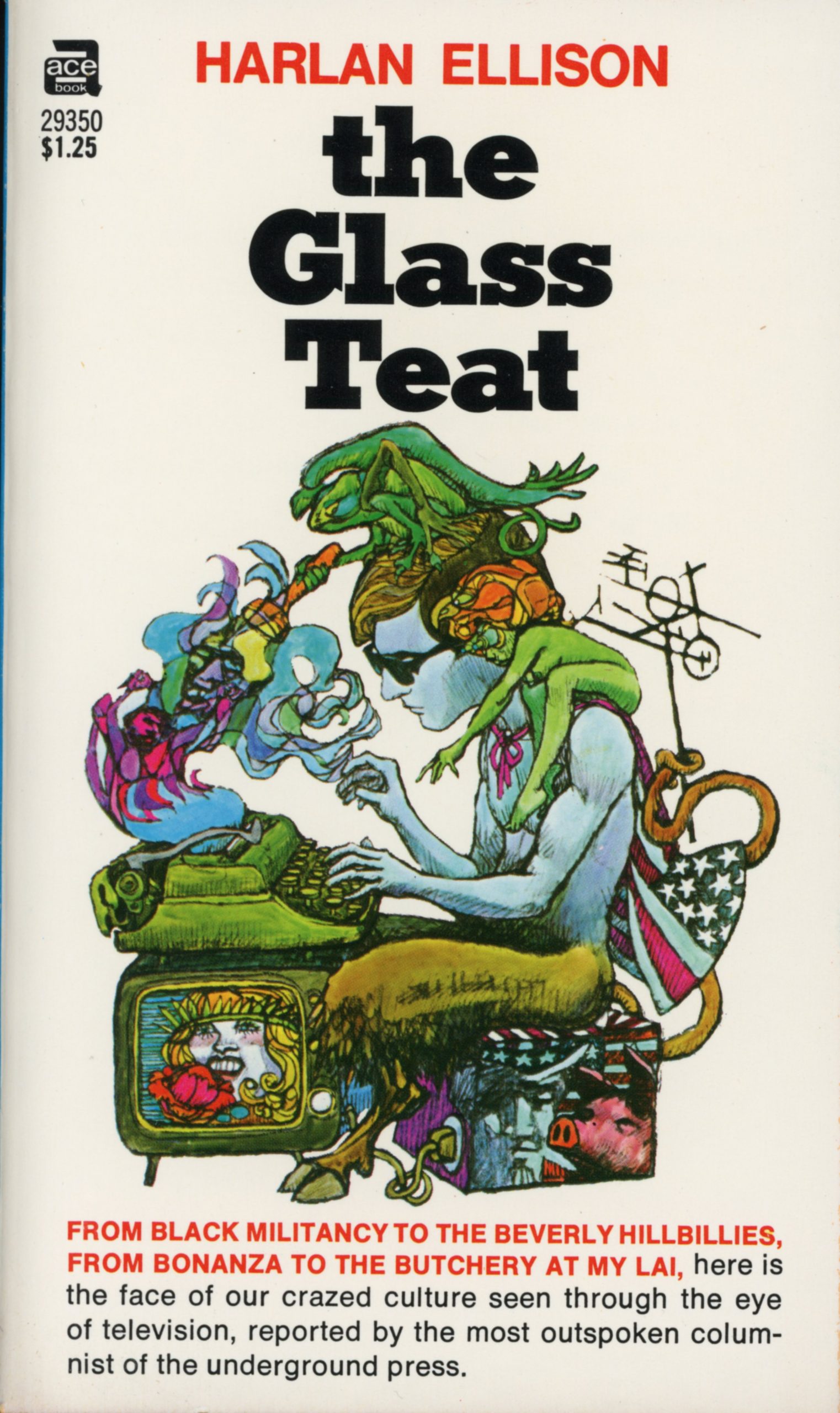
![[August 4, 1970] Through the Wasteland (Harlan Ellison's <i>the Glass Teat</i>)](https://galacticjourney.org/wp-content/uploads/2025/07/700804teatcover-672x372.jpg)