
by Cora Buhlert
Today's article is on architecture in the modern age, but first, I have a couple of news tidbits for you — one public and one personal:
For a Few Westerns More
While the "western" appears to be a declining genre in the United States, at least on the silver screen, West German audiences are currently flocking to the cinemas to watch an Italian western. Yes, you heard that correctly. After entertaining us with a seemingly endless stream of sand and sandal epics, Italian filmmakers have decided to try their hand at a new genre, the western.

The movie in question is called Per un pugno di dollari, which translates as "For a Fistful of Dollars". It features Clint Eastwood, star of the American western TV series Rawhide, as a nameless gunslinger. West German actress Marianne Koch, mostly known for sappy romantic fare, plays a Mexican damsel in distress. Per un pugno di dollari is an exciting movie, full of action and a lot more graphic violence than is commonly found in Hollywood westerns. However, if the plot of a nameless stranger getting involved in a feud between two rival gangs seems a tad familiar, that's probably because it is. Only four years ago, Akira Kurosawa told the same story, albeit set in 19th century Japan, in Yojimbo. And Kurosawa didn't come up with the plot either, but borrowed it from Dashiell Hammett's 1927 crime novel Red Harvest.
Nevertheless, I enjoyed it, and I'm looking forward to more of this Italian spin on an American genre!
A Happy Couple
Spring is also the time for weddings. And even though April has been cold and wet so far, I nonetheless attended a family wedding yesterday. Here are some photos of the happy couple.
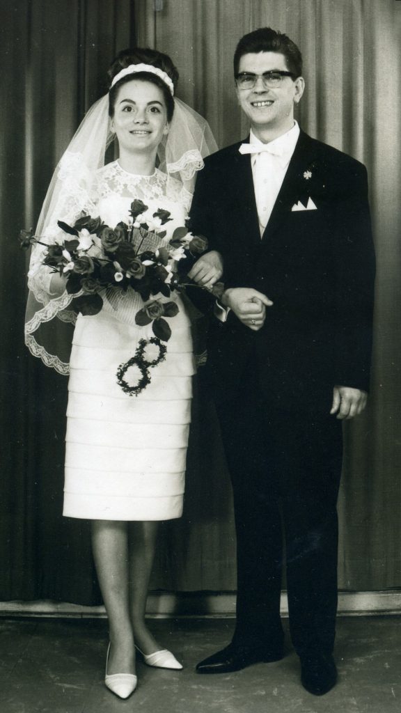
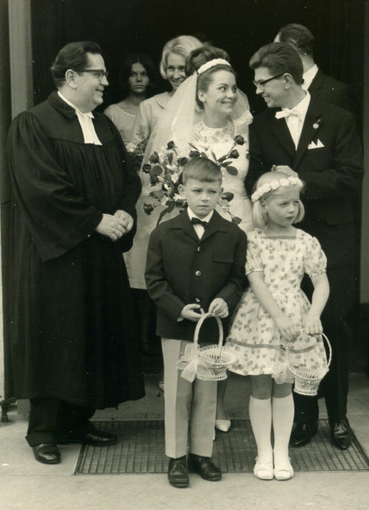
Even twenty years after the end of WWII, there are still housing shortages in West Germany and therefore, the young couple above is thrilled to have found an apartment to start their new life together. I don't know what that apartment will look like, but thinking about it led me to contemplate contemporary interior design in general. So strap in for a tour of what's in, literally.
The Workplace of the Future
Last year, I brought you an article about the exciting modern buildings that are going up all over Europe and elsewhere. Futuristic buildings need futuristic interiors. Thankfully, today's designers are on the ball and are creating some amazing furniture that looks like nothing ever seen before.
In many areas, the so-called International Style, which emerged after World War II from the Bauhaus style of the 1920s and early 1930s, is still dominant. And indeed the clean lines and functional design of the International Style are perfectly suited to hotel lobbies, airport lounges and office buildings.
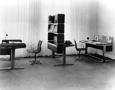
Companies like Vitra of Switzerland and Knoll International and Herman Miller Inc., both from the US, supply the headquarters of international companies with a mixture of classic thirty to forty year old Bauhaus designs revived for the postwar era as well as new chairs, desks and tables created by designers like Charles and Ray Eames. Of particular note is "Action Office", designed by Robert Propst and George Nelson for Herman Miller Inc. The mobile and modular "Action Office" system breaks up the rigid rows of desks which characterise many modern offices and allows for moving around chairs and desks. Shelving units and filing cabinets serve as dividers, allowing office workers more privacy. "Action Office" makes work seem like fun.
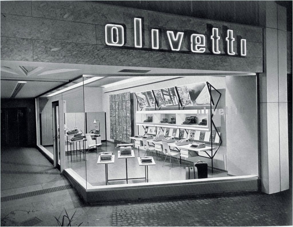
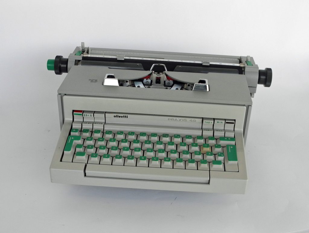
Of course, a modern office also needs modern equipment. The Italian company Olivetti produces some of the best and most functional office equipment currently on the market such as the "Praxis 48" typewriter with its bright green keys or the strikingly futuristic "Programma 101" programmable calculating machine. Owning an Olivetti typewriter or an IBM "Selectric" is the dream of many a writer.
Northern Exposure
But while the International Style may excel at furnishing office buildings, its minimalist purism does feel a little too cold and bland for the home. Thankfully, our Northern neighbours are on the case with furnishings that manage to be both modernist and cosy.
In the past three decades, Scandinavia has emerged as a source of beautiful and functional design to the point that Scandinavian Modern has become a recognisable style found in many homes in Europe (including my own) and beyond.
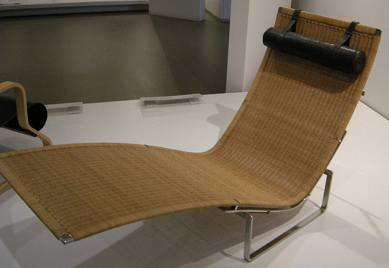
Traditionally, Scandinavian Modern has been associated with clean lines, neutral palettes and natural materials like wood, leather and wicker. A prime example is the beautiful "Hammock" chair by Danish designer Poul Kjærholm. However in recent times, Scandinavian designers have branched out and embraced materials like plastics as well as brighter colours.
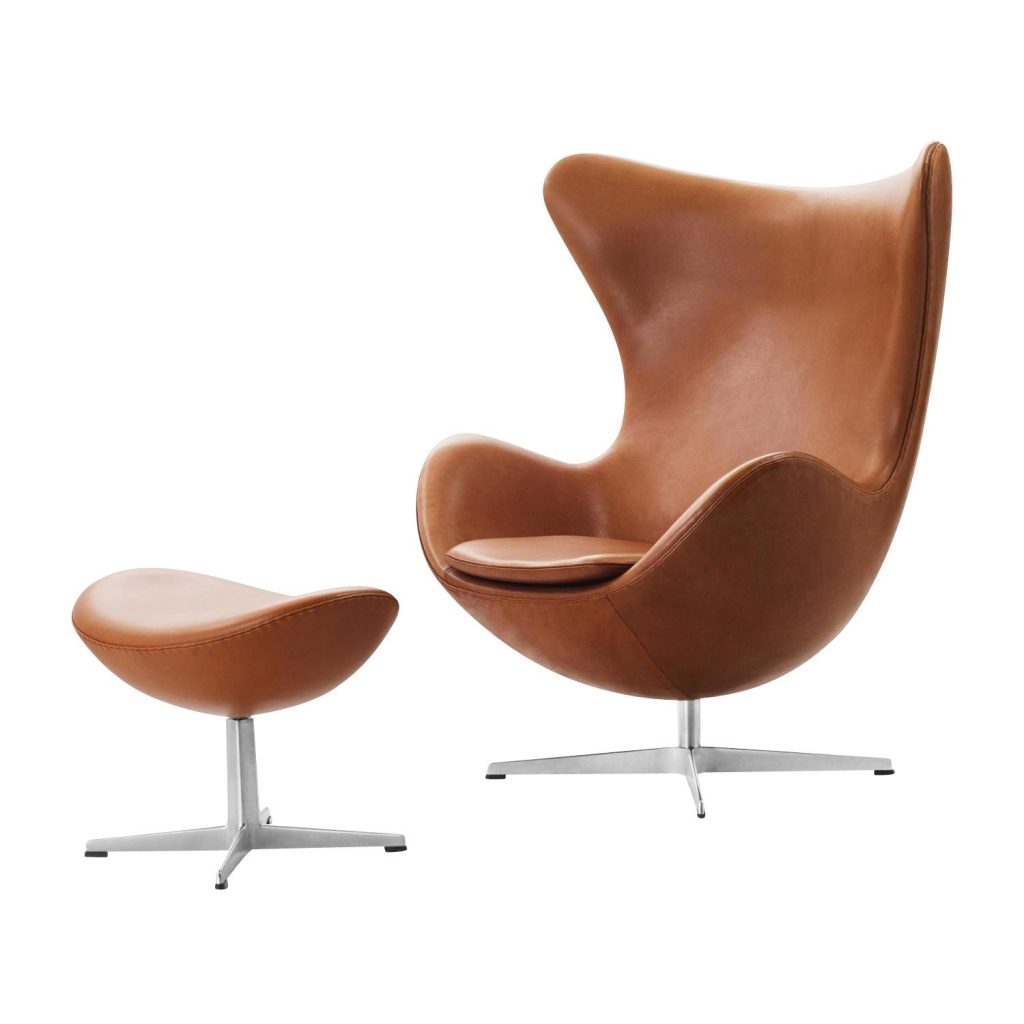
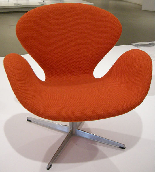
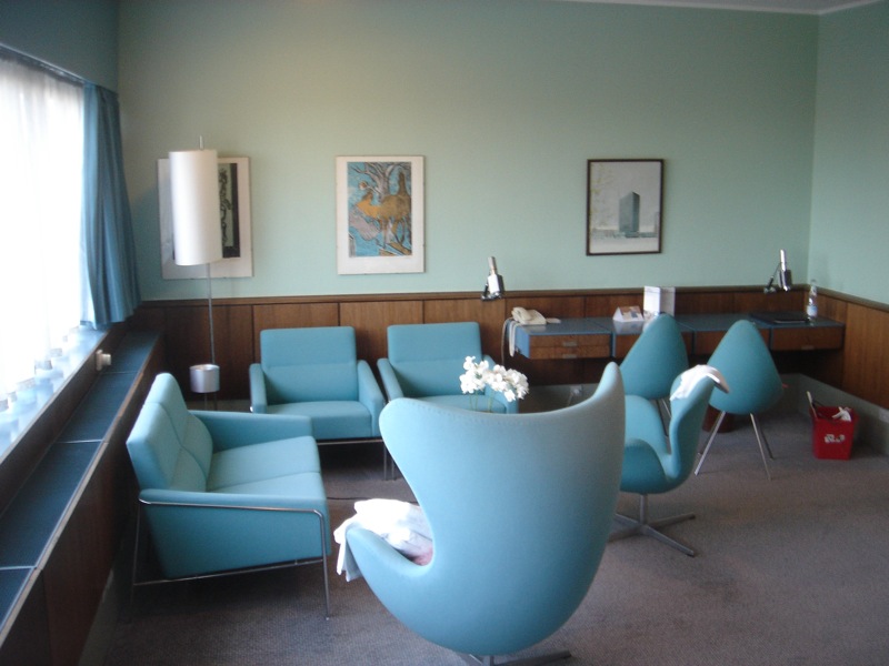
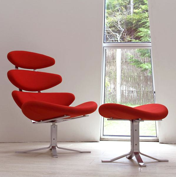
A few years ago, Danish designer Arne Jacobsen created the incredibly comfortable organic forms of the so-called "Egg" and "Swan" chairs for the SAS Royal Hotel in Copenhagen, Meanwhile, his countryman Poul Volther designed the striking "Corona" chair, inspired by witnessing a solar eclipse.
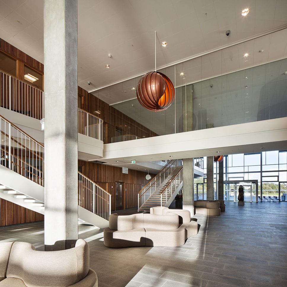
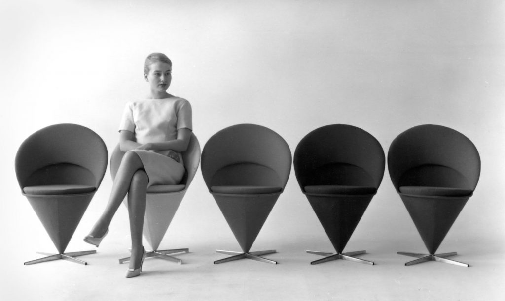
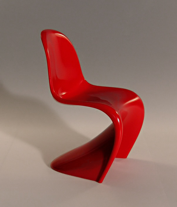
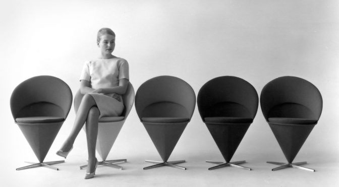
Another Dane, Verner Panton, came up with such innovative designs as the "Moon" ceiling lamp, the "Cone" chair and a cantilever chair from a single piece of injection moulded plastic which is sadly only a prototype for now, though the Swiss company Vitra is looking at possibilities for mass production.
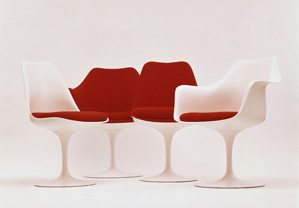
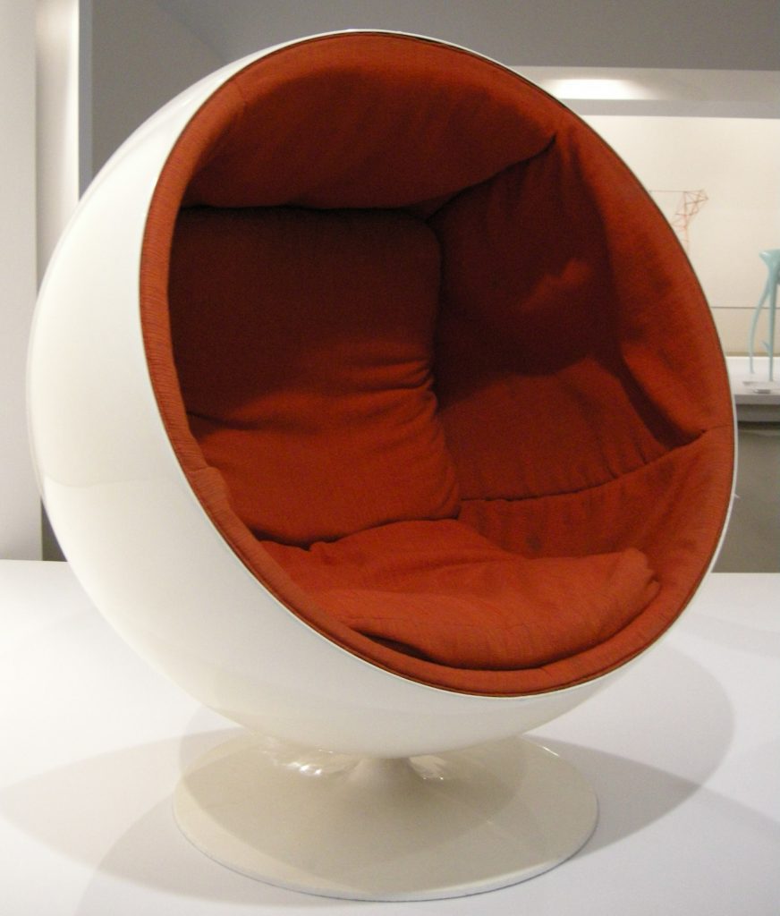
Eero Saarinen from Finland is mainly known as the architect responsible for such stunning buildings as the Trans World Flight Center, the Washington Dulles International Airport and the St. Louis Gateway arch. However, Eero Saarinen is also a talented furniture designer and the plastic "Tulip" chair he designed for Knoll International can be found in homes and boardrooms around the world. Meanwhile, Eero Aarnio, also from Finland, created the fabulous "Ball" chair, which is perfect for curling up with a good book.
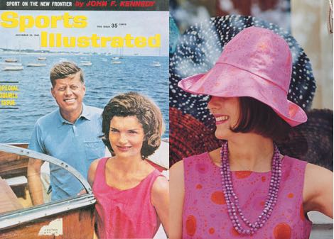
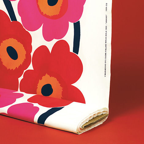
But Scandinavian designers also excel in fields beyond furniture design. In 1960, Jacqueline Kennedy made the colourful fabrics of the Finnish company Marimekko world famous, when she bought six Marimekko gowns for her husband's presidential campaign. Those carefree days may be over, but Marimekko is still producing striking and brightly coloured fabrics such as the "Unikko" (poppy) pattern, designed last year by Maija Isola.
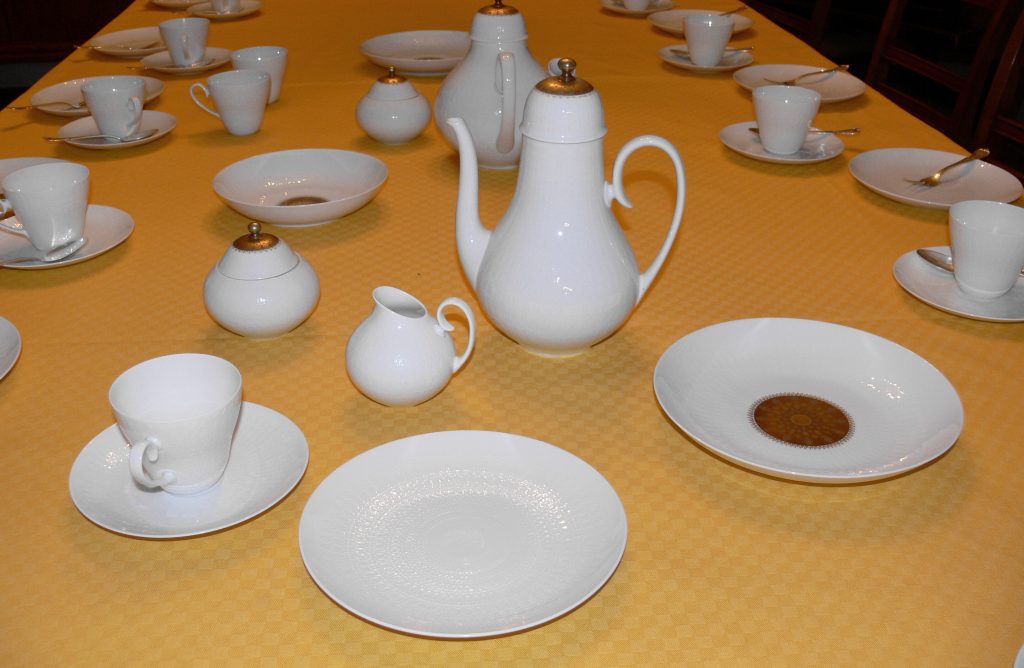
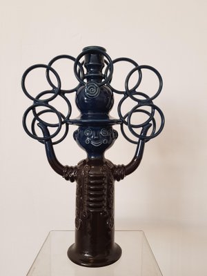
Meanwhile, Danish designer Bjørn Wiinblad has shaken up the stuffy Rosenthal porcelain company with his elegant and modern designs such the "Romanze" dinnerware line, which can be found on many West German tables, including mine.
From Italy with Love
If Scandinavia is the centre of North European design, the style heart of Southern Europe beats in Italy.
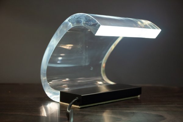
Designer Joe Columbo from Milan may be only 34, but he has already created such revolutionary designs as the stackable "Universale" No. 4860 chair, the desk lamp "Acrilica", the "Combi-Centre" flexible storage cabinet and the "Elda" chair which would not look out of place on the bridge of a starship.
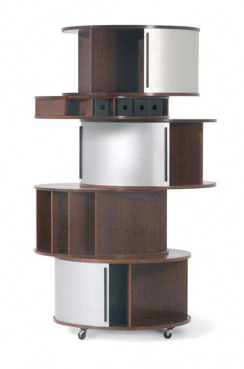
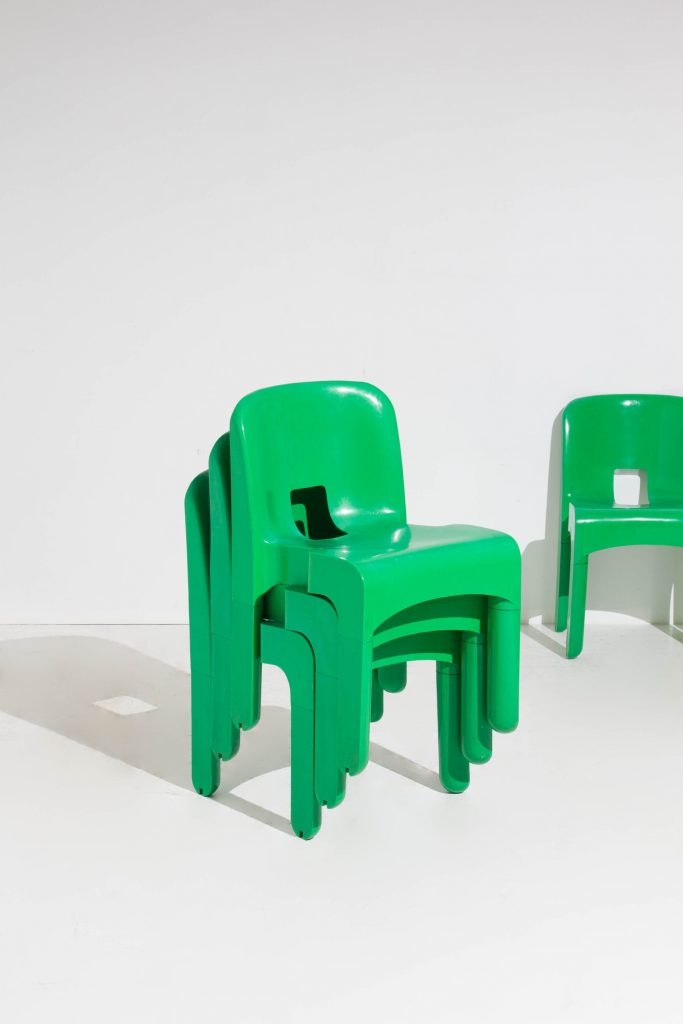
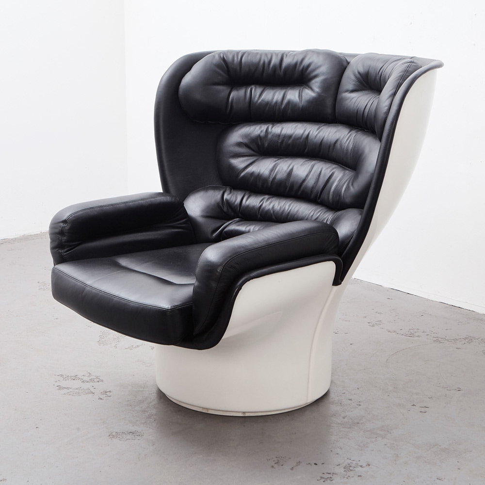
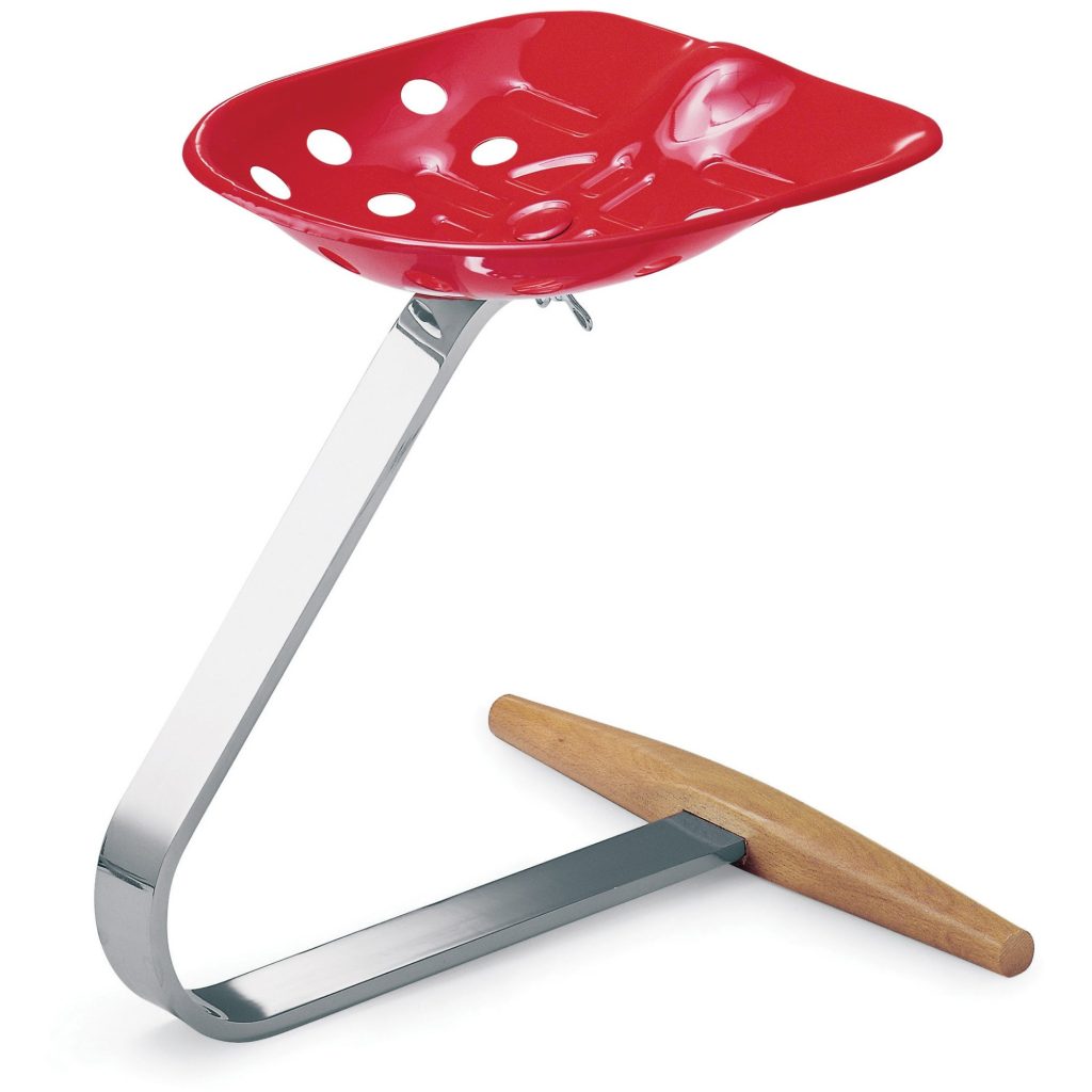
The "Arco" lamp, designed by brothers Pier Giacomo and Achille Castiglioni, is not just beautiful, but also combines the simplicity of a floor lamp with the illumination provided by a ceiling lamp. An "Arco" lamp currently brightens up my living room and was well worth both the price and the hassle of transporting the large and heavy lamp home in a small car. A few years earlier, the brothers Castiglioni also designed the deceptively simple "Mezzadro" stool.
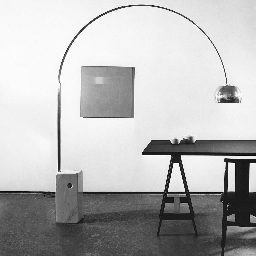
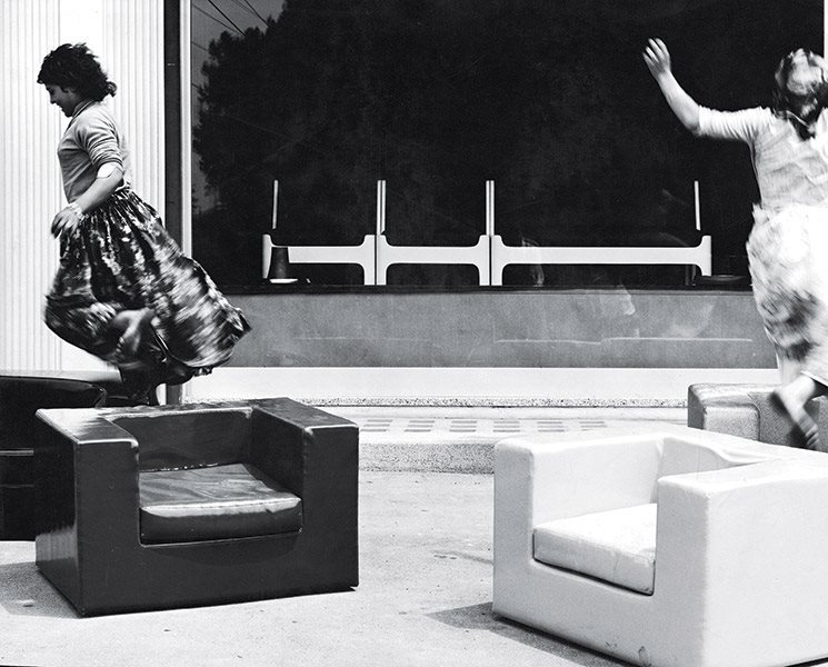
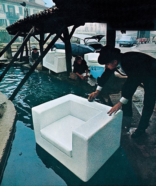
But Italian design is not just beautiful – no, the Italians also pioneered the use of space age plastic materials for home furnishings. Above, I already mentioned the "Universale" chair from brightly coloured ABS plastic and the stunning "Acrilica" desk lamp, which turns a sheet of acrylic glass into an stylised ocean wave and lights up your desk, too. Another example of innovative plastic use is the line of "Throw Away" sofas and armchairs designed by Willie Landels for the Milanese company Zanotta. Outwardly, the boxy "Throw Away" armchairs and sofas may not look particularly exciting, but if you were to cut one open – not that you should – you'd find only polyurethane foam inside, no wooden frames or steel springs needed.
Making Household Appliances Beautiful
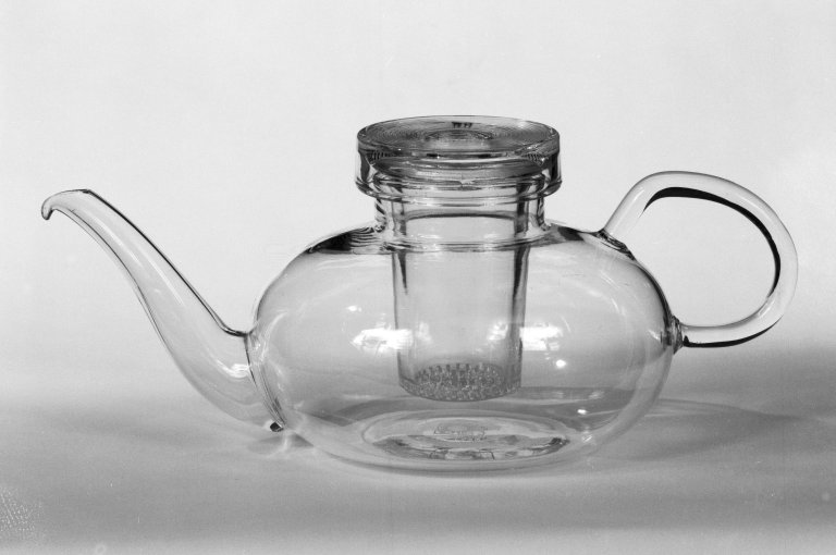
In West Germany, interior and product design are still very much influenced by the purist Bauhaus style of the 1920s and early 1930s. The rise of the Third Reich scattered the Bauhaus alumni all over the world, though some like Wilhelm Wagenfeld remained in West Germany. A son of my hometown of Bremen, Wilhelm Wagenfeld has created both lamps and tableware such as this teapot from heat-resistant borosilicate glass or the salt and pepper shaker combination "Max and Moritz". Wagenfeld's designs can be found in many West German homes, including mine.
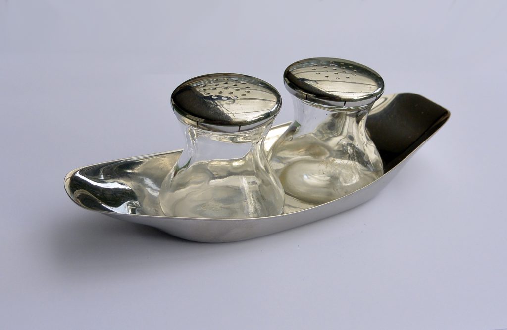
The original Bauhaus in Dessau has sadly vanished behind the Iron Curtain, but its spiritual heirs may be found at the Ulm School of Design, whose alumni found employment at corporations like Lufthansa airlines and the Braun AG.
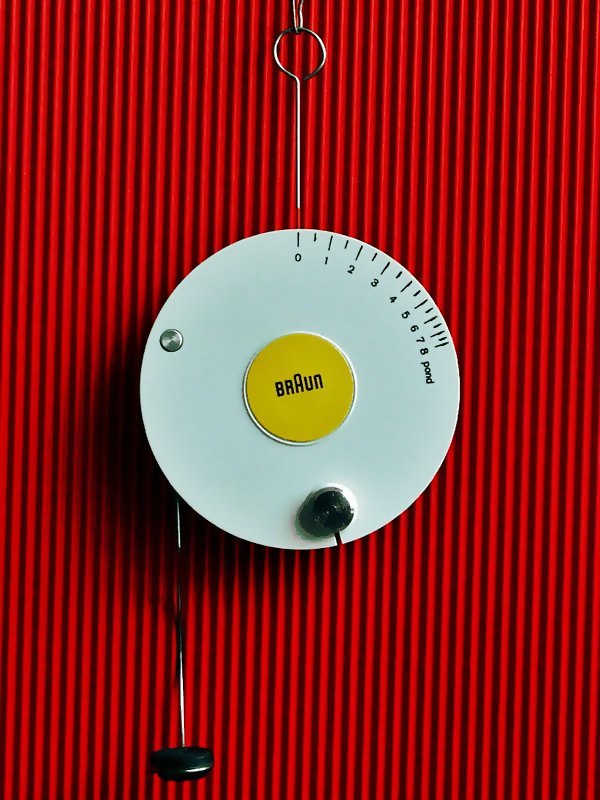
The Braun AG has long been known as a manufacturer of high-quality radios, clocks, electric shavers, kitchen and household appliances. However, in the past few years, Braun has also become known for its functional and beautiful product design, courtesy of designers Dieter Rams, Hans Gugelot and Reinhold Weiss.
Braun's most famous product is probably the "Phonosuper SK4", which combines a radio and a record player in a single white box with a lid of clear acrylic. Due to its appearance, the "Phonosuper SK4" quickly gained the nickname "Snow White's coffin". But never mind the somewhat morbid nickname, your Beatles records have never sounded better.
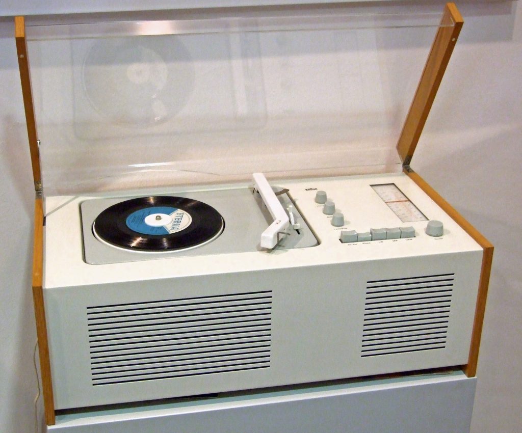
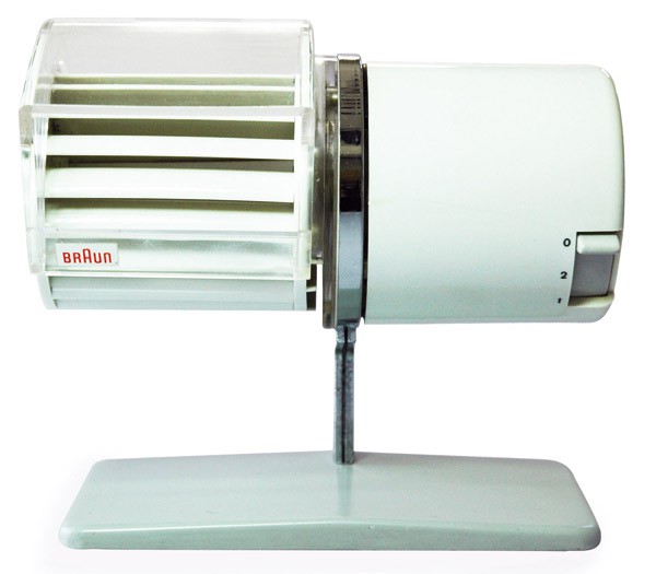
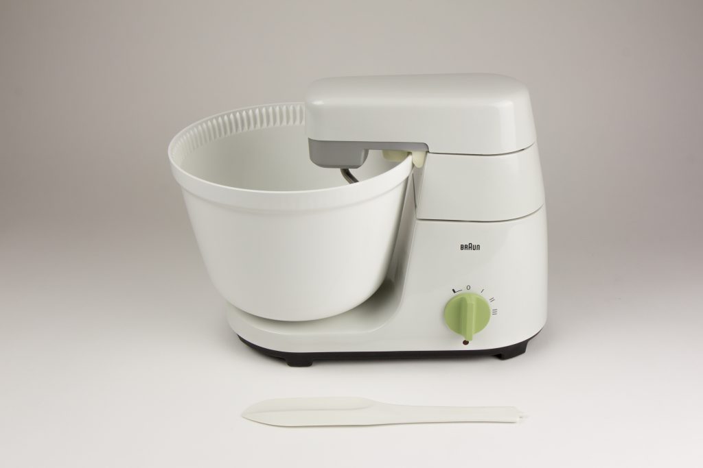
I'm fortunate that my uncle works for the Braun AG and can hook me up with their latest products. And so I'm not only the proud owner of a "Phonosuper SK61", the improved follow-up of "Snow White's Coffin", but also of a Braun KM32 food processor and the HL1 desk fan, which keeps my office cool in the summer.
Good Design for the Masses
The many striking examples of modern interior design I have presented above all have one thing in common. They may be beautiful, but they're also very pricey. So what is a couple with a limited budget like our newlyweds above to do? Stick with grandma's Victorian hand-me-downs, until they have saved up enough to be able to afford the stunning pieces seen above?
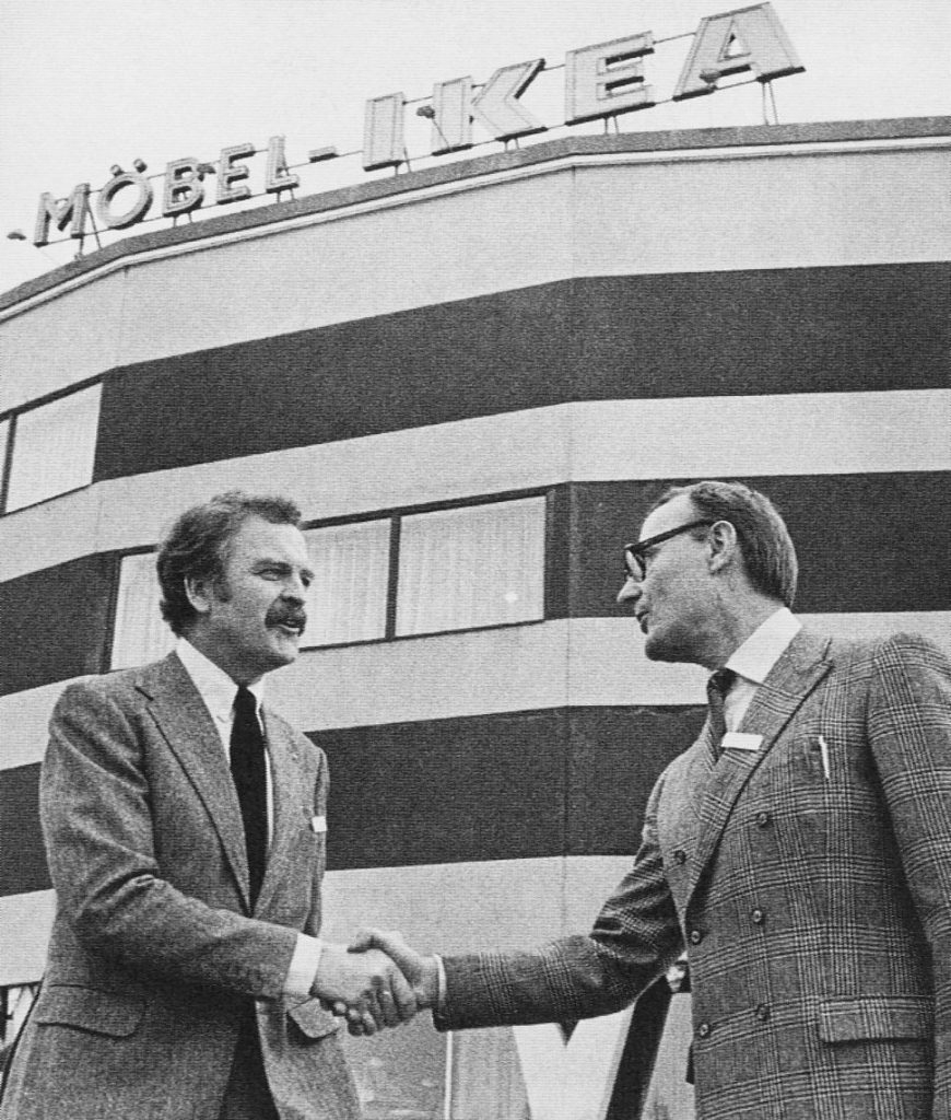
Not necessarily, because all over Western Europe companies are springing up to bring modern design to the masses at affordable prices. The foremost among those companies is IKEA of Sweden. Founded by Ingvar Kamprad, IKEA was originally a mail order business offering furniture for self-assembly. In 1958, IKEA opened its first furniture store in Älmhult, Sweden, followed soon by many others. Whether ordered by mail or purchased at a store, IKEA furniture always comes in a flat box, the contents of which the customer can assemble themselves. IKEA furniture is modern, practical and – most importantly – much cheaper than the expensive designer pieces seen above. Sadly, IKEA only operates in Scandinavia so far, but I hope that the rest of us will get to enjoy their products soon.

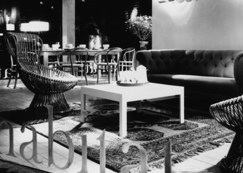
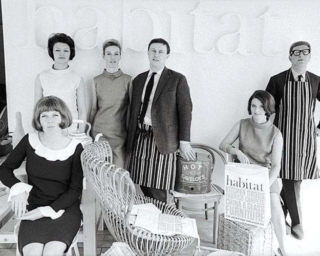
Over in Britain, a young designer named Terence Conran had a similar idea. In 1956, Conran created his "Summa" range of furniture, to be sold in flat boxes for self-assembly at home. However, Conran found that few stores would sell his products, so last year he opened his own shop, called Habitat, on Fulham Road in London. Like IKEA, Habitat offers good design at affordable prices. However, Habitat doesn't just sell furniture, they also offer kitchenware and other accessories from around the world to make your home beautiful. And so Habitat's most popular product is not furniture at all, but storage jars for dry pasta.
The Return of Victorian Whimsy
But even though practical and beautiful modern furniture is available at increasingly affordable prices these days, the Victorian furniture and accessories of our grandparents, long considered old-fashioned and passé, is currently undergoing something of a Renaissance as well.
Particularly the Art Noveau style of the turn of the century with its flowing, organic designs is back en vogue both due to high profile retrospectives in museums in Paris and London and because the swirling designs of Art Noveau also happen to echo the psychedelic experience, something which would probably have baffled the great Art Noveau designers and artists such as Henry van de Velde, Alphonse Mucha or Aubrey Beardsley.
So far, the Victorian and Art Noveau revival seems to be confined to London, where the walls of trendy apartments are covered in vintage enamel advertising signs and the Biba boutique offers the latest fashions amidst an eclectic mix of Victorian furniture, Art Noveau wallpapers and ostrich feathers. So if you still have some of grandma's old furniture in the attic, by all that's holy don't throw it away, because it's about to come back into fashion.
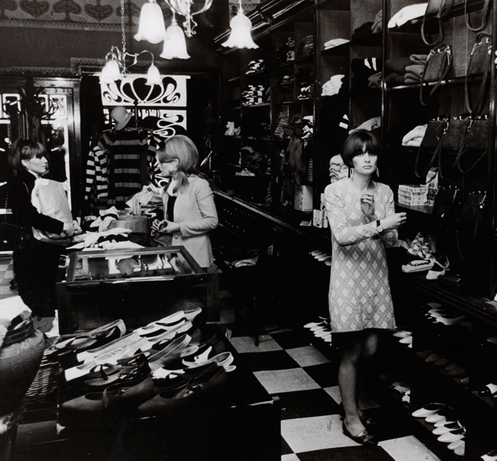
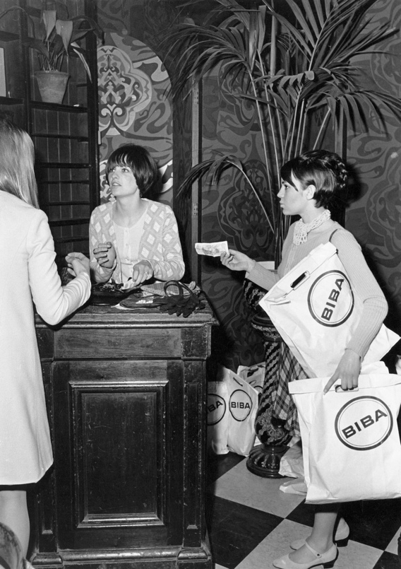
But what do you do if you don't happen to have inherited any authentic Victorian or Art Noveau objects from your grandparents and if you can't find any at your local antiques store either? Luckily, companies like Dodo Designs of Tunbridge Wells, England, offer a range of tins, mugs, wall plaques and milliner's heads that look as if they fell out of a time warp.
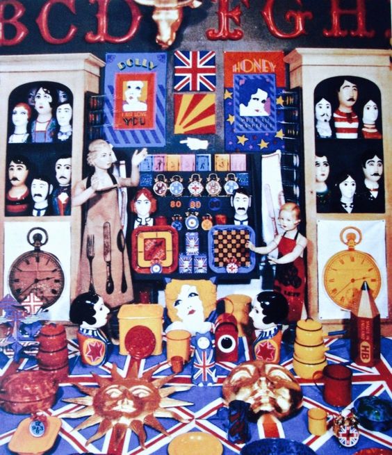
Hold onto your seat
With so many different styles and movements currently vying for customers, what will the home of the future look like? Of course, it's always difficult to predict trends with any certainty, but I do think that we will be seeing brighter colours and more furniture made from plastic. We will also be seeing stores like IKEA or Habitat expand and similar enterprises springing up in other countries. Finally, we will also be seeing older styles – whether it's the recently rediscovered Art Noveau of sixty to seventy years ago or the Bauhaus style of the 1920s and 1930s which never truly went away – coexist with the latest designs.
But one thing is certain. The home of the future will be bright, fun and exciting.
We had so much success with our first episode of The Journey Show (you can watch the kinescope rerun; check local listings for details) that we're going to have another one on April 11 at 1PM PDT with The Young Traveler as the special musical guest. As the kids say, be there or be square!



It is a peculiar disease of high-end architects that at some point they begin to design furniture and even other things like flatware. Arne Jacobsen seems to have been especially affected. His Ant chair is rightfully respected, and its successor the No. 7 has gained a bit of infamy thanks to Christine Keeler and the Profumo Affair in Great Britain, but I have to say the Egg and the Swan mentioned here seem to have been… let's say heavily inspired by the Eames Brothers' Molded Plastic & Fiberglass Shell chairs. And that Tulip chair looks like an outright copy.
Inexpensive furniture in an easily transportable flat pack certainly sounds interesting, but I really can't see furniture that you have to put together yourself ever really catching on.
Miss Keeler posing on Arne Jacobsen's No. 7 chair did not make it into the article, because the photo is a little too risqué for a family-friendly site. But for those who are over 21 and interested, you can see it here.
i'm a bit sceptical about the self-assembly furniture myself, though people with craft abilities should be able to manage. I imagine the young couple above could handle hit, because the groom is an engineer and the bride's father, who lives in the same house, is a carpenter.
By the way, my ultra-modern local church purchased some No. 7 chairs as back-up seating, when the pews are overflowing on Christmas, Easter or the Christian harvest festival/Thanksgiving. When I first saw them, I wondered if the pastor was aware of the photo or if he had innocently purchased those chairs.
The chair has nothing intrinsically to do with anything immoral. And anyone who thinks it may is extrapolating. A lot.
That Keeler photo is a SCANDAL!
In a good way.
Fascinating designs, but some of those chairs look more like museum pieces rather than something that would comfortable to sit in.