
by Jason Sacks
After the hullabaloo we saw in the world of comics in 1968, our new year of 1969 looks to be equally as interesting. Last year saw both Marvel and DC expand their lines—in Marvel’s case, doubling the number of comics they released—and we fans are lucky to see that diversity.
One of the breakthrough stars of ’68 was Jim Steranko, whose astonishing work on Nick Fury, Agent of SHIELD provided some massive pop-culture thrills and energy. Steranko’s style feels like nobody else’s in comics, combining a pop-art, hyper-stylized approach with excellent storytelling and a massive dose of energy in his work.
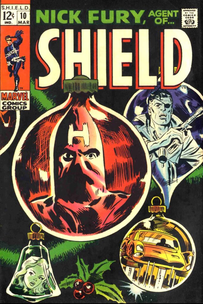
Steranko’s successors on SHIELD don’t have the same flash, but journeyman cartoonists like Frank Springer and Herb Trimpe still bring the goods. The Christmas-themed issue 10 brings some special spy drama and a bit more energy than I’m used to from those artists.
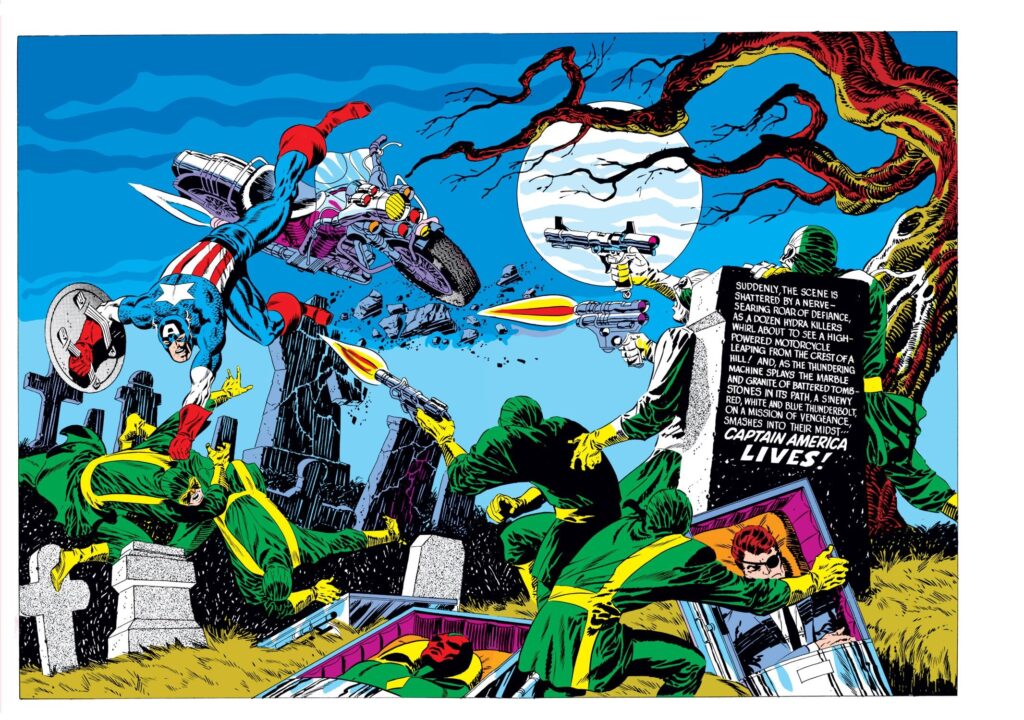
Steranko left SHIELD, but 1969 dawns with an equally epochal run by him on Captain America, with writing as always by Stan Lee. One barely needs to look past the covers to see the energy Steranko brings to the page—see this week’s Cap cover for an example. Inside, the team has contrived to bring back Cap’s pal Bucky Barnes, dead since the end of WWII, and the twists and turns promise to be thrilling.
Stan, of course, continues to write much of Marvel’s line, most notably on modern classics Amazing Spider-Man (now teamed with artist Jim Mooney), Fantastic Four and Thor (it’s hard to imagine anyone other than Jack Kirby drawing either). Spidey, in particular, has featured some great tales recently. Last year’s Kingpin tale was a show-stopper, while “Crisis on Campus,” cover-dated January 1969 and released in October, places Spider-Man firmly in the world of today, dealing with the fury and chaos of our complicated world.
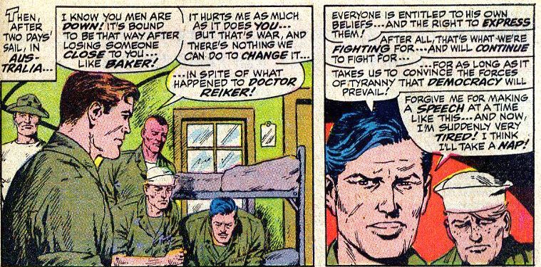
Other Marvel books have taken on the modern world, too. Most surprising was probably Sgt. Fury and His Howling Commandos, a book which would be as out-of-step with today as that Green Berets movie if not for the way writer Gary Friedrich tries to bridge the gap, as in January’s story of “The Peacemonger, ” in which a character voices empathy for the enemy and tries to find gray areas between the Allies and Japanese. It’s a bit ham-handed, but the attempt is interesting.
Maybe the nicest surprises from Marvel have been two-fold over the last year or so.
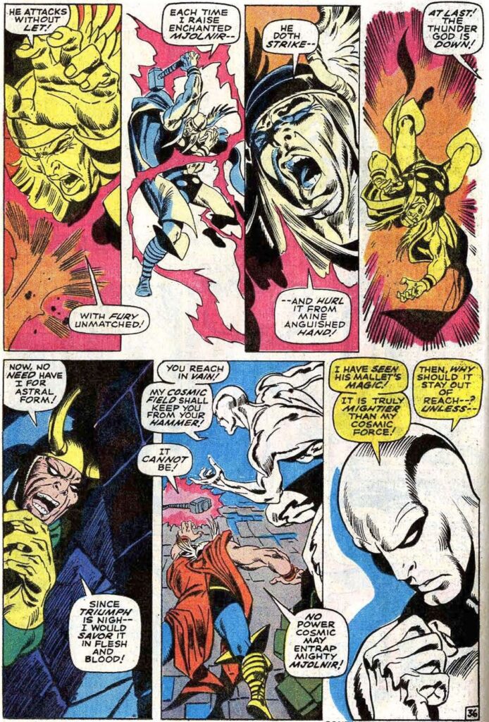
Stan and co. took a chance spinning the Silver Surfer off into his own series. I had my doubts whether the “Sky-Rider of the Spaceways” could support a title all his own—the character often seemed too self-pitying and dull in previous appearances. But my concerns were confounded. Stan installed artist John Buscema on the new title, and Big John brought the same majestic heroic splendor to the book which he has been demonstrating on Avengers. Silver Surfer #4, released in November, was an early Christmas gift for anyone looking to see gorgeous super-hero art.
The other nice surprise has been the move away from the dull, dutiful Wener Roth art in The X-Men. The aforementioned Mr. Steranko drew two mind-blowing issues before giving way to a young but promising tyro named Barry Smith. Smith copies Jack Kirby’s linework dutifully, but his art also shows the promise of an artist who might break out like Neal Adams recently did. Speaking of Adams, the fan press tells us that brilliant artist will be taking over X-Men starting next month, so I am on the edge of my seat waiting for that day to arrive.
Marvel still rounds their line out with a plethora of other super-hero mags (including Captain Marvel, Daredevil and Doctor Strange) as well as war comics, westerns and Archie-style books.
Over at National/DC, the company feels like it’s on the verge of embracing a 1970s mindset in their comics. I’ve written before about the evolution Batman comics took over the last year, from goofy camp to dramatic tales which fit the character’s long history. Frequently written by comic-strip vet Frank Robbins and neo-comics writer Denny O’Neil, there’s a vitality in Batman, Detective and Brave & Bold which fits our times. This month’s Brave & Bold, which teams Batman with the Teen Titans, and includes brilliant Adams art and a story which beautifully captures the generation gap causing chasms in so many American households today.
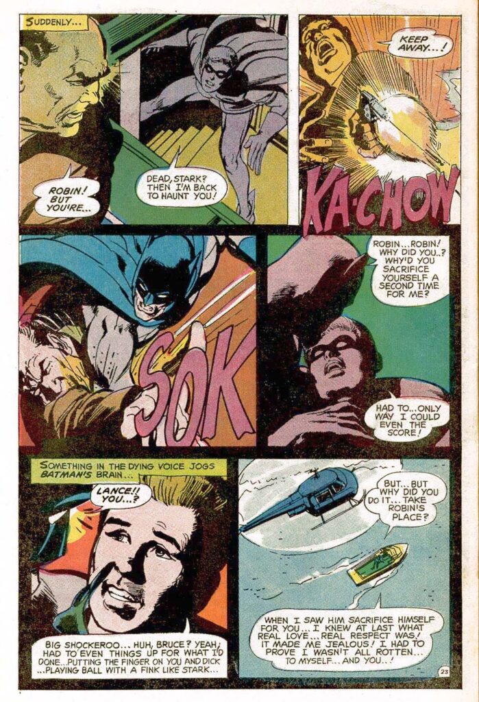
O’Neil has also added vitality to another of National’s more stodgy titles, as his take on the Justice League of America has moved the book away from formula and towards a book with one foot in reality. JLA #69, for instance, is a fairly sober look at the rule against heroes killing, an interesting exploration of violence in an era when violence causes hell on Earth.
O’Neil also provides the writing chores for one of National’s most radical changes, in Wonder Woman. Recently editor/writer Mike Sekowsky took over chores on WW, one of DC’s most childish characters, and provided a radical shift in stories. Gone was the patriotic costume, transparent plane and magic lasso. Instead, we have “Diana Prince, The New Wonder Woman”, an adventure heroine in the style of Emma Peel or Tara King. The stories have their flaws—I could happily live without seeing Diana’s stereotypical Asian mentor I Ching again—but Sekowsky’s changes have a thrilling feeling similar to the Road Runner running off a cliff—it feels like these stories will crash, but it’s thrilling to stand on air.
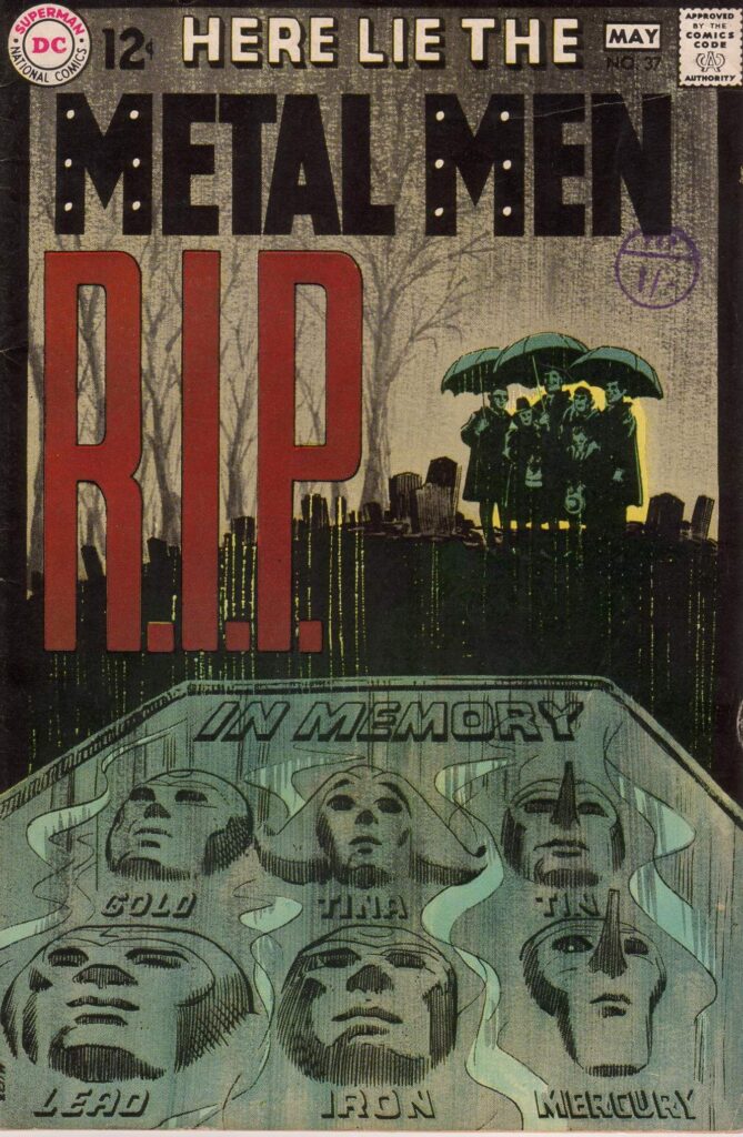
Just this month, Sekowsky is leading perennial also-rans the Metal Men into their own revolution. In Metal Men #39, he has the robot heroes melted down and transformed into human form. This change is wild, unlike anything I’ve seen in comics other than the Wonder Woman transformation, and I can’t wait to see how it plays out.
And while the Superman comics seem as stuck in their rhythm as ever (though the Adams covers on those books are fantastic!), DC also has revitalized some of their other classic heroes. Aquaman, now by the Skeates, Aparo and Giordano, has lovely art and a thrilling exploration of underwater life. Jerry Grandanetti delivers surreal art for DC’s mystical hero The Spectre. And they have transformed House of Mystery from a comic with DC’s worst heroes to a standout horror anthology which is often better than that previous gold standard for horror comics. Warren Magazines’ Creepy and Eerie are having a down year, but thankfully DC has filled that void.
But National’s best comics in 1969 are new series. Beware the Creeper and Hawk and Dove come from the fruitful imagination of Steve Ditko and are offbeat heroic fun, strange action delivered in that delectable, indisputable Ditko style.
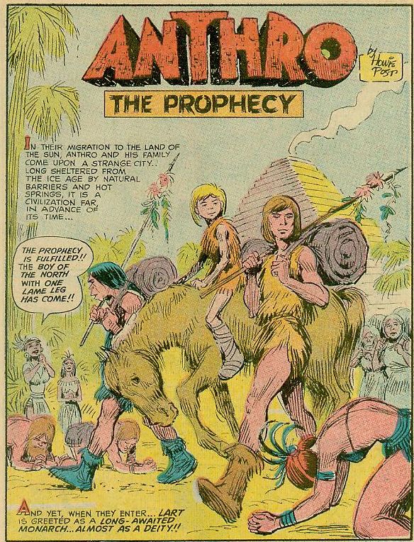
Anthro, by Howie Post—a rare example of one man providing writing and art skills for a DC comic—tells the story of a boy and his family during caveman times and is a thorough delight—full of fun characters, interesting action and a low-key comedy mood which makes it a treat each time a new issue is released.
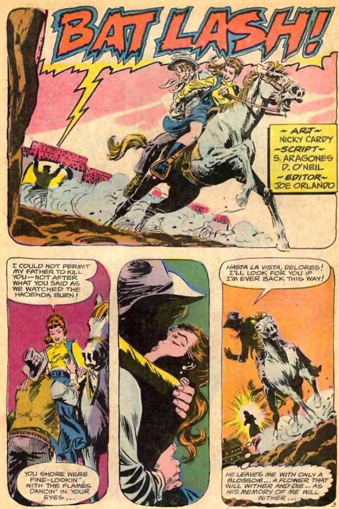
The standout new DC title is called Bat Lash and has nothing to do with the caped crusader and everything to do with the new wave of western characters appearing on TV these days. Batton Lash is kind of an antihero, a rare western hero who would rather pick flowers than engage in a gunfight, a wizard with women and at the gambling table who nevertheless always seems to find himself in the middle of one crazy criminal scheme or another. With gorgeous art by Nick Cardy and great writing by Sergio Aragones of MAD fame (no, really!), this is as good as comics get.
A few other titles not to sleep on at National: despite the toy tie-in, Captain Action is a lot of fun and features art by Gil Kane and Wally Wood; Enemy Ace continues in Star Spangled War Stories, with some gritty, smart stories of WWI from the German standpoint; and even DC’s romance comics have caught up with the times and feature more contemporary-feeling tales.
Archie continues to be Archie, the comics your kid sister loves, while Harvey continues the kiddie comics and Gold Key their unexceptional comics line with the likes of Lost in Space, Three Stooges and The Flintstones. I always think of Gold Key comics as “emergency comics”: to pick up when nothing better is on the stands.
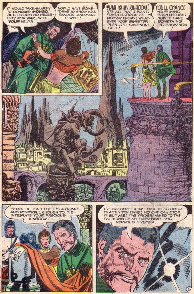
Sadly, Charlton comics are worse than that, usually unreadable despite their comics featuring The Phantom, Popeye and Flash Gordon—though Pat Boyette's art on Flash is dynamic. Their comics have a bottom-of-the-barrel feel to them. Worse, their comics actually smell weird, as if their publisher prints cereal boxes as well as comics.
So, overall, comics in 1969 seem in good shape. From top to bottom, there’s something for most everyone. If I can recommend one comic above all the others, it’s Bat Lash. I don’t think the series will be long for the world—it’s too good to sell well—so grab an issue when you can and you will thank me.

![[February 6, 1969] Are Comics Embracing a 1970s Mindset?](https://galacticjourney.org/wp-content/uploads/2024/01/shield9-672x372.jpg)

