![[April 10, 1967] A Queer Dream (the CBS "documentary" <i>The Homosexuals</i>)](https://galacticjourney.org/wp-content/uploads/2022/04/670410homosexuals-672x372.jpg)
There is something profoundly queer in enjoying science fiction and fantasy. The genre asks us, again and again, to imagine worlds fundamentally different to the one we live in every day. Worlds with equality of the sexes in a workplace, fair and accountable courts, ends to unjust wars – and of course, pointy-eared aliens, impossible spaceships, and lithesome green women.
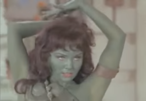
For many of us, these science fictional spaces are a refuge, a place that is not only safe for imagining, but safe from discrimination, casual cruelty, and doubt as to our welcome. Fan communities, at their best, can be places where fairness, open mindedness, and creativity reign over entrenched biases, reflexive bigotry, and the dishwater-dull thinking of corporate life.
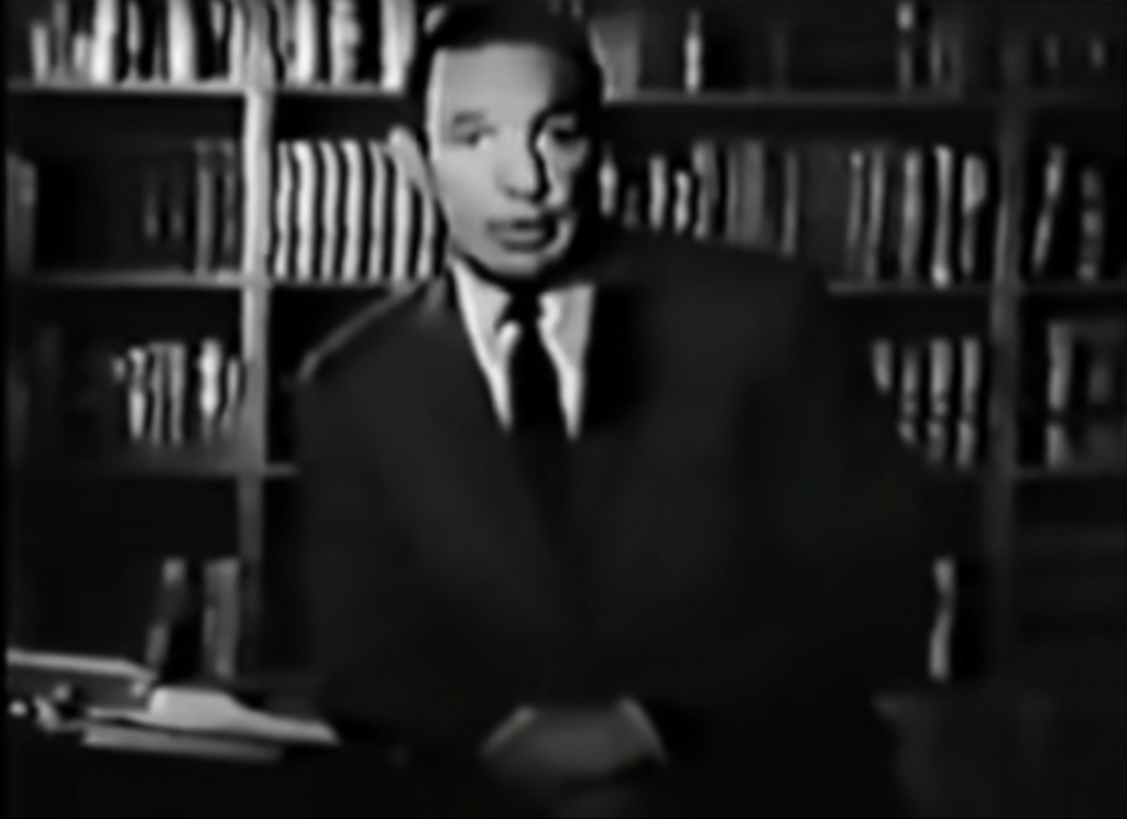
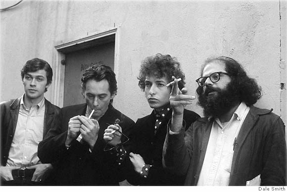
Last month, I felt myself yearning for Ursula K. Le Guin's shapeshifting wizards, the science fictional poetry of Adrienne Rich, the spinning worlds of Star Trek–the direct result of having watched CBS News's deeply cruel, intellectually lazy, and poorly reported documentary piece "The Homosexuals."
Over the course of an hour, reporter Mike Wallace managed to repeat nearly every stereotype, false scandal, and ignorant opinion of this group from the past decade, along with tossing tinder onto the fire of at least two witch-hunts whose scarring cinders had barely cooled. From San Francisco to Washington DC, with law enforcement layovers in Idaho and Los Angeles, this documentary gave platform and voice to faux expert after faux expert who pathologized, medicalized, and generally generalized about a population they are not from and whose membership they only come into contact with during extreme criminal or psychiatric crises.
It was a bit like watching a reporter interview a panel of ax murderers about about the lives of modern lumberjacks and taking their words on lumberjacks' needs, lives, and values based on their shared experiences wielding an ax.
Love is generally treated much more gently in science fiction and fantasy. There are any number of cruel, debasing, woman-hating or family-hating or love-hating works of fiction available on the average public library shelf, but it is far easier to find acceptance and warmth and a curiosity about all the ways there are to be alive in our shared universe between the covers of a book than on the nightly news. Perhaps that is because those of us who love science fiction and fantasy are used to being seen as queer by the wider world, we can find it within ourselves to accept queerness in others. Perhaps the experience of imagining different languages and cultures and lifeways makes us more open to allowing others to live as makes them happiest.
I think this shared hobby certainly makes us more comfortable trying on new language for size. For example, in the program mentioned above, Mr. Wallace doggedly uses the word "homosexuals," even while one of the several men he spoke to used the term "gay." Once, Mr. Wallace used the term "bisexual," but swiftly dropped it.
Now, there is no word for this community that is not soaked in blood. I have friends who call themselves saphists or faggots or queers or lesbians or fairies or dykes or homophiles or queens or gays or homosexuals, and that is their right; I'll call anyone what they ask to be called. I use "queer" for myself because I had four years of high school Latin and can't really square calling myself "man-sexual" when what I am is a woman who is plumbing agnostic. Bisexual is a fair enough descriptor too and one I sometimes use in the wilds, but there is something juicy in taking back a word so often used in violent insult, so "queer" is what I use.
It is also how I think of my collection of friends here in California, queer as to their sexual orientation or their genders or just their worldview. It is a wide and colorful umbrella we all crouch under, holding each other close out of the storms of social opprobrium like those given a megaphone in this documentary.
It did not have to be like this. Mike Wallace could have spoken to members of the Janus Society or ONE Magazine, rather than merely filming their doors for shock value; he could have followed in the footsteps of his fellows reporters at my own local station, KQED, who produced a much better documentary on this same subject six years ago titled "The Rejected." If he wished to speak to bisexuals, to women or anyone who isn't a man, to people of color, to people outside of the middle class, all he had to do was pick-up a copy of Tangents or The Phoenix or Vanguard Magazine or ring up the editors.

Mr. Wallace could have done what an anonymous congressional aide did nearly 20 years ago in one of the most sympathetic federal reports on queer people; he could have represented our experiences with compassion and care. In 1949, while the United States Congress was debating a change to the U.S. military's approach to discharges, an aide serving the House of Representatives' Committee on Veterans Affairs compiled report entitled: “History of the Phrase 'Discharged Under Conditions Other Than Dishonorable’ and Present Discharge Criteria for Three Services.”
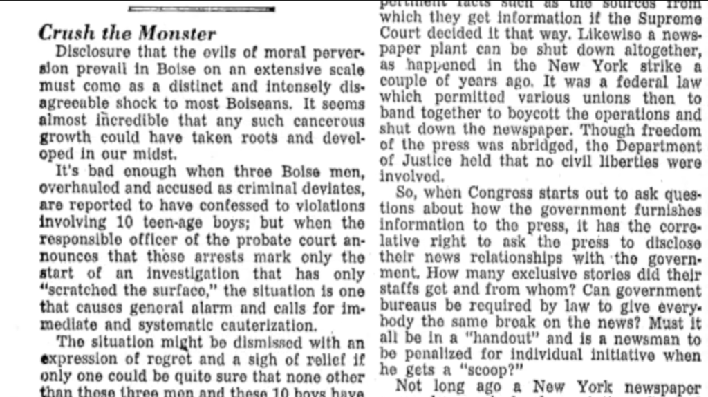
Now, this report title has none of the thrill of Mr. Wallace's headlines from Boise ("Crush the Monster") or the brutal audio he included of a 19-year-old soldier begging police not to tell his mother they'd caught him with another man and near weeping when they taunted him with the threat of telling his commanding officer. But I find the best stories are sometimes tucked away, not behind flashy titles but in tomes deep enough to hide the truth. No one would accuse Professor J.R.R. Tolkien of being flashy, but I find more truth in his writing of the world than many a jazzier author.
Imagine cracking open the Congressional Record of 1949 like we're opening up your well-loved edition of The Lord of the Rings. Find your way to the report, where a staffer explains how extraordinary it is that the committee has received any formal complaints about the blue discharge ticket process – the process by which the U.S. military removed tens of thousands of soldiers, sailors, marines, and airmen from the armed services during World War II. Flip your way past the harsh realities of finding a job with blue ticket discharge and references to reports with names like The Pervert Records (1947), and you will find this impossibly poignant and beautiful paragraph:
“It should be borne in mind that even a moderate amount of complaint in a matter of this sort is significant. For a person to make such a complaint in his own case implies that, he feels, a sense of injustice so great that he is willing to risk publicizing the stigma of having been discharged from the Army under circumstances which savor of disgrace. For each complainant there are many more persons who feel the same sense of injustice but prefer to bury their hurt in as much oblivion as possible.”
Today, most people who I would call queer "bury their hurt in as much oblivion as possible," making the brave few who raise their voices worthy of our shared pride. Most people who I would call queer seek to protect themselves and the ones they love from the stigma and disgrace and frequent injustices that Mr. Wallace's program did nothing to address or to heal. Most of us fantasize about a day when we will be free to be who we are. Of living fully in communities where fairness, open mindedness, and creativity reign.
I think we can get there. I dream about it. I hope you do too.


![[March 24, 1967] One Door Closes As Another Opens (Death and Renewal with a VW Bus)](https://galacticjourney.org/wp-content/uploads/2022/03/670324van-672x372.jpg)


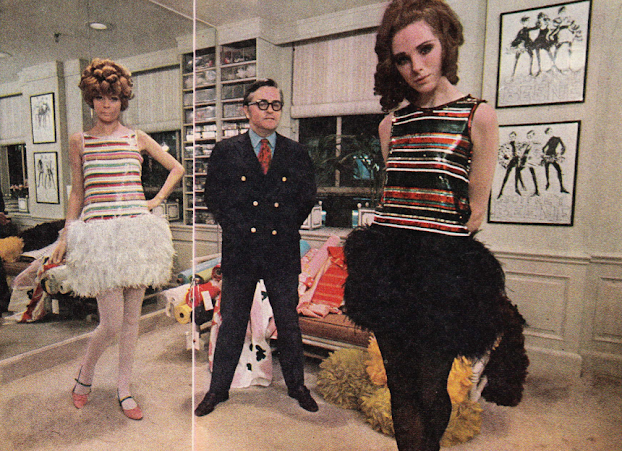
![[February 26th, 1967] Geoffrey Beene, The Master of Modernity](https://galacticjourney.org/wp-content/uploads/2022/02/03.jpg)

![[February 10, 1967] Match made in Heaven (1966 NFL Season Overview)](https://galacticjourney.org/wp-content/uploads/2022/02/670210attack-672x372.jpg)


![[November 28, 1966] Truman Capote's Ink and Paper Cinderella (a party to end all parties)](https://galacticjourney.org/wp-content/uploads/2021/11/lee-radziwell-and-capote-672x372.jpg)


![[October 8, 1966] Martial Law in San Francisco (Hunters Point riots)](https://galacticjourney.org/wp-content/uploads/2021/10/Mayor_Shelley_at_Potrero_Police_Station-672x372.jpg)

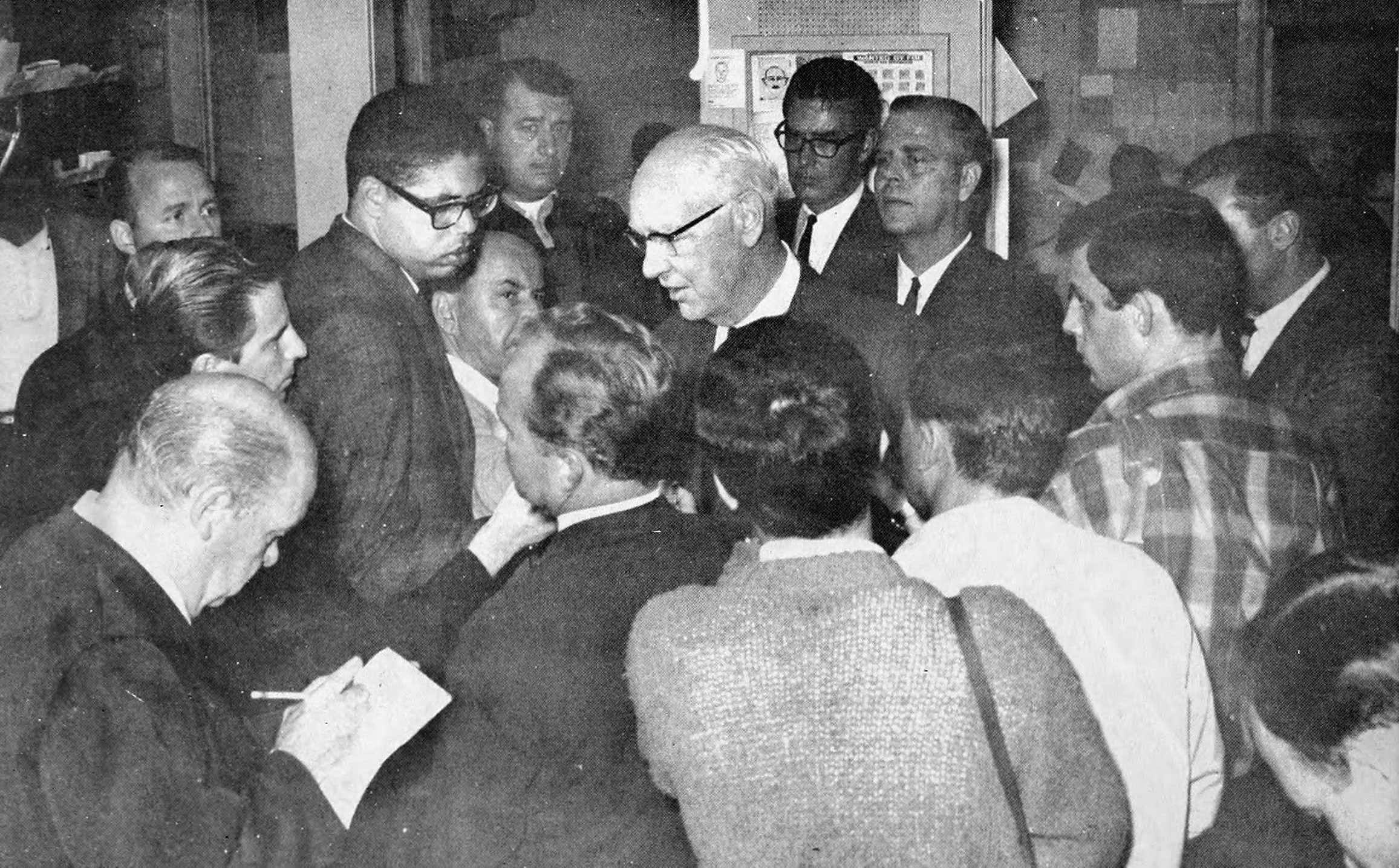
 The National Guard Lands on City Hall
![[August 22, 1966] Been Beatnik So Long, Hippies Looking Up to Me](https://galacticjourney.org/wp-content/uploads/2021/08/grateful-dead-psychedelic-paisleys-1960s-jpg-672x372.jpg)


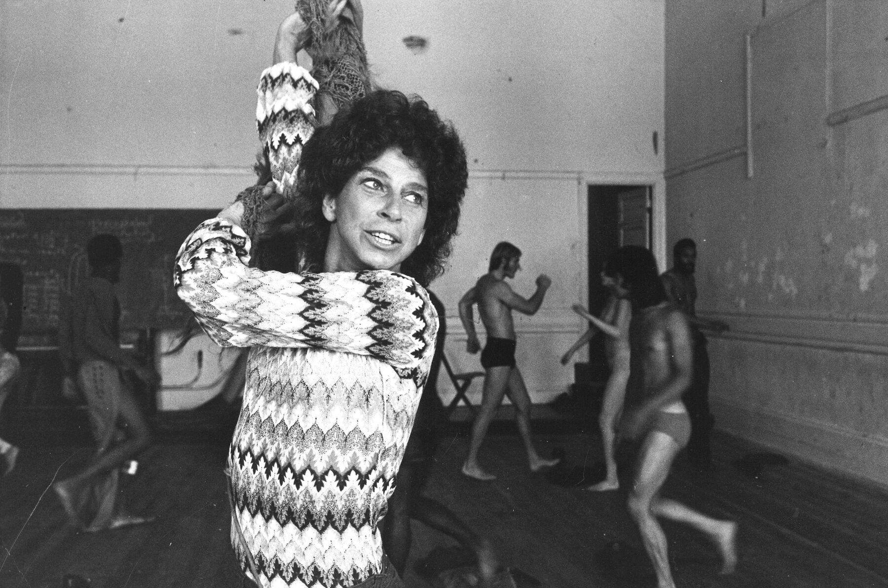
![[August 6, 1966] I Won't Dance, Don't Ask Me (Anna Halprin and the Dancers Workshop)](https://galacticjourney.org/wp-content/uploads/2021/08/halprinself.jpg)
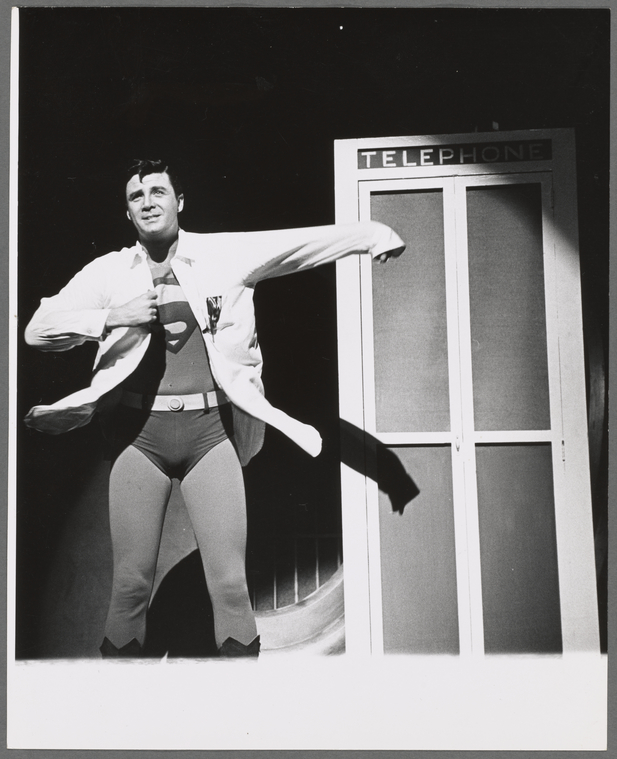
![[August 4, 1966] Up, up, and away! (the <i>Superman</i> musical)](https://galacticjourney.org/wp-content/uploads/2021/08/660804b-672x372.jpg)


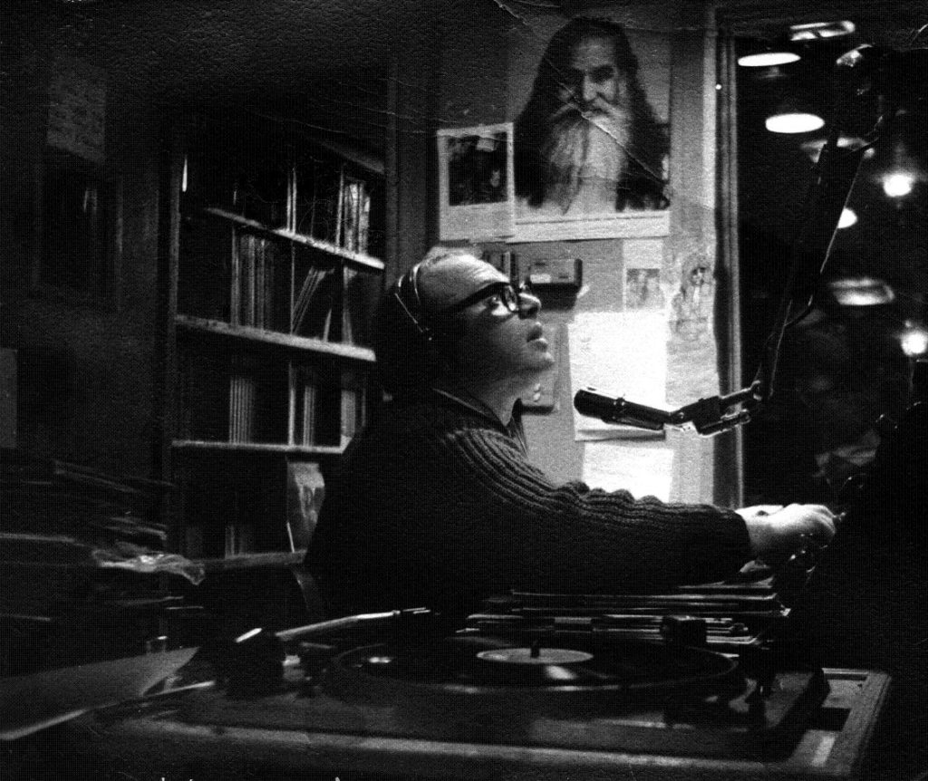
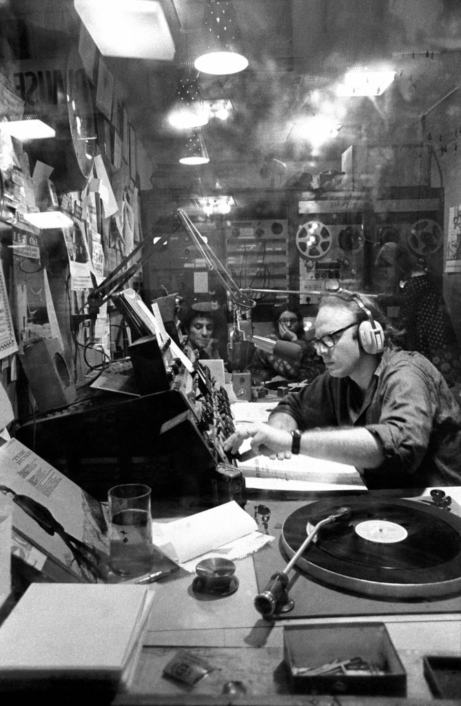
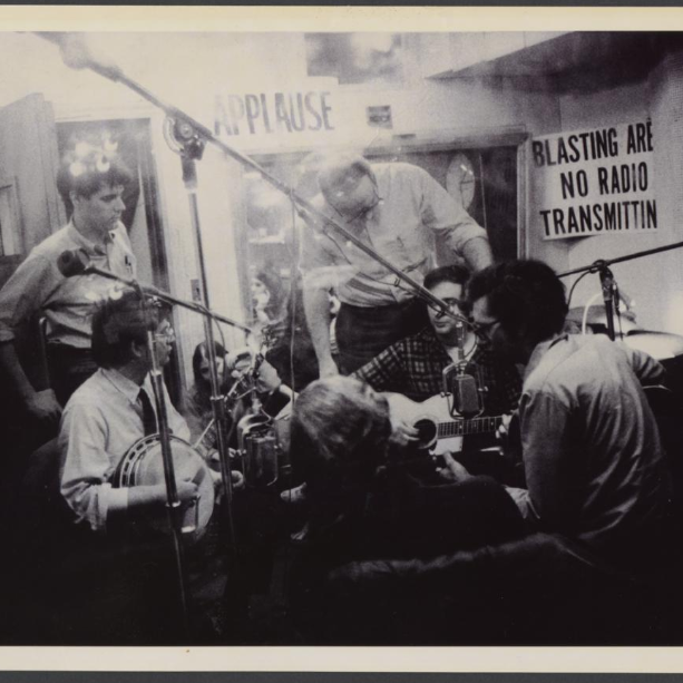
![[June 18, 1966] Avant Radio for "Satisfaction" (Bob Fass on WBAI)](https://galacticjourney.org/wp-content/uploads/2021/05/bob-Fass.jpg)