I have recently fallen back in love with the ever personal, exhaustively practical designs of the worldly Bonnie Cashin. From ballet costumes to uniforms for servicewomen during World War II to Coach, there’s no doubt she has had a far-reaching influence on our culture.
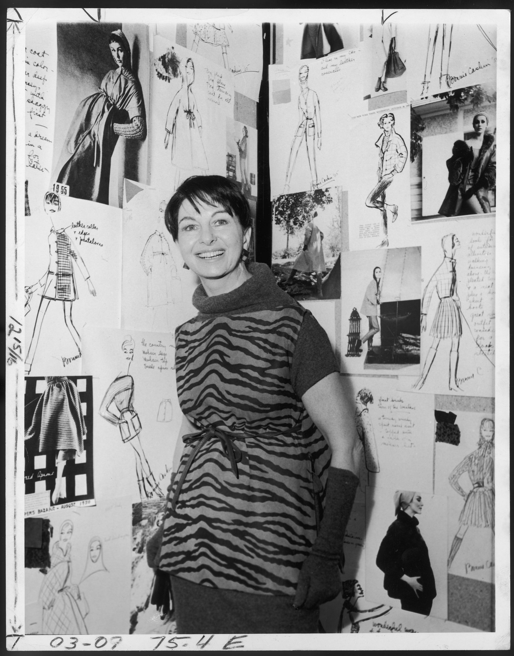
Bonnie Cashin wearing a wool zebra-striped tunic, early 1960s.
A staple of American design, Cashin is most known for pioneering the sportswear culture we now thoroughly enjoy. But her work has been far more diverse than one is led to believe. She lends a worldly view to American design, and explores other cultures through silhouette and textile alike. Let’s explore her inspirations and creations.
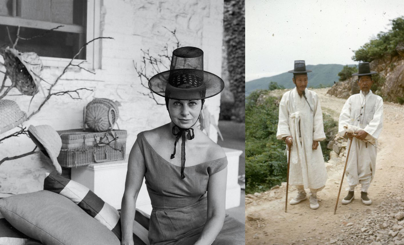
In 1960, Bonnie Cashin visited South Korea. Here she dons a gat, a black horsehair wide-brimmed steeple hat which is traditionally worn by noblemen and scholars during the Joseon period. Perhaps this foreshadows her interest in symbols of status and power.
I would be remiss to not first introduce Cashin’s most recent invention, the Blanket Coat, an evermore popular trend that will most assuredly be in style for a decade or more. While at first, the Blanket Coat seems to follow the boxy trapeze cuts ubiquitous in fashion, it does so from a long-informed fascination with the shapes and details of other cultures. This style, derived from her recent interest in the Japanese kimono, departs from the expected silks and linens and turns instead to delicate, fuzzy mohair wool which softens the look. Bold colors and patterns, though not directly derived from kimono, are inspired by Eastern color schemes, which at first glance create discord to the eye but settle into a harmonious and energetic palette.
Blanket Coat, 1965. While the bright yellow and pink palette of this coat may be jarring at first, it's worth noting that this is the color palette of a young unmarried Korean woman's hanbok.
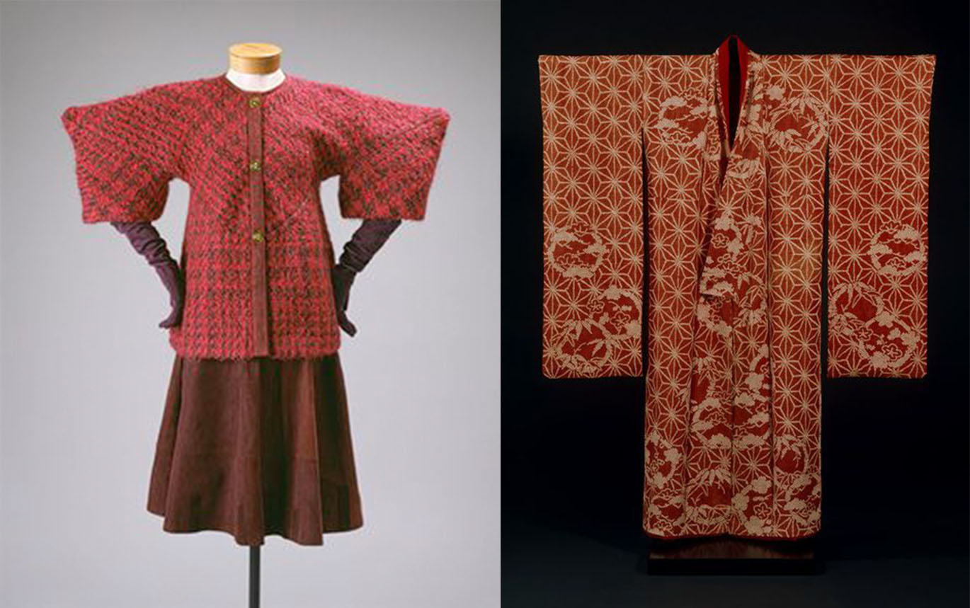
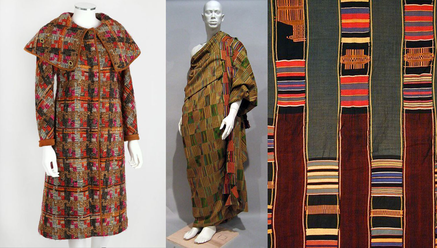
Her interest in kimono doesn’t stop there. Recently, she released experimental suits of tweed wool. These curious pieces portray Cashin’s devotion to character and story. Note the kimono displayed traditionally on a wooden pole, in comparison to the angular shoulders of Cashin’s design. I was floored by Cashin’s clever jab: that women are often the dressings of the room. This silhouette lends the woman’s tapestry its own agency, thereby freeing the woman from conventional expectations.
This particular silhouette rose in Cashin's fall/winter 1964-1965 season. The kimono pictured right is made of rinzu silk, circa 1800-1840.
Beyond silhouette, textiles also play a bold role in Cashin’s creative expressions. Cashin looks to symbols of power and translates them into womenswear. Born in 1908, before women’s suffrage (embarrassingly, we’ve only had the right to vote for forty-five years) and witness to the bravery of women at war, I can’t help but surmise that Cashin’s designs are for women with strength of character. (On the ethicality of appropriating symbols of power from other cultures, I tend to believe it’s best to leave them in the hands of their successors. However, after centuries of Western fashion committing the same fashionable faux pas, I doubt there will be an end to this design philosophy anytime soon.)
A perfect example of this is the wool coat below. Closely resembling Kente cloth, a woven textile worn by powerful men and women in many African nations, the coat takes on more meaning. These types of cloth have many different meanings and patterns, depending on the culture of origin. Here we see Cashin calling to what might be termed a “Primitive” pattern today, but what in reality is the cloth of kings and queens. I appreciate the poetry of a misrepresented textile being used in womenswear, as women are so often misrepresented and underestimated.
Left, Cashin's tweed wool and suede car coat. Center and right are images of Prestige Kente and Ewe Kente cloth from Ghana. Kente cloth is also utilized in countries like Nigeria, and printed onto Dutch wax cloth, the textile used to create their elaborate headwraps. Cloths like these were traditionally reserved for the most powerful people in the community.
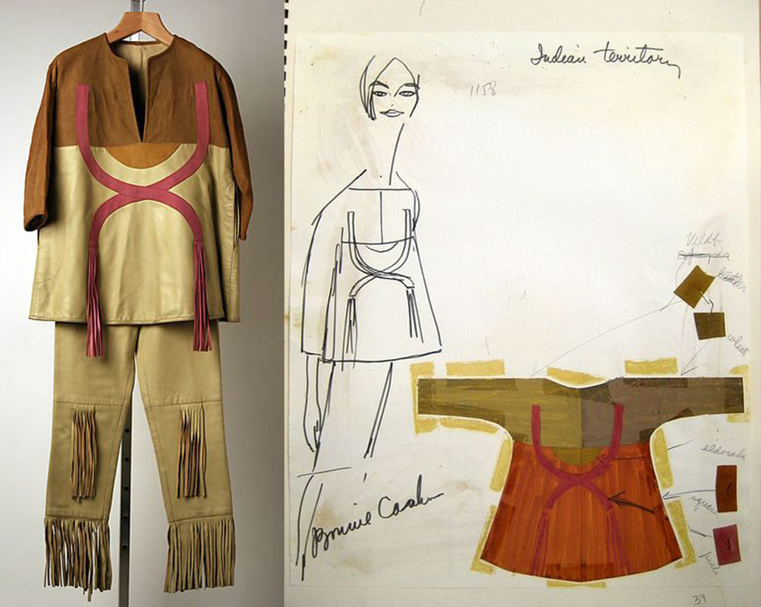
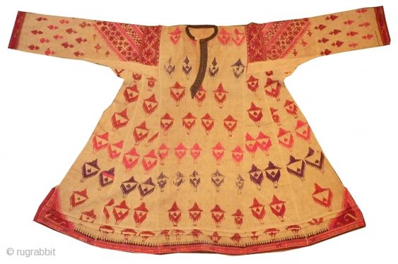
Perhaps one of her riskiest forays into cultural design is her dive into Native American and Pakistani design. While she commonly uses suede in her styles, she takes her “Indian” inspirations much further in the design below. She is clearly inspired by Pakistani Ikat, or perhaps Swat (a type of wedding dress), silhouettes that share the trapeze torso and dolman sleeves so popular in the West now. She also pushes suede to new heights in this series, incorporating fringe and cosmic designs akin to the origin stories of Native tribes in the American plains.
Cashin's designs, labeled Indian Summer and Indian Territory (left to right). Note the fine suede leather and fringe, indicative of the American native nations, which wore deerskin and suede rather than cloth due to tall grass. Meanwhile, the shape of the top's design (pictured right) is reminiscent of Indian ikat or swat dresses. Cashin combined both "Indian" inspirations to make this look.
A Pakistani Swat dress of the 19th century. Swat are traditional wedding dresses in the Bengal region. Cashin's inspiration may also have come from an ikat-style tunic, dress, or coat. These are sometimes referred to as ikat kurta, and can be found across Uzbekistan, Nepal, Pakistan, and northern India. Note how the underarm is round, thanks to a gusset. This detail, among others, is emulated in Cashin's design above.
In short, Cashin’s worldly aesthetic lends power to the American woman. It’s well-known that she designs with the modern woman in mind: mobility and urbanity above all others. Despite her lightning-quick career and successes, she doesn’t allow herself to stick her nose in the fashion industry and keep her head down. Rather, she looks up at the world around her in search of true character and strength.
It's no wonder that the modern woman, so eager to explore the world and carve out her place within it, is entranced by Cashin's designs.
[Come join us at Portal 55, Galactic Journey's real-time lounge! Talk about your favorite SFF, chat with the Traveler and co., relax, sit a spell…]
The Journey lettercol continues to be active. Last month, we received a piece so interesting that we felt it deserved an article slot on its own. So let us present Mr. Geoff Kemp with his delightful survey of virtual conflicts in the UK…
Geoff Kemp
Two Roads Diverged…
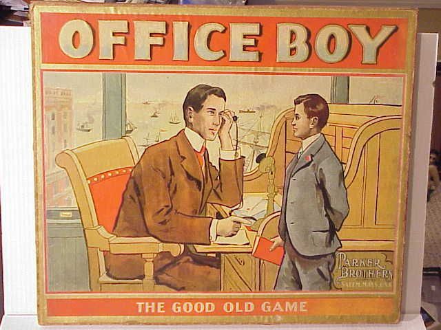
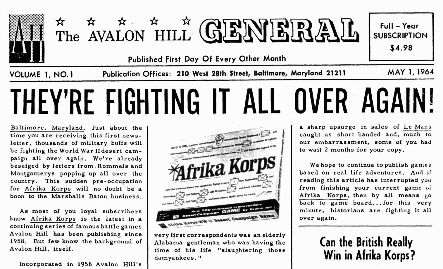
Although primarily built on the foundations of two similar companies on either side of the Atlantic Ocean, board gaming has taken divergent paths over the course of the last 130 years. In America, Parker Brothers were formed in 1883 by George S. Parker. His gaming philosophy was to move away from the then current board games published to promote moral and social values, such as The Mansion of Happiness or which emphasized how hard work and manners would make you happy/wealthy, like Office Boy, to games that are fun to play. In contrast, in the United kingdom, John Waddington of Leeds founded a company which originally produced packs of cards and other paper products before moving over to initially card games and then board games primarily produced, like Parkers, for families to enjoy.
There was a great deal of crossover and communication between the two companies, with Parker Brothers producing ‘Monopoly’ in the USA before licensing Waddingtons to produce an English version: a London board rather than the original Atlantic City board used in the states. Later Cluedo was invented by Anthony E. Pratt of Birmingham, England and manufactured by Waddingtons before American rights were sold to Parker Brothers for production there. These were the two main players in producing board games for many years on both sides of the Atlantic, often licensing their games to each other. Thus gaming was seen as primarily seen as a family pastime and this continued with the arrival of companies such as Ariel Productions and H.P. Gibsons.
Things started to change for us in 1962, with the arrival firstly of 3M games (also known as Minnesota Mining and Manufacturing Company) closely followed by The Avalon Hill Games Company (known as TAHGC) in the USA. They produced games which started to move away from ‘family’ games and towards board games geared for traditional wargaming as played on tabletops, featuring wooden/metal and occasional plastic models, as well as more financial based games or strategic games. From 3M came Twixt ('63), Stocks And Bonds ('64) and Acquire ('65) whilst Avalon Hill produced Stalingrad ('62), Afrika Korps ('64), Midway ('64), and Battle of the Bulge ('65). Combined with games such as Diplomacy (Games Research – 1954) and Risk, which was published by both Waddingtons and Parker brothers, there has been a suite of games diverging from the family games genre. Possibly the biggest recent innovation, however, was Avalon Hill’s. They began producing a magazine devoted to their games, in the form of ‘The General’ which saw the first edition dated 1st May 1964 with articles on game tactics, history and industry (almost exclusively AH related).
This is where gamers on this side of the pond have turned a shade of green in envy as even the magazine (much less the games it describes) can take weeks to get to us here, although at least we now have more of an idea of what is happening in the States. Besides home grown products such as the games from Waddingtons, Gibsons, Ariel, and a few others, it is not easy to get hold of a lot of American games; even the exceptions such as Acquire or Diplomacy are only found in some of the bigger department stores, unfortunately.
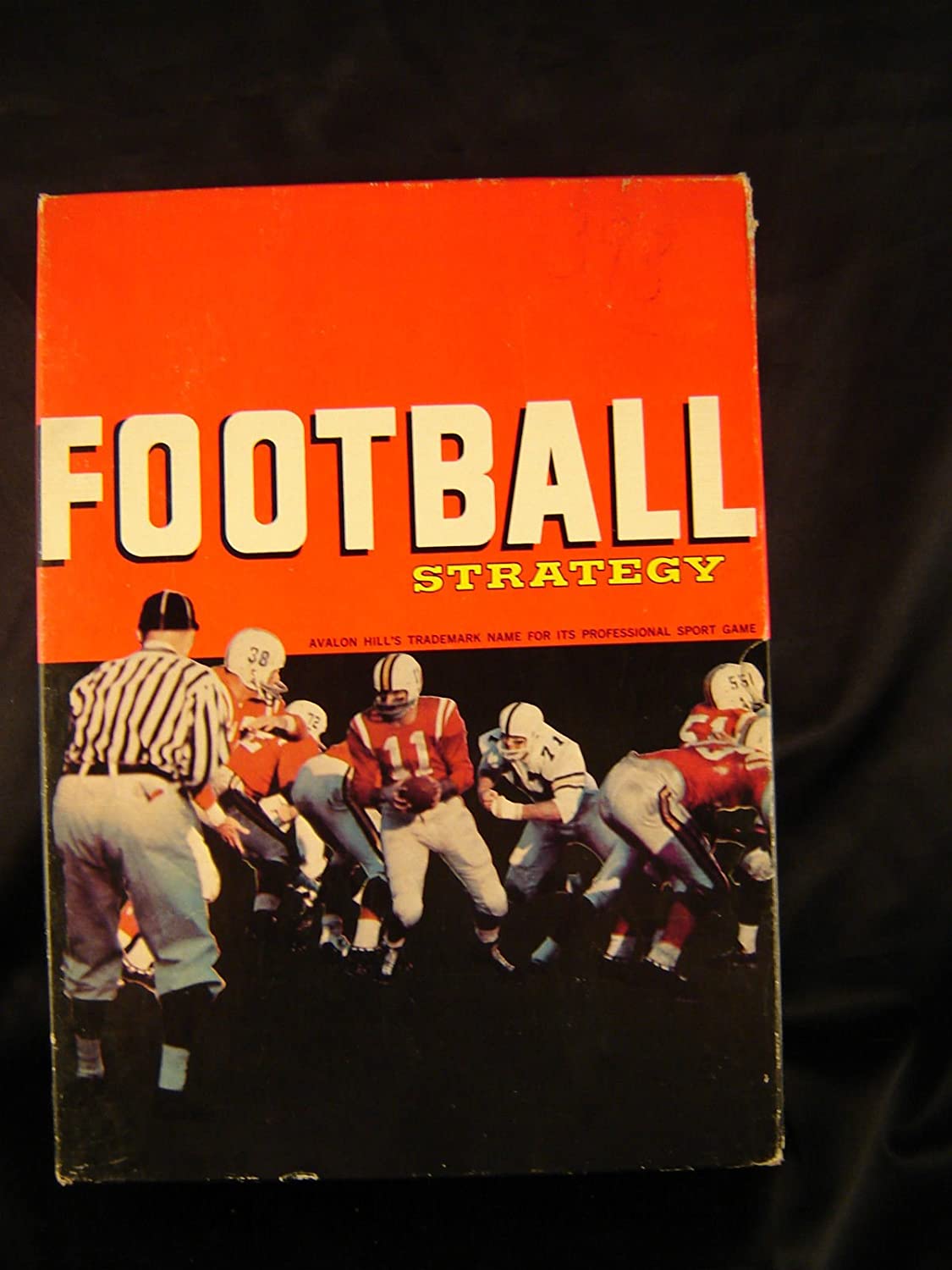
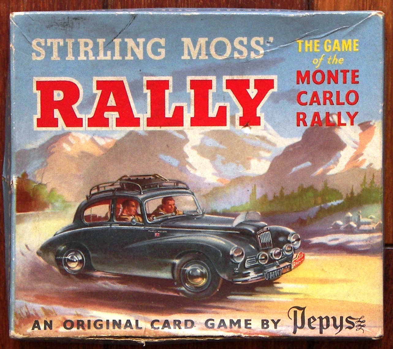
Another area where boardgames have diverged is in the area of sports related games, although this is more likely down to the popularity of different sports in each country. Again you have various Avalon Hill games such as Football Strategy ('60), Baseball Strategy ('62), and Le Mans ('61) whilst in the UK we have Subbuteo Football ('47), Subbuteo Cricket ('49), Wembley ('52), Stirling Moss Rally ('65) and Formula One ('65). Baseball being primarily an American sport and Cricket a British sport explains why each has gotten a game in their respective countries.
Possibly the biggest confusion is over ‘Football’ simulations as the game has different names on each side on the Atlantic. I believe in America, the Football Strategy game by Avalon Hill relates to what is known in the UK as ‘American Football’, whilst Subbuteo Football and Wembley are games reproducing Association Football which I understand to be known as ‘Soccer’ in the USA. Is this correct?
But racing is universal in appeal. Formula One is an excellent British game, easily the best British attempt to date to reproduce the excitement of Motor Racing. Unfortunately, although I have heard good reports of Le Mans, I have yet to see a copy so cannot really comment there. Stirling Moss Rally is based on Rallying (stage as opposed to circuit racing), which has been popular in Europe since 1895 and has many famous Races. The most well known is probably the Monte Carlo Rally which was first raced in 1911.
I have said that it is not easy for us here to be able to get hold of American Games, but is it the same for you in getting hold of some British games. I realise that in some cases certain games are available in both countries, such as Monopoly (published by both Waddingtons & Parkers) or Cluedo (Waddingtons), also I believe known as Clue (Parkers), but am unsure how many other games that applies to.
So what are you playing at the moment? Here I am enjoying a mixture of British and (when I can get them) American games. Current Favourites are in no particular order, Acquire (3M), Midway (Avalon Hill), Dog Fight and Square Mile (Milton Bradley), Astron, Risk, Railroader, Formula One and Mine A Million (Waddingtons), Wildlife (Spears), Wembley (Ariel) and Subbuteo Football.
They say that war arises between two parties over scarcity of resources. It is clear, however, that there need be no resumption of hostilities between Britain and the United States in the near future thanks to the abundance of games produced and shared by our two nations.
Now, if only my copy of The General would arrive in the post!
Science fiction, as a cutting edge genre, often skirts the line of decorum, occasionally earning calls for banning of particularly sensitive works. Thus, it is appropriate that this month, I have three stories from West Germany for you that are connected to the freedom of the arts, enshrined in our constitution, and how it is sometimes challenged.
But first, some political news:
No Experiments
Even for his first re-election campaign as chancellor, Ludwig Ehrhard's face is not on the campaign poster, but that of his predecessor Konrad Adenauer endorsing Ehrhard.
The headline news this month was the West German federal election, the fifth since the founding of Federal Republic of Germany and the first where the candidate of the Christian conservative party CDU/CSU is someone other than Konrad Adenauer, namely his successor as chancellor Ludwig Ehrhard.
But except for the name of the chancellor, very little has changed. The CDU/CSU once again won the majority of the vote and will be able to continue the coalition government with the liberal party FDP. The opposition, the Socialdemocratic party SPD gained some votes, but not enough for SPD chancellor candidate Willy Brandt to replace Ludwig Ehrhard.
I have to admit that I never liked Konrad Adenauer. However, he and Ludwig Ehrhard have done a lot to rebuild West Germany after World War II and turn it into the industrial powerhouse it is today. Nonetheless, I feel that after sixteen years of a CDU/CSU/FDP government, it is time for a change.
Rolling Stones, Riots and Rebellion
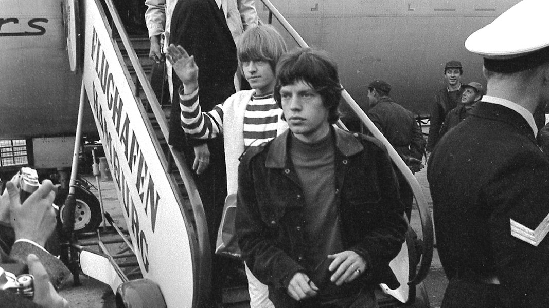
The Rolling Stones arrive at Hamburg airport.
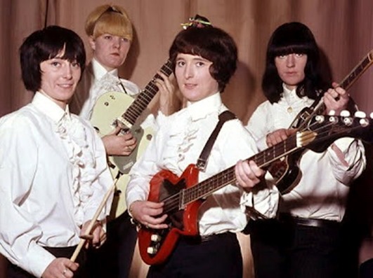
At least in the realm of pop music, change is in the air. The West German music charts are still dominated by the so-called Schlager genre of sappy pop songs sang in German. But while Schlager is still king with the over forty demographic, the young are increasingly turning to beat music.
The Rolling Stones recently finished their first tour of West Germany to the delight of their young fans and the disdain of conservative critics, who called the band "cavemen" and their music "primitive and unimaginative".
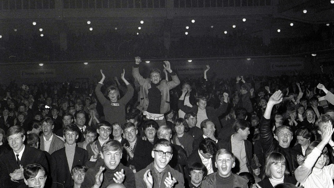
Young fans cheer on the Rolling Stones in Hamburg
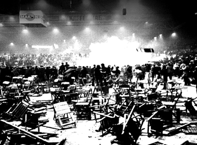
The Rolling Stones concert in Hamburg erupted into violence, when more than two thousand young people, who hadn't been able get tickets for concert, decided to take out their frustrations on streetlamps, benches, planters, cars and election posters outside the concert hall. The police responded in kind and by the end of the day, forty-seven young people had been arrested and thirty-one people injured.
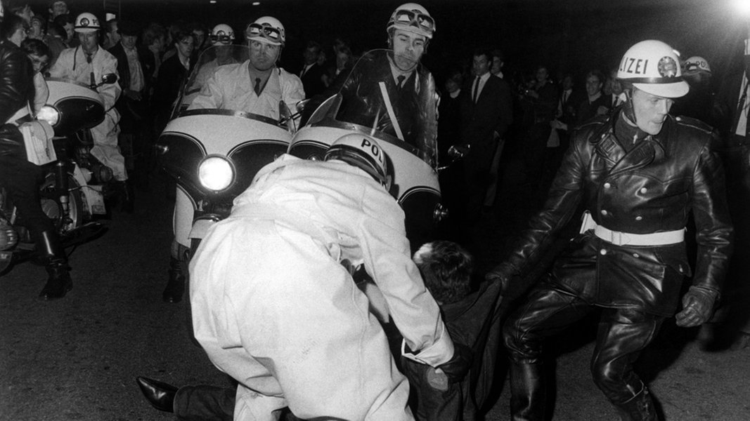
The Hamburg police clashes with rioting Rolling Stones fans.
But that was nothing against what happened the following day in West Berlin, where the Rolling Stones performed at the Waldbühne. Once again, the concert was sold out and once again, young fans who had not been able to get tickets showed up outside the venue. But since the Waldbühne is an open air arena, the youngsters were able to break through the police cordon and get in.
Things were initially quiet, but once the Rolling Stones came on stage, the young fans stormed the stage. The police managed to clear the stage, but once the Stones performed their latest hit "Satisfaction", there was no holding back and the fans stormed the stage once again. The band, fearful for their safety, broke off the concert and that's when the trouble truly started.
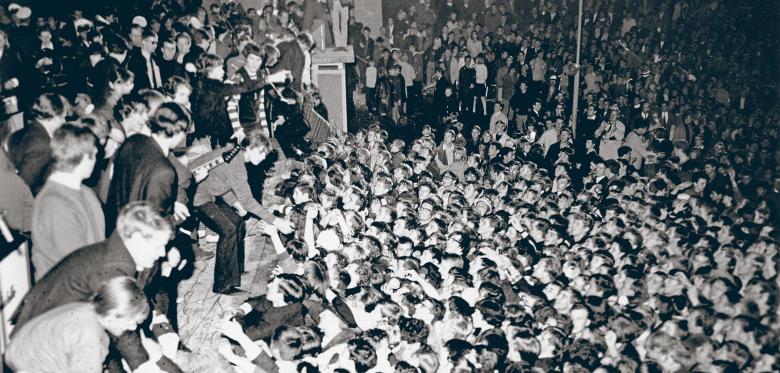
The Rolling Stones on stage at the Waldbühne in West Berlin.
The young fans demanded that the Rolling Stones come back and finish the concert. When the band didn't come back, they started demolishing the seats in the arena. The West Berlin police responded with excessive violence (eye witnesses report that the situation only escalated, when police officers started attacking a group of forty to fifty teenaged girls huddling near the stage) and the result was a riot which lasted several hours, caused eighty-seven injuries and left the Waldbühne in ruins. But the riot did not stop there. Because on their way home, many of the young West German fans decided to take out their frustrations on the trains of the S-Bahn light rail network, which is operated by the hated East Berlin transport authority. In the end, seventeen S-Bahn trains had been damaged, four of them so badly that they had to be taken out of commission.
Aftermath of a concert: The venerable thirty-year-old Waldbühne in Berlin is left in ruins.
East and West Berliners never agree on anything, but the newspapers in both parts of the divided city agreed that the Waldbühne riot was a disaster that must never happen again. The West German tabloid Bild compared the Rolling Stones concert cum riot to a witches' sabbath. Meanwhile, Neues Deutschland, the official newspaper of the Socialist Party of East Germany, not only reprinted the Bild article (which is unusual in itself, since Bild is explicitly anti-Communist), but also added some hyperbole of its own, comparing the rioting young fans to the Hitler Youth (even though the Nazis famously hated the very jazz and blues music which inspired the Rolling Stones) and claiming that the true aim of the Rollings Stones' music was to prepare the West German youth for World War III. Why a British beat band would even want to prepare young Germans for war is a question that not even the Neues Deutschland can answer.
Beats in Bremen
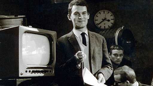
But even those West German beat music fans who did not make it to one of the Rolling Stones concerts got a chance to listen to their favourite music. For last Saturday, a brand-new music show named Beat-Club premiered on West German TV. I was watching with particular interest, not just because I like beat music, but also because the show was produced and filmed right here in my hometown Bremen.
Apparently, the idea of a TV show playing solely beat music is so shocking that announcer Wilhelm Wieben, at age thirty himself a member of the younger generation, explicitly apologised to older viewers who might not like beat music. Oddly enough, no TV announcer has ever felt the need to apologise for any other genre of music.
The smirk shows that TV announcer Wilhelm Wieben is very much looking forward to Beat-Club, even as he warns the older generation of viewers about the show.
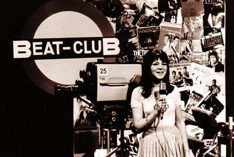
Compared to the dire warnings that preceded it, the actual program was a lot of fun, but fairly harmless. The format is loosely based on the US show American Bandstand and the British show Ready, Steady, Go! Various bands play live music, while the young studio audience dances. The presenters are Gerd Augustin, discjockey at the Bremen dance hall Twen Club, where he also recruited the live studio audience, and Uschi Nerke, an attractive twenty-one-year-old architecture student with musical ambitions.
Uschi Nerke, 21-year-old architecture student turned TV presenter in Beat-Club
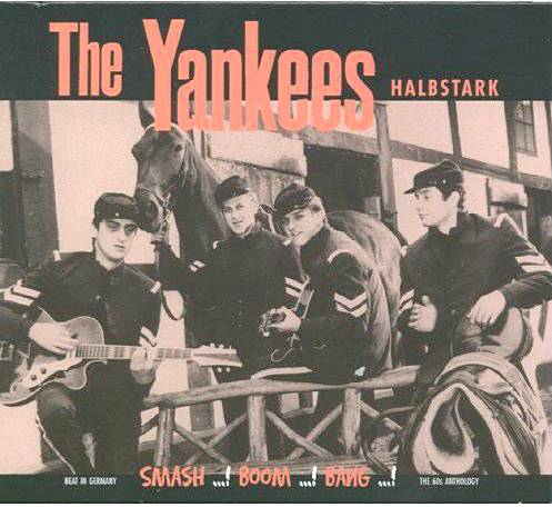
The Rolling Stones may have toured Germany barely a week before the premiere of Beat-Club, but producer Mike Leckebusch wasn't able to afford a band of that calibre yet. And so the opening number was "Halbstark" (a German slang term for young rowdies and rockers) by the Bremen beat band The Yankees, named for the Union Army Civil War era uniforms they wear on stage. Further acts included the British bands John O'Hara and His Playboys and The Liverbirds, an all-girl band from Liverpool who are already well known in North Germany for performing in Hamburg's Star Club, where the Beatles got their start not so long ago.
The girl band The Liverbirds also performed in Beat-Club
The first edition of Beat-Club may have been a little rough, but the program has a lot of potential. Were the apologies and dire warnings justified? In my opinion, no. But judge for yourself, cause thanks to the magic of Telstar I present you The Yankees performing "Halbstark" live at the Beat-Club.
Devil's Advocate
Finally, I want to report about a court case that concluded at the Hamburg district court last month. Why is this case important? Because what was on trial was nothing less than the freedom of the arts that is enshrined in the West German constitution.
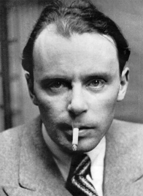
Klaus Mann
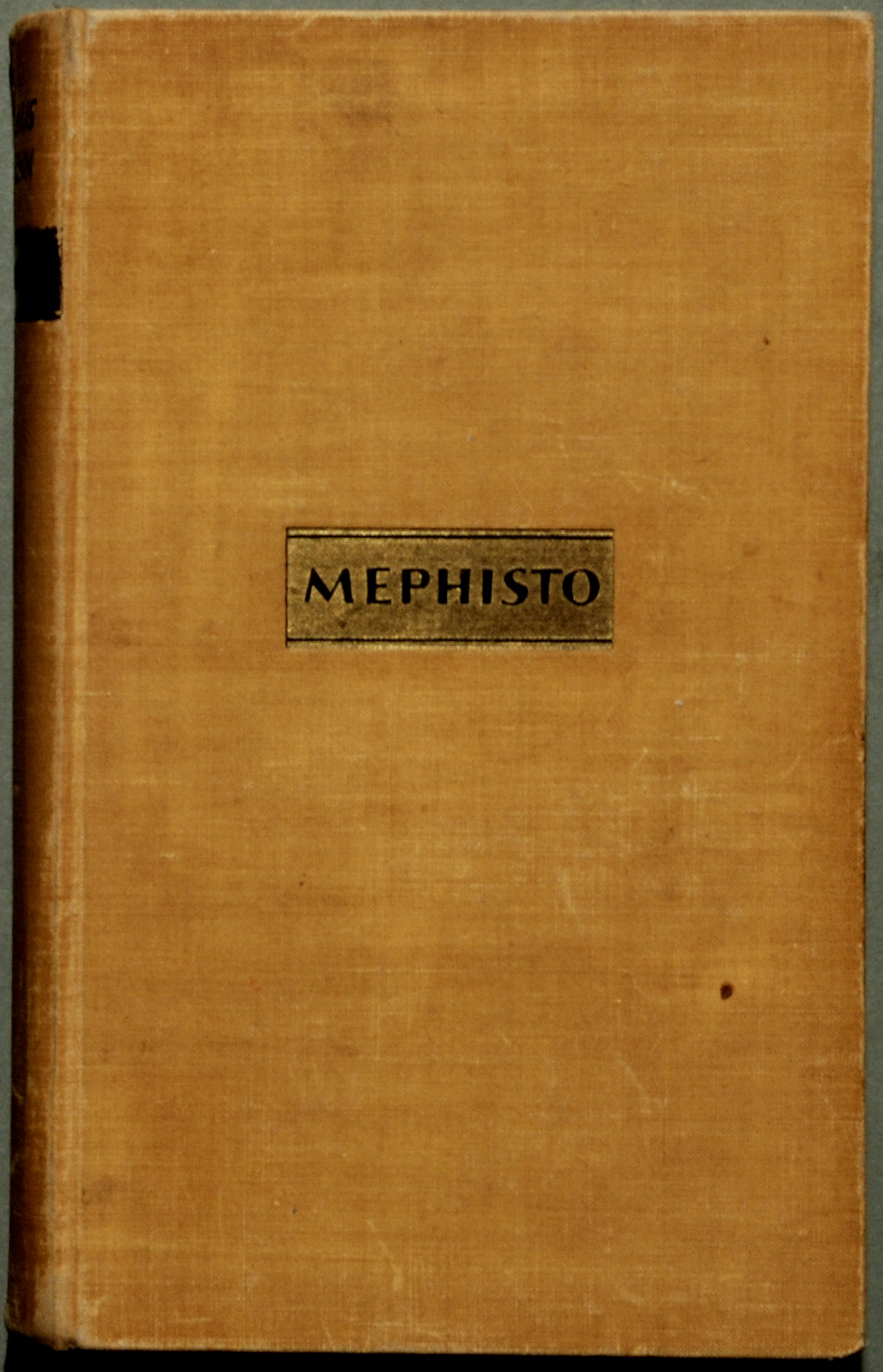
Let's have some background: In 1936, Klaus Mann, son of Nobel Prize winner Thomas Mann and older brother of occasional science fiction writer Elisabeth Mann Borgese, published a novel called Mephisto – Roman einer Karriere (Mephisto – Novel of a Career), while in exile in Amsterdam, because the Mann family were persecuted by the Nazis. Now the publisher Nymphenburger Verlagsbuchhandlung wanted to republish the novel in West Germany.
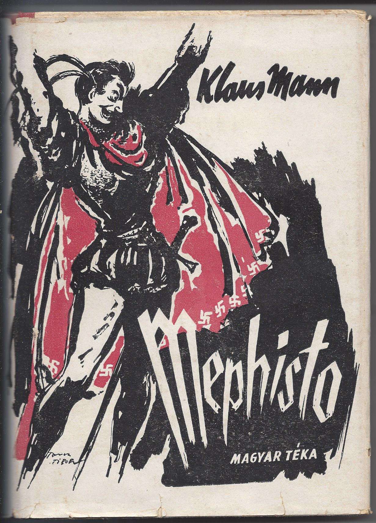
The 1936 first edition of "Mephisto – Novel of a Career" by Klaus MannThe 1946 Hungarian edition of Mephisto by Klaus Mann.
None of this would be remotely controversial, if not for the fact that Mephisto is a roman-à-clef about the German cultural and theatre world of the 1920s and 1930s. In particular, the protagonist Hendrik Höfgen is a thinly veiled portrait of actor and theatre director Gustaf Gründgens whose most famous role was Mephisto in Johann Wolfgang von Goethe's Faust. The novel chronicles Höfgen's rise from small time actor to director of the Prussian state theatre and favourite of Hermann Göring himself. Höfgen himself never believes in the Nazi ideology. Instead, he is portrayed as an opportunist who makes his own deal with the devil he is so adept at playing and uses every chance to gain advantages for himself (at one point even seducing Göring's lover and future wife), even as his former friends and colleagues are forced into exile.
Gustaf Gründgens in his most famous role as Mephisto in "Faust" by Johann Wolfgang von Goethe
We do not know how Gustaf Gründgens felt about Mephisto, though we know that he knew the novel, because Klaus Mann made sure that Gründgens was sent a copy. Nor can we ask Gründgens, because he died two years ago of an overdose of sleeping pills. Klaus Mann cannot speak out on the case either, since he committed suicide in 1949.
However, Gründgens' adoptive son and heir (and, it is rumoured, lover) actor Peter Gorski was not at all happy about the plans to republish Mephisto in West Germany. And so he sued the publisher to have the publication stopped, because Mephisto supposedly libels the late Gustaf Gründgens and violates his human dignity.
Gustaf Gründgens and his adoptive son Peter Gorski as Faust and Mephisto in "Faust".
Now Mephisto is undoubtedly a roman-à-clef, even if Klaus Mann himself claimed otherwise in his afterword, and most of the characters are based on real people. However, it is also a fictionalised account and some events don't fit the historical record. The most notable of these is Höfgen's lover Juliette Martens. Because Juliette is a black woman, daughter of a German father and an African mother, this relationship is taboo in Nazi Germany. Juliette is one of the few characters in Mephisto who does not have an equivalent in the real world. Instead, the scandalous relationship between Höfgen and Juliette is a stand-in for the fact that Gustaf Gründgens was homosexual.
Is Mephisto a good novel? Well, I'm probably not the right audience for it, since I have to admit that the only member of the Mann family whose works I ever enjoyed is Elisabeth Mann Borgese. Furthermore, Mephisto requires a rather deeper knowledge of the German theatre and cultural world of the 1920s and 1930s than I have. And the portrayal of Höfgen's black lover Juliette is highly problematic, since Juliette is frequently described as savage and animal-like. It is obvious that Mann introduced Juliette to avoid the homophobic implications of portraying Höfgen as homosexual. But indulging in racism to avoid homophobia doesn't make it any less racist.
Was Mephisto intended as a jibe against Gustaf Gründgens? Certainly, especially since Mann and Gründgens not just knew each other, but were actually family, since Klaus Mann's sister Erika was briefly married to Gründgens in the 1920s. The Mann siblings and Gründgens also performed together in two plays written by Klaus Mann. It is also rumoured that the relationship between Klaus Mann and Gustaf Gründgens was a lot more intimate than just brothers-in-law, since both Gründgens and Klaus Mann were homosexual, whereas Erika Mann is lesbian. So the novel was likely the result of a family quarrel or lovers' spat.
Two couples: Gustaf Gründgens, Erika Mann, Pamela Wedekind and Klaus Mann on stage in the 1920s.
It is understandable that Peter Gorski is trying to protect the legacy of Gustaf Gründgens. However, Gründgens' legacy is not in question. He was able to continue his career unimpeded in postwar West Germany and is considered one of the greatest actors and directors of his generation. Furthermore, Gründgens did collaborate with the Nazi regime, so that part of Mann's novel is absolutely correct. And Mann explicitly did not mention Gründgens' homosexuality in the novel – not that it was a big secret, though homosexual relationships between men are sadly still considered a crime in West Germany.
The fact that the heir of a Nazi collaborator tries to block the publication of a novel by a victim of Nazi persecution should also leave a bad taste in everybody's mouth.
However, the question is not whether the novel defames Gustaf Gründgens, especially since Gründgens is too dead to care anyway. The question is whether the freedom of art, which is enshrined in the West German constitution, weighs higher than the right of a dead theatre director to keep his memory unsullied.
As a writer myself, I come down on the side of art in this case. Not to mention that one precedent could lead to further lawsuits. After all, people often claim to recognise themselves in novels. For example, the British-Hungarian architect Ernö Goldfinger believed that the villain in the eponymous James Bond novel was based on him (not without reason, for Ian Fleming was known to name villains after people he disliked) and also tried to block the publication, whereupon Ian Fleming offered to change the name of the character to Goldprick. As a result, Goldfinger abandoned his lawsuit and the novel was published (and filmed last year) as Goldfinger.
Such a solution is not possible in the Mephisto case, if only because both Mann and Gründgens are dead. But thankfully, the Hamburg district court agrees with me and rejected Peter Gorski's lawsuit. The case is not yet over, for Gorski has announced that he will file an appeal. However, freedom of art won for now and that is a very good thing.
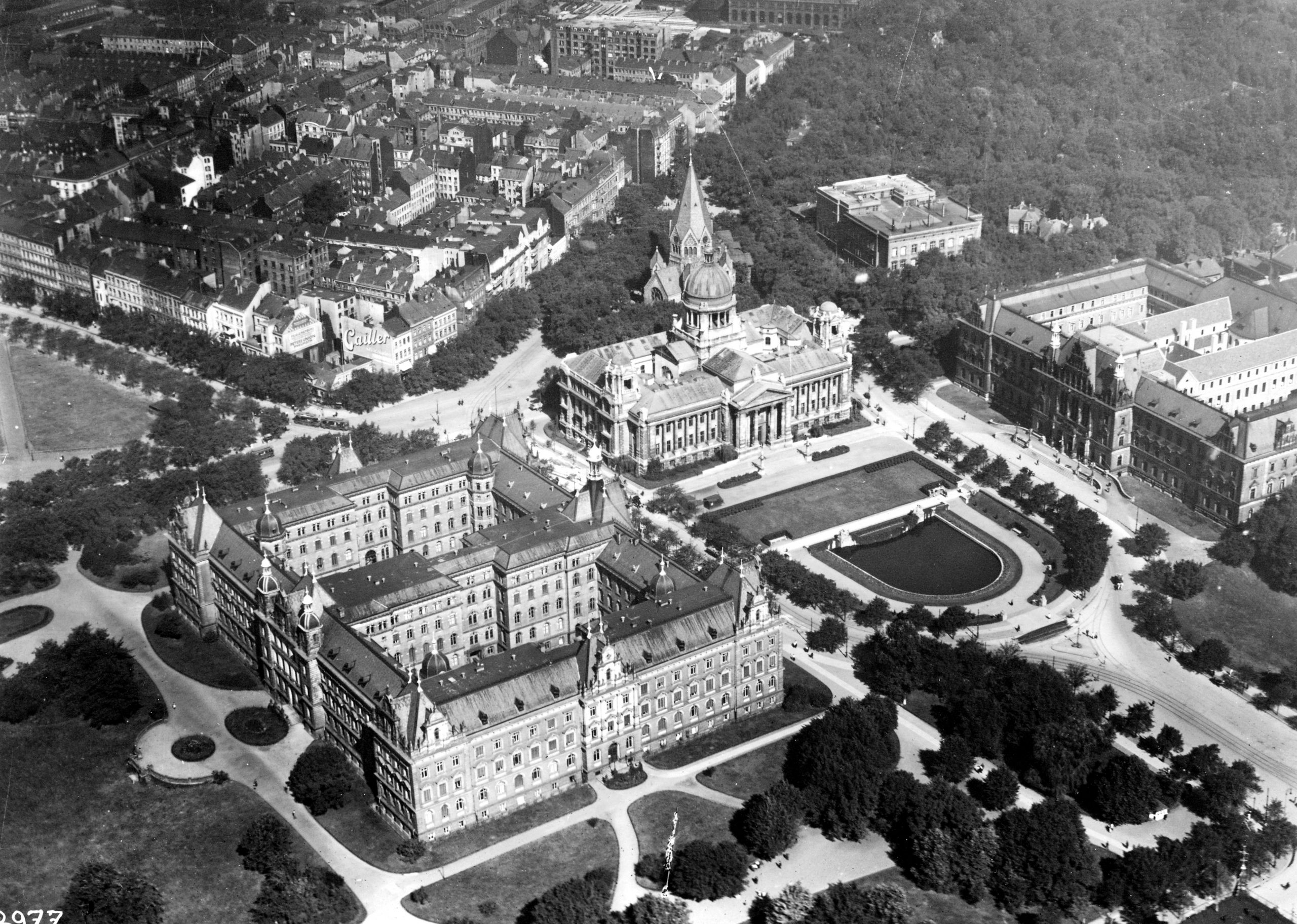
Aerial view of the Hamburg district court, which rejected the lawsuit.
You may think that the Rolling Stones riots, the Beat-Club premiere and the Mephisto have little to do with each other. But they all demonstrate why freedom of the arts is so important. Because in all three cases, we had people complaining about and trying to ban art they don't like. And in all three cases, art won out in the end. It is a hopeful trend that our science fiction writers might do well to note in their predictions of the future.
Hello everyone. You may remember me from a recent episode of The Journey Show that focused on fashion. Gideon (the Traveler) tapped me to become a regular contributor to the Journey, and I was very much looking forward to covering a subject I'd recently become quite excited about: comic books.
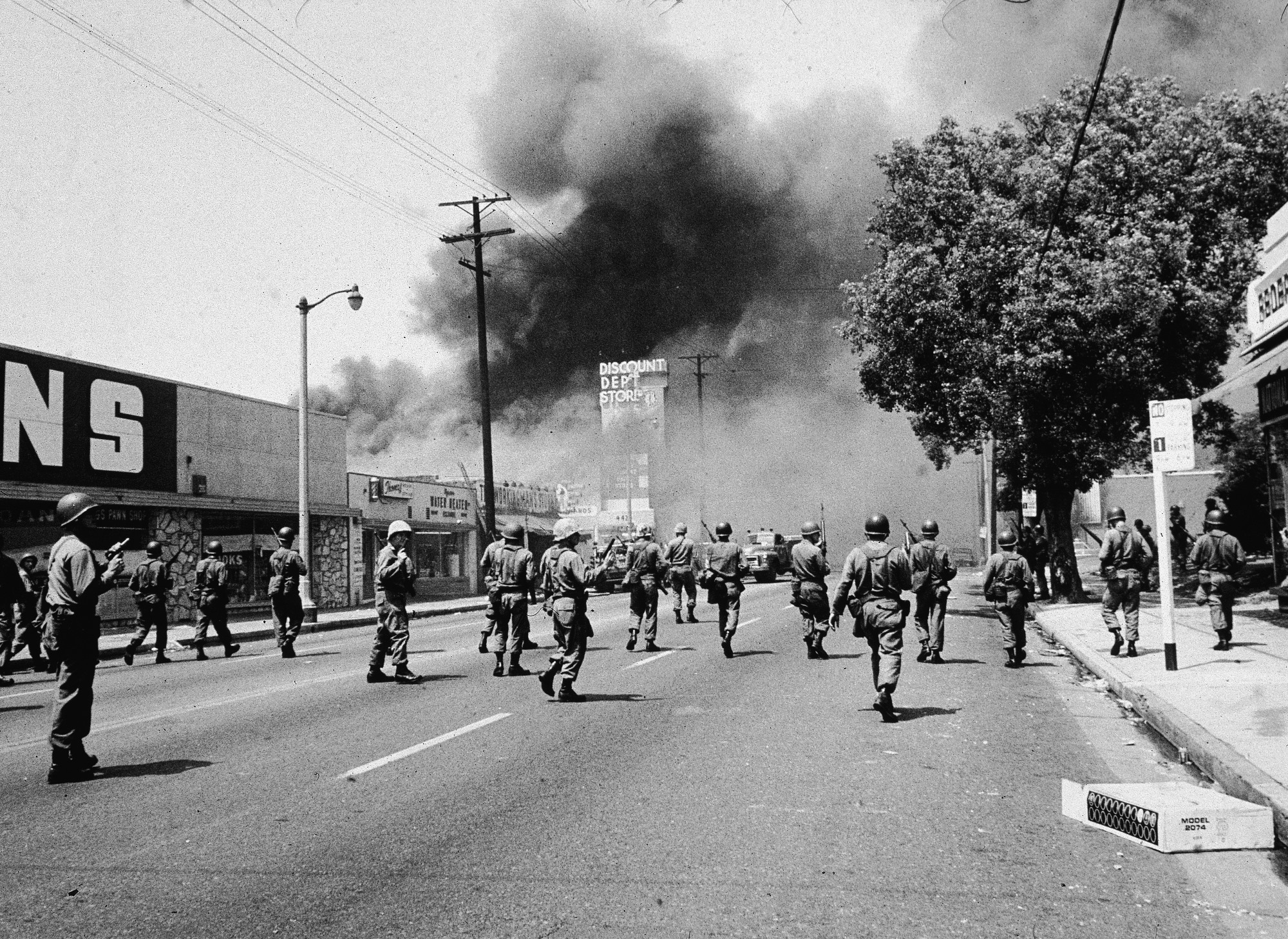
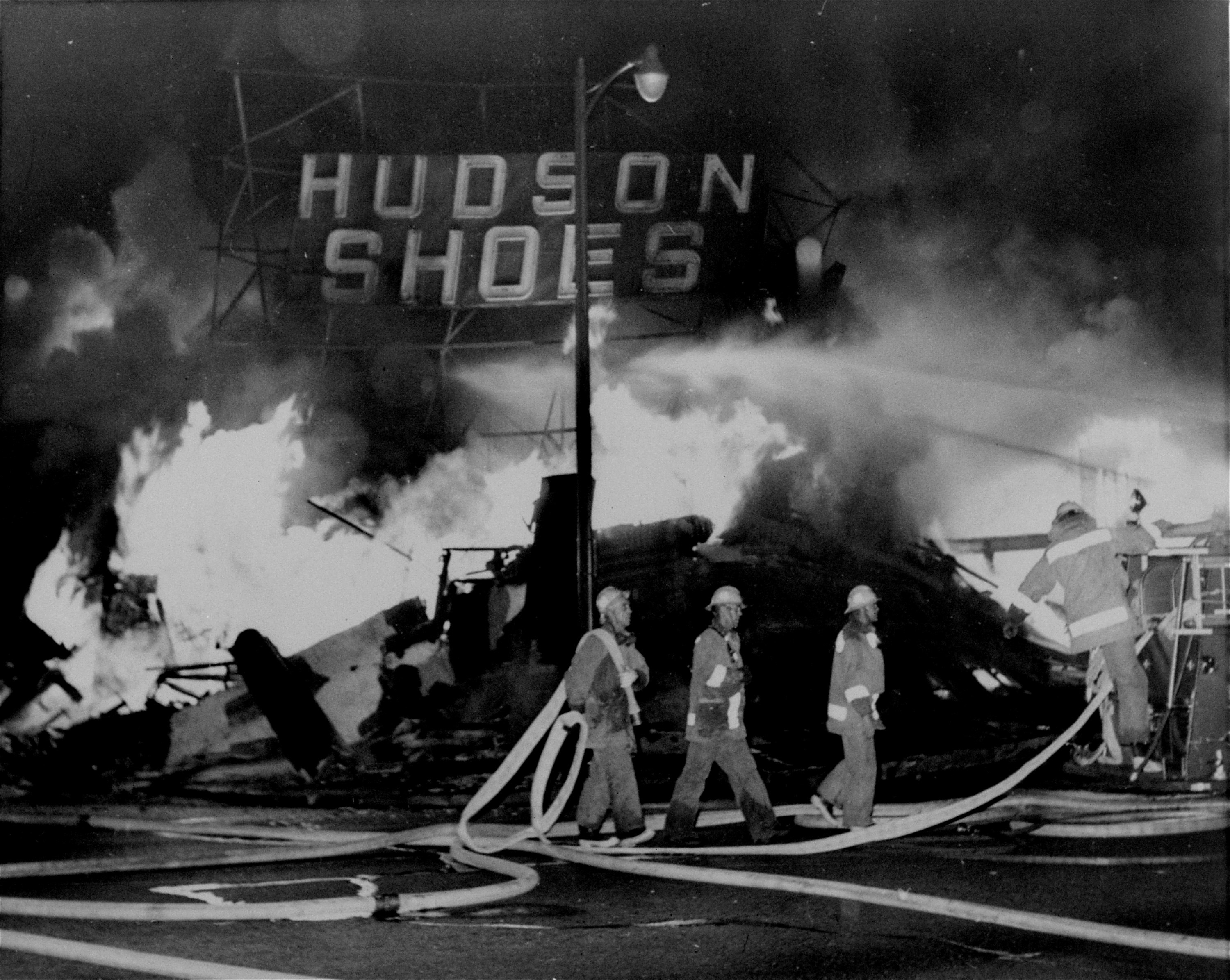
But last week, hell broke loose, and I've spent the last few days stressed out and scared. So instead of comics, I want to tell you about the days that have rocked Los Angeles, an event that will go down in history.
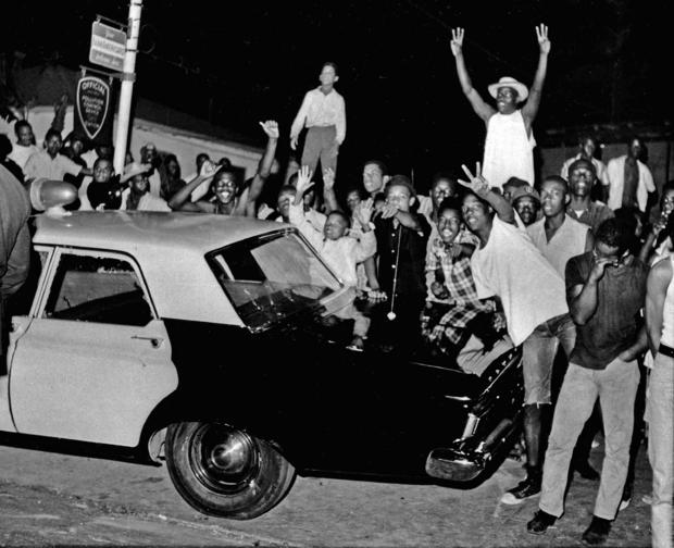
Tensions reached their boiling point in the Watts neighborhood of Los Angeles, just two hours' drive north of my home in San Diego. On August 11th, a mother and her two sons were arrested. Marquette Frye had been stopped by a CHP officer on suspicion of driving drunk in his mother's 1955 Cadillac. Ronald Frye, Marquette's brother and passenger, alerted their mother, Rena Price, that his brother had been stopped and the car was to be impounded. Price arrived at the scene and scolded her son, and things got a bit hairy. Someone got shoved, and another officer pulled a shotgun out. Crowds grew, and the situation intensified with people yelling at officers and throwing things at them. The Frye brothers and Ms. Price were arrested, yet the crowd stayed, enraged.
The next day, my great-aunt called up to tell us “If you see our city on the news, know we'll be ok.” Worried, I asked what happened, and my heart sank as she told me.
With crowds increasing in the area, on August 13th over 2,300 National Guardsmen were called in by the Chief of Police, William Parker, to break them up and help the police officers maintain some semblance of order. He likened the riots to an insurgency, and the Governor of our fair state, Pat Brown, said “law enforcement is confronting guerrillas fighting with gangsters.” Protesters continued to clash with the men in power, and in the evening, a death occurred: a Black person was shot during a shoot-out with Guardsmen, police, and the protesters. By that time, in my little area of San Diego, new riots began to rear their heads. Thankfully, they were small compared to the ones in Watts and other Southern California areas, but they were still terrifying.
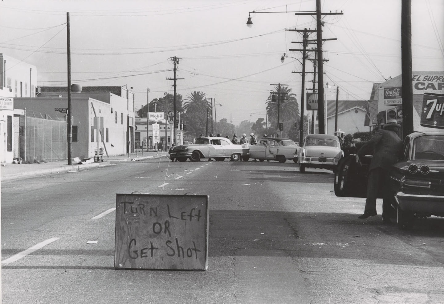
In the Los Angeles area, law enforcement set up blockades in certain areas to protect people and property. The signs they erected were crude but effective.
More of the rioters, still incensed with the way they were being treated by the police and National Guardsmen, began to take their anger out on the firemen and ambulances being sent out. Streets and sidewalks were destroyed to give ammo for them to throw at the approaching vehicles. In some areas, white owned businesses and shops were burned and looted due to resentment over price disparity. Many (but not all) of the Black owned ones were spared and protected.
Chief Parker decided to enact a curfew to help settle things. Anyone in the surrounding area of Watts, and any other Black-majority area of Los Angeles, who was out of their home after 8pm would be arrested. Some 3,500 people were arrested for breaking that curfew. By Sunday August 15th, the riots were largely over, mostly due to this tactic.
Though there were 34 deaths, many as a result of police brutality, I derive great comfort from knowing that my family in the area were safe, just as they hoped they would be.
But Watts is only the beginning. Though the riots are a terribly fresh wound in our minds, and we know their immediate cause, the underlying fuel for that spark has been piling up for years. Many of the older people say it started because of events last year, with the repealing of the Rumford Fair Housing Act. The Rumford Fair Housing Act provided that landlords could not deny people housing due to ethnicity, religion, sex, marital status, physical handicap, or familial status. The repeal of this Act kept Black people in Black-majority areas, and with no chance of upward mobility in terms of housing. It also affected where children could go to school, as well as many other socioeconomic disparities between Blacks and whites.
Others say it was due to police brutality and racial profiling. Marquette Frye was possibly targeted because he was a Black man in a nice, albeit older car. Too many Black men and women are harassed by police and it is very frustrating to witness, frustrating to be told from a young age how you have to go about your life so as not to have this happen to you, frustrating in general.
I have to hope that the events of last week, which were as much a rebellion as a riot, will shine a bright light on these endemic issues so that they can be addressed. I want to hope that one day, in the future, that we can live in unity, celebrating our differences and similarities. That Black people can go about their day without having racial epithets screamed at them, and without being harmed physically and mentally.
I wanted to thank Gideon for giving me the opportunity of sharing this story with you all. For now, I'm going to try to read something to relax my mind. With luck, my next article will be the one I'd originally intended.
With summer well underway, silk wraps and teardrop jewels are in full bloom in the fashion scene. And while being in love with the Silk Road is nothing new in the West, we seem to be turning away from Egypt in favor of the majestic silks and gems of ancient kingdoms such as India and Thailand.
Elizabeth Taylor in Cleopatra, released in 1963 wearing the iconic 24-carat gold phoenix cape designed by Renie Conley. Note what Revlon has referred to as the “Sphinx Eye” makeup that has so heavily influenced women’s faces today.
Elizabeth Taylor’s depiction of Cleopatra in 1963 sparked a healthy obsession with women’s power in Europe and North America. Before we knew what hit us, her iconic smokey eye, dark brows, and blunt haircut took the beauty industry by force. Now, two years later, women are looking at powerful images in South Asia as a shining example of the adventurous spirit and strength of women across the globe.
Maharani Gayatri Devi of Jaipur wearing a delicate sari and wrap, gold bangles, and two heavy strings of pearls as she discusses politics in a local community. The word “Maharani” can mean the wife of a great ruler, or “Maharaja”, but also a woman that is a great ruler. Great Maharani have wielded power in recent years in such places as Thailand, Nepal, India, and Malaysia.
Inspiration comes from India courtesy of Maharani Gayatri Devi of Jaipur, a member of the Indian Parliament and a purveyor of the arts. Having won her electoral race in 1962 in the largest landslide in history (winning 192,909 out of the 246,516 cast), she continues to be a force of social change. Thanks in part to her, we see the traditional Indian paisley patterns and silk wraps reminiscent of saris this year in Vogue.
Perhaps one of her most impactful contributions to fashion though, is the popularization of Rajasthani blue. This beautiful color is vital to arts and crafts of the region, and has inspired a blue palette steeped in mysticism in the West. In Vogue this February, Jacqueline described this as the “Maharani mood” for the spring of this year.
An advertisement in Vogue’s Feb 15th, 1965 issue for Jacqueline’s Blue-Jade and Baby Ganges hues.
The Maharani isn’t the only Asian woman of power that has stolen our breath away. Queen Sirikit Kitiyakon, Regent of Thailand, is another figure that has been featured prominently in fashion across the world. Currently, her majesty rules over Thailand as its regent, having performed her duties exceptionally while King Bhumibol Adulyadej took a leave of absence from the throne to enter Buddhist monkhood in 1956, a tradition of kings in Thailand. Since then, she has maintained her regency as the second Siamese queen to ever hold that power.
The queen, left, sitting on golden cushions in Chakri Palace wearing a court Siwalai dress of gold and diamonds she initially wore to the Greek Royal wedding, designed by Pierre Balmain. Top right, she’s photographed wearing a Thai silk Boromphiman ensemble.
The queen is captivating not only for her grace and beauty, but also for the opulence of the Thai monarchy and traditional dress. The narrow sleeves, high necklines and columnar skirts the queen wears with traditional pride are a direct inspiration for our fashions here.
Queen Sirikit Kitiyakon was featured in Vogue of February this year with her children. Here she wears traditional Boromphiman formal attire, an inspiration for the womenswear we see today.
The fashions and palettes of these women are far from the only things that inspire us. We’ve also turned to the jewels of South Asian monarchs. From dripping teardrop earrings to festoon necklaces laden with diamonds and rubies to golden bangles worn up on the forearm, Western women are mimicking the royal jewels as a statement about modern women, decadence, and power.
Take for example, the Patiala Necklace. The House of Cartier created the necklace in 1928 for Maharaja Bhupinder Singh of Patiala. It was encrusted with nearly three-thousand diamonds, one of which was the De Beers diamond, seventh largest in the world. The necklace disappeared from the royal treasury in 1948, shrouding the impressive collar in mystery and igniting imaginations.
Collars like the Patiala Necklace pictured left were worn by great male leaders of India. Adopting these elements of design in women’s jewelry in the West is a powerful statement for the fight against the patriarchy likely coming our way.
It’s refreshing to see our industry be inspired by not only the beauty of famous women in history, but also their independence and power. That young western women are looking up to figures such as Queen Sirikit Kitiyakon, Regent of Thailand and Maharani Gayatri Devi is significant. We are once again using our beauty and fashion, like many before us, as a statement of women’s independence and the history of our power. We are living in exciting times! I have much anticipation for whatever happens next.
[Come join us at Portal 55, Galactic Journey's real-time lounge! Talk about your favorite SFF, chat with the Traveler and co., relax, sit a spell…]
Love. The fluttering of butterflies, entire acceptance of another, passionate desire, comradery, compassion, a word. Love is used so often and means so much that it's practically a cliché. I hear it applied to numerous names on the radio, such as "Johnny," "Wendy," and "my darling in Michigan." Nearly every man on television has a woman to love or fall in love with. And perhaps the most visible example at the moment is the squealing masses of girls my age who claim to be in love with the Beatles. I once, foolishly, saw myself above it all. Sure I like to date, and I love my parents, but those gooey feelings that seem to saturate every cranny of our culture were beyond me and my maturity.
That is, until America's most charming actor came along.
This is how I fell hard for handsome, clever, talented teen idol of the century: Tony Randall.
My first real encounter with Tony Randall (one Password game I don't remember aside) was his starring role(s) in Seven Faces of Dr. Lao. The movie itself was whimsical and fun, but it was certainly Randall's acting that made it a memorable experience. He blends into each of his seven roles perfectly, to the point that I first believed they were played by different actors!
He's at his best though, when he is playing Dr. Lao; specifically when he drops the stereotypical façade of a foolish Chinese man and becomes the traveled scholar underneath. Suddenly he is standing straight and tall, almost regal in his confidence. His voice is deep and carrying, but his demeanor is kind, wise, and gentle. He speaks in a perfect and precise manner and his words discuss the magical secrets of the universe. I hadn't known it at the time, but despite all the makeup and effects, this role was one of the closest to Randall's true self.
At this point, I was awed by Randall's performance in the movie, but felt little beyond that. Dr. Lao was a few thousand years too old for my tastes, and I had yet to see the man behind him more clearly. Then my father's and my weekly Password viewing happened to feature a very special guest. I was quite excited, not necessarily because it was Tony Randall on Password, but simply because it was an actor that I recognized and admired. At least, that's how it started.
I was folding laundry while watching the TV, and I found my attention frequently drifting away from my linens and to the man on screen (no, not host Alan Ludden.) Randall was fascinating to watch. He always sat with perfect poise and spoke with wonderful rich tones. And he was absolutely erudite, forcing me to pull out a dictionary a few times. His brilliance aided in his gameplaying as well, as I believe he is the only player in Password history so far to win four games in a row!
It was an experience. The feelings crept up on me and changed. I admitted later that night to my father that I may have had the teensiest tiniest insignificant little crush on Tony Randall. After a bout of laughter and teasing, suddenly our dining room table was covered in TV guides and movie schedules in a desperate search for a single starring name. This wasn't just a harmless crush anymore, but rather a crusade to expose myself to as much Tony Randall content as possible.
That's how the family ended up at the local theater watching one of the last viewings of Boys Night Out, a movie starring James Garner, Tony Randall, and a host of others. Three married men and one recently divorced make a plan to share a luxurious apartment where they can each escape from their lives at home with a beautiful girl for a night. Except the beautiful girl they find turns out to be a sociologist, so those nights don't go quite as expected. It was a cute film with hopeful messaging and a good ending. Not to mention how amazingly colorful the sets and costumes were.
Unfortunately the direction wasn't the best, making the movie a little boring in parts. It didn't help that Tony Randall was only in some of the scenes. Even when he was on screen he played a man meant to be weak, average, and unintelligent. Randall did a fantastic job portraying the character, down to the deliberate slouching, but it was infuriating to watch because he was playing the complete opposite of the man I wanted to see– himself! Sadly this would become a trend…
Next we found a drive-in playing a double feature revival night of Barbara Eden movies. Funny enough both films also happened to star Tony Randall. First we watched The Brass Bottle, your typical genie story. Randall plays a young up and coming architect (a role better suited for literally any other male actor in Hollywood) who accidentally frees a genie of near limitless power who now answers to his every whim. Of course the genie is a few thousand years out of date, so how he executes those orders varies from inconvenient to disastrous for Randall's character.
Overall the movie was terrible, even with Randall's superb acting (once again wasted on a slouching, sputtering fool.) The one good scene is when Randall gets to interact with the mule and has to ad lib. for part of it. Randall also executes quite a few fantastic girly screams. That's it though; otherwise it's a one star movie.
The second movie carried a little more promise: Will Success Ruin Rock Hunter? was Randall's breakout role into cinema, after all. Randall plays a young up-and-coming marketing executive – I'm noticing a pattern here – who accidentally seduces a movie star and is turned into the world's best lover overnight, causing chaos to ensue in his life. The movie had too much it wanted to do. It took time in the introduction and halfway through for comedic bits poking fun at television and marketing. Its main plot sacrificed character development for ridiculous slapstick that wasn't particularly funny, and ultimately the ending was thrown out too, to fit in a speech about the moral. Despite all these flaws, it was still a better movie than Brass Bottle. It was clever in a few parts, and watching Tony Randall be mobbed by teenage girls was hilarious.
Both films are a testament to Randall's acting skills. He takes these roles of such generic characters and plays them to a T. This means aside from some very brief moments where the mask slips, I don't actually get to watch the actor that I know and like. For instance, I know that Tony Randall started in stage productions and is a professionally trained dancer. Yet twice in Rock Hunter he is forced to dance poorly, going against all his instincts and training, and he succeeds (at dancing poorly)!
Randall has so much potential as an actor, and yet no one can seem to cast him in anything but comedic romps (excluding the unusual case of Dr. Lao)! It makes me wary of the new Fluffy movie that's just come out. Especially considering Randall himself had an unpleasant time filming with the lion. I will still see it of course – I have a duty to uphold – but I've found that Randall's name in the credits doesn't guarantee I'll enjoy a film he's in.
On the bright side, television has been kinder (both to him and me) than the movies. I got to see Randall on What's My Line? last week and he was as composed and well spoken as ever. I hear he'll also be on Password again in the next few weeks, so have something to look forward to.
I also hope to see him in one of his stage shows. With all the character and energy he brings to each role on the screen, I bet he really shines under the spotlight. Nevertheless, whatever he's in next, be it on film, video, kinescope, or (if I'm lucky) on a stage, I'll be there to watch it.
Because I have a big old crush on Tony Randall.
This is the Young traveler, signing off.
If you want to see more of the Young Traveler, come register for this week's The Journey Show!
We'll be discussing the latest fashion trends of 1965, and we have some amazing guests including the founder of Bésame Cosmetics. Plus, you'll get to see the Young Traveler show off her newest outfits!
Poetry has an unusual place within the science fiction and fantasy community. Many of the earliest and most influential works come from poetry, such as the Norse epics or Spenser’s Faerie Queen, continuing into the 19th century with pieces such as Rosetti’s Goblin Market and Childe Roland to the Dark Tower Came by Robert Browning.
This has continued in the speculative magazines, with poems regularly featured in F&SF and Galaxy.
However, introduction of more experimental forms has come to be as important a dividing line as the "message" and "anti-message" divide we have seen debated for the last decade. Even more literary writers such as Brian Aldiss are not always in favour, describing William Burroughs as “piss” in a letter to Zenith.
For myself I love to see more experimental forms and beat poetry, the likes we have seen emerging in the post-war era, ever since I read Donald Allen’s anthology, The New American Poetry.
The New American Poetry Collection
So as such I was fascinated to see on BBC News that there would be a meeting of International Poets at the Royal Albert Hall.
The Venue For The Evening
Me and my wife applied and were pleased to receive tickets. It was a fascinating list of poets
Poster For the Incarnation
With the performance starting at 6:30 I was able to meet my wife just outside our offices and grab an early bite to eat before taking the underground round to South Kensington (thankfully my offices only being a short hop away).
Heading into the Royal Albert Hall we found the place to be packed, causing me to momentarily worry we had turned up on the wrong day and Bob Dylan was playing here again. The Royal Albert Hall seats around five thousand people and to see this many interested in seeing Avant-Garde poetry was a shock and a delight.
On the way in people were handing out flowers and the whole thing was a curious atmosphere, with a stage covered in foliage and the clanking of bells. Almost funereal. There was also a lot of smoke about but I think the was more from the audience than an attempt to create a specific mood. (We were up in the gods ourselves so did not get as affected by this as much as those in the stalls much have done, which is a good thing given my wife suffers from asthma).
This evening is an experiment and we are finding out what happens when you put 5000 people in a hall with a few poets… – Alexander Trocchi
Pre-Event Bulletin
As it was a very long night I won’t take you through all the performances but will highlight some of the most memorable:
Laurence Ferlinghetti
Lawrence Ferlinghetti’s To Fuck Is To Love Again was an excellent crowd pleaser. Making brilliant use of irony, metre and giving a rousing performance, he wove a journey about sexual repression and the pointlessness of division.
Harry Fainlight
Harry Fainlight’s The Spider was frustratingly interrupted and he took it hard. However, the poem is a brilliant dark piece that he performed really well under the circumstances. It takes a dark journey into the mind of someone who believes themselves being transformed into a spider and how this compares to their own mental state. If it was published in Fantastic, I am sure fantasy fans would be devoting many letters pages debating its merits (whilst I would myself be giving it five stars).
Adrian Mitchell
Adrian Mitchell's poem To Whom it May Concern was a little more traditional than some of the others, having spent a long time on the British poetry scene and in anti-war causes, but probably my favourite of the evening (and many others given the level of applause he received). It is an angry piece against the war in Vietnam and contains amazing imagery:
I smell something burning, hope it's just my brains. They're only dropping peppermints and daisy-chains
Ernst Jandl
Ernst Jandl gave a fascinating performance that was mostly through sounds but was really meaningful nonetheless. This included one that was done entirely through sneezing! I had never heard sound poetry before but it is a really interesting and something I would like to see more of.
Allen Ginsberg
Allen Ginsberg was obviously the star attraction and gave a performance in his usual powerful style, sounding like he is forcing the words out in a flow of emotion. These included his epic The Change and a brand new one combining viscerally disturbing imagery, despair and current politics.
He also read New York Bird by Russian poet Andrei Vosnesensky. Apparently Russian authorities would not allow Vosenesky to perform his own poem, so Ginsberg performed it in his place.
Some of the performances were less memorable and there were also some highly expected performers, like Pablo Neruda, who did not end up performing.
There were some downsides to the event. The whole thing seemed very disorganised, with no official running order. Nor was it really all their best performances. I have heard records of some of those present that have been significantly better.
It was also disappointing how all of the performers were men. Why not invite some excellent contemporary women poets like Diane Di Prima or Denise Levertov?
Poets Gathered Together, All Men
What was most fascinating about the whole experience was seeing these poets live, and being with so many others people who were interested in this kind of art. Whilst we there we saw the event being filmed, so perhaps it will spread even further?
Either way it was an exciting performance to be at and shows a healthy future for experimental writing around the world. The event lasted more than four hours so we headed home for the weekend very tired but also elated at what we had seen.
Will the poems of this calibre and experimental nature be featured in the SF magazines? It's hard to say, but I surely won't find it aught amiss if they do!
[Don't miss the next episode of The Journey Show, featuring singer-songwriter Harry Seldon. He'll be playing a mix of Dylan, Simon, and some unique original compositions!]
This review is late. The performance of "The Exception and the Rule" happened on May 7, 1965, produced by Bill Graham at the Gate Theater. However, I was too stunned to write earlier. Not only did the San Francisco Mime Troupe appear in one of Bertolt Brecht's Lehrstücke or dramatic exercises, but journalist and publisher Robert Scheer was featured after intermission. Also, as you can see from the program, Pauline Oliveros of the San Francisco Tape Music Center provided the music, so that was an attraction for me.
Program for "The Exception and the Rule"
In the play, the "exception" was a "coolie" who tried to give his master a drink of water. The rule was the master's fear of his abused underling that led him to see the flask as a "stone" and believe the coolie was trying to kill him. The results were the death of the coolie, shot by his master, the absolution by a judge of the master's actions (which were underlain by his need for "self defense"), and the protest of those who saw things otherwise.
No Exceptions to the Rule of White Masters
In the Mime Troupe's version, of course, the actors wore masks (in the tradition of the commedia del' arte in which they place themselves) and updated the 1929 work by Brecht, whom they outed as a "Communist." Whereas the results could be expected, the conclusions were disturbingly thought provoking. Here are some bits of dialog I wrote down: "The police fire out of pure fear." "One must go by the rule [the master's fear], not the exception [the coolie acts on fear of his master's dying of thirst while he was dehydrated]." "Dehumanized humanity" is a description of the coolie-master relationship that creates fear on both sides. "Sick men die but strong men fight" is the war cry of social Darwinism (not invented by Darwin). "He [the coolie] can't make us believe that he'll put up with it all," therefore he is "dangerous."
Scheer Opinion
After this disturbing performance with its comments on "class" and murder, Robert Scheer gave what the program called "a morality talk" on "The U.S. War in Vietnam." Scheer is now managing editor and editor-in-chief of Ramparts Magazine, a new left voice since 1962, produced here in San Francisco. He is also their Vietnam War correspondent.
Report from the Front
So how is the war going, you ask? Badly, my friend, badly, for both sides. It's like reporting on a journey that is uphill both ways. While that is a common trajectory in San Diego, which is all mesas and canyons, it's usually thought that if a war is going badly for one side it's going well for the other. Not so this war.
Violation of Geneva Accords
Scheer points out that the Geneva Accords of 1954 that ended the French war in Indochina mandated elections within 2 years to reunite Vietnam, with the present border meant to be temporary until elections could be held. In Vietnam, though, political battles have been fought on a literal battlefield rather than via the ballot box, and the US has been obstructing holding such elections precisely because the belief among US government officials is that Ho Chi Minh would win. Scheer compares and contrasts the situation of Negros in the South, whose voting rights have been interfered with, to the "n*gg*rs" of Southeast Asia, who are not allowed to vote at all in the present conflict.
Voting Rights and Human Rights
Deeper than that political comment, Scheer calls President Johnson's "voting rights" bill window dressing, and the lack of elections in Vietnam an avoidance of obstructing what he calls the "colonial ambitions" of the US in Asia. Scheer does not share the fear of Communist takeover as a form of political suppression of democracy, defining American "democracy" as suppressive in itself. According to him, in the US "white makes right," and in Vietnam "might makes right." He makes the point that as we slowly wake up to Negro rights in the US, we should also wake up to human rights in other parts of the world, particularly now in Vietnam, where both sides are clearly losing.
Suppressed Reporting
I've been listening to National Public Radio (NPR), reporting mainly by Christian Science Monitor correspondents, since NPR has little to no foreign-correspondent budget. They actually visit American troops and talk with the leaders, and their home editorial desks do not suppress their stories. So instead of publishing the US government press releases as the mainstream press does, the Monitor and NPR report what they see to the public. Scheer's commentary is in line with what I've been hearing. In March the US began systematic bombing of North Vietnam and the so-called Ho Chi Minh Trail–the supply route from North to South Vietnam. This began with the first landing of US Marines at Da Nang. Stories of atrocities persist but are not reported by the mainstream news.
As the World Turns
In short, I think I hear the noise of the world whizzing by, but I'm usually too scared or tired to lift my head, get up, and look over the ramparts of our middle-class consciousness. The Mime Troupe always provides such a view (while being raucous and funny), but what I saw this time was uncommonly scary. If you want to take a peek over the ramparts, buy the June edition of Scheer's magazine, at newsstands in the larger urban environments.
The Monokini, featured in orange. The Pope, Denmark, Greece, and the Netherlands have all banned it.
With summer on the verge, everyone’s attention is turning to swimwear, and I don’t think anyone will be talking about anything but Rudi Gernreich’s Monokini for a good while! The fashion activist is known for stirring up the hornet’s nest of Western sensibilities, apropos of his personal history and artistic goals. Let’s take a look at his past, and also at his shocking beachwear.
Rudi Gernreich, 1964.
Bear with me as I tell you of Rudi Gernreich’s childhood. He grew up in Vienna, Austria, the son of a stocking maker. He spent his afternoons in his aunt’s dress shop where he would sketch designs and share them with her clients. At age twelve, he was offered an apprenticeship by designer Ladislaus Zettel in London, but his mother declined due to his age.
His dress shop days did more than just betray his talent for fashion though. He recounts his first explorations of sexuality in fashion, and the liberation of women through their candid conversations in his young presence. His homeland was known also for promoting nude exercise during the time, in defiance of Western norms as much as for health. In 1938, Adolf Hitler banned this practice, and a sixteen year old Rudi fled Austria with his widowed mother for Los Angeles.
It was at this point that he began studying the arts in earnest. He attended the Los Angeles City College, and then the renowned Los Angeles Art Center School. He fell into fashion design some time after, a winding road that included dance and costume design, and a rejection of the American obsession with Parisian sophistication. He also helped found the Mattachine Society, a gay rights organization, in 1950.
Over the years, Gernreich's activist heart and artistic genius have formed a close bond, resulting in the scandalous Monokini. But we should have seen this scandal coming. In 1962 he predicted its arrival, saying that “bosoms will be uncovered within five years” in Women’s Wear Daily. And much to my amusement, he was recently quoted as saying that, for the sake of history, he had to fulfill his own prophecy before Emilio Pucci.
Peggy Moffit, photographed by husband William Claxton, in the infamous Monokini. It was named for its counterpart the bikini. A nice but inaccurate play on words. The bikini is named for the Bikini Atoll, an island used by the US for nuclear testing.
The result is the Monokini. Despite exposing the bust, it actually covers more skin than the bikini with its high-waisted bottom. Straps bisect the bust and run over the shoulders. In another nod to tradition and conservatism, the swimsuit is made of the same woolen fabric used in Victorian swimwear.
Women in 1925, wearing wool bathing suits. The material choices and shape of the Monokini speak to one of Gernreich's overarching goals in art: to humanize women rather than sexualize them through the freedom of their bodies.
The Monokini is a statement rather than merchandise. Although it’s currently on shelves, Gernreich has stated he doesn’t expect to sell any, and hadn’t intended to. In fact, he had to be persuaded to even take photos, calling on muse Peggy Moffit to wear it, and her creative cohort of a husband William Claxton to photograph it.
The journey of just the photographs itself is truly interesting. Look published the first photograph, from the back. Women’s Wear Daily followed suit, showing it from the front. When Gernreich approached Life about publishing the photos, their letter in response claimed they only print “aborigine” women’s breasts. (I would love to know Gernreich, Moffit, and Claxton’s thoughts on this! I hope notions such as this are abolished in quick fashion.) The image that lit the world on fire was accepted by Life however: Moffit with her arms crossed, covering her chest.
Despite Western reactions to the Monokini, Gernreich’s interests actually lay in the emancipation of women from over-sexualization and social censorship. He challenges the shameful gaze in Western beliefs, and tries to push society to see women as human beings rather than ‘other’. I find his work to be incredibly engaging and thoughtful, far more so than the tabloids make the Monokini out to be.
If the Monokini doesn’t single-handedly push us towards a moderate view of the human body, I’m sure Gernreich’s work in the next decade will!
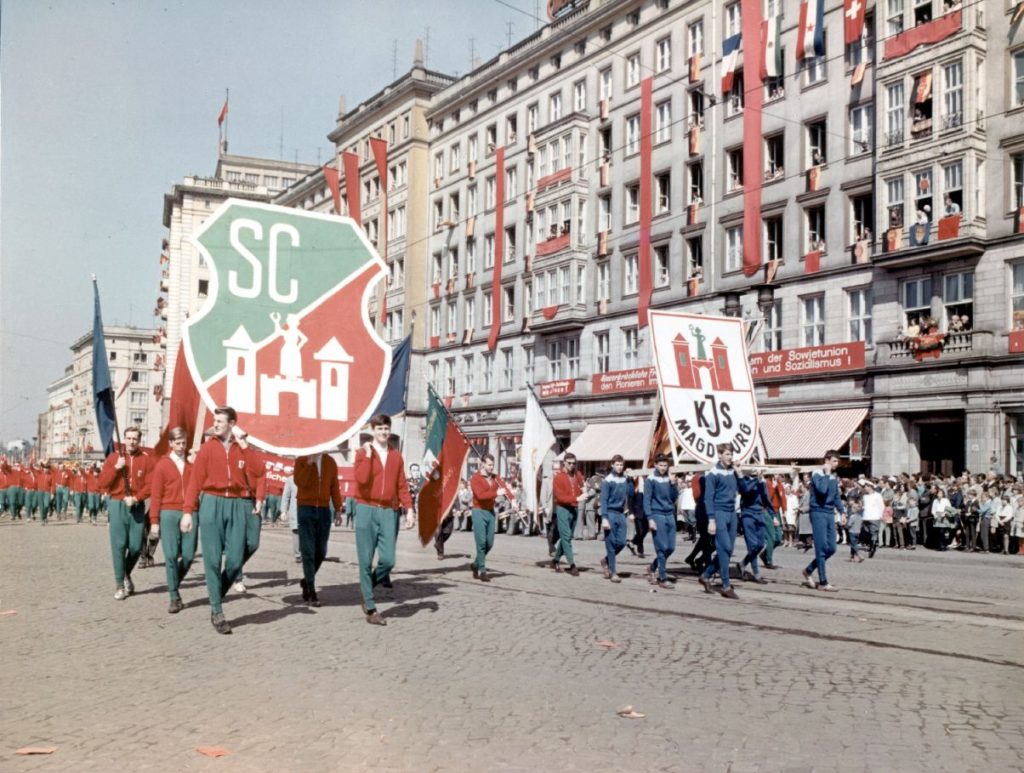
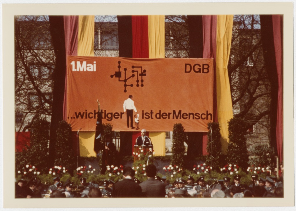
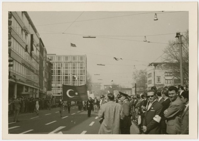
May 1 is not just a public holiday in all of Germany, but also the traditional holiday of the labour movement. The day was celebrated with marches and rallies in both East and West Germany. In East Germany, the marches were the usual propaganda affairs. In West Germany, Turkish, Portuguese, Spanish and Italian flags were spotted at the Mayday marches, as immigrant workers from Southern Europe joined their West German colleagues to demand higher wages and better working conditions. Concerns about the political situation and lack of freedom in the home countries of some of the immigrant workers were raised as well.
May Day parade in Magdeburg, East GermanyMay Day rally in Cologne, West GermanyA Turkish flag at a May Day march in Cologne, West Germany.
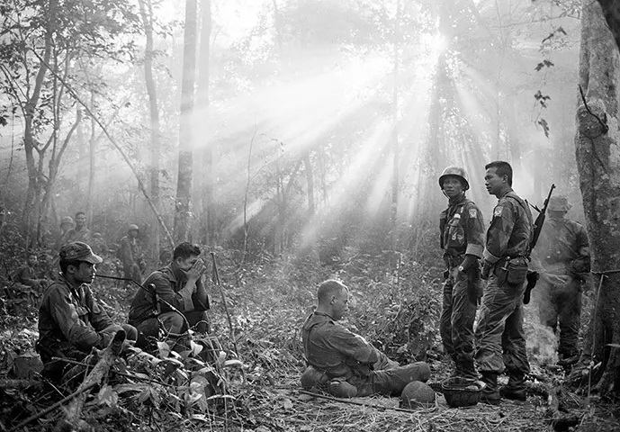
In other news, 32-year-old war correspondent Horst Faas became the first West German ever to win a Pulitzer Prize for his haunting photos of the war in Vietnam. Happy as I am for Mr. Faas, I still hope that he will soon have to find more pleasant subjects to photograph.
AP photographer Horst Faas, the first West German to win a Pulitzer PrizeOne of Horst Faas' haunting photographs of the war in Vietnam that won him a Pulitzer Prize.
Maybe one day in the future, press photos like Horst Faas' will hang alongside fine art in museums and galleries around the world. Because there are certainly exciting movements afoot in the art world.
Art News
That's that for current events. Now for the meat of the article — a review of current art movements in this most modern year of 1965 (apropos given our show coming up in a few days):
The Reign of Abstract Expressionism
In the art world, Abstract Expressionism has been ruling supreme since the end of World War II, at least in the West. An outgrowth of prewar movements such as Futurism, Cubism, Constructivism, Expressionism, Surrealism, Dadaism and the Bauhaus, Abstract Expressionism is the art world's equivalent of the International Style in architecture and interior design. It is ubiquitous, wins awards, has the highest prestige and commands the highest prices. Abstract Expressionism also has widespread political support in the West, most likely because the Communists really, really don't like abstract art and prefer what they call Socialist Realism. There are even rumours that the CIA has been promoting abstract expressionism via the so-called Congress for Cultural Freedom, which certainly makes for strange bedfellows.
As a result, what was avantgarde and daring only twenty years ago had now become the very establishment that newer artists are rebelling against. And this rebellion is taking some very exciting forms.
Less is More: Minimalism
One reaction to the dominance of Abstract Expressionism was to take abstraction to its utmost extreme and simultaneously return to roots of modernism and the graphic simplicity of Russian Constructivism, the Dutch "De Stijl" movement or the German Bauhaus. This school, dubbed Minimalism, objects to the expressionist part of Abstract Expressionism and believes that art should not reflect its creator and his or her moods. Instead, art should be neutral, objective and refer only to itself. 29-year-old Frank Stella, one of the most notable figures of the Minimalist movement, sums up the aims of Minimalist art as "What you see is what you see."
"Marriage of Reason and Squalor" by Frank Stella, one of his "Black Paintings"
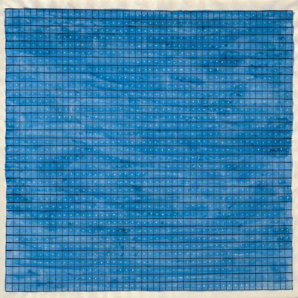
So what do you see, when you look at a work of Minimalist art? You'll see simple patterns, geometric shapes, hard edges, primary colours and monochromatic palettes. The so-called "Black Paintings" by the above mentioned Frank Stella consist of concentric stripes painted on raw canvas in the black wall paint that Stella uses in his day job as a house painter. Canadian artist Agnes Martin paints grids and stripes in pastel watercolours. Meanwhile, Dan Flavin eschews paint altogether and instead creates artworks from tubes of neon lights arranged in various geometric patterns.
"Summer" by Agnes Martin"A Primary Picture" by Dan Flavin
Minimalism is also a new trend for sculptures, as artists such as Donald Judd, Sol LeWitt or Tony Smith create sculptures that consist of geometric shapes such as cubes, prisms or triangles. So far, many of those sculptures only exist as sketches or cardboard models, but some such as "Cigarette", a 1961 Minimalist sculpture by Tony Smith made from twisted flat planes of steel, or "Free Ride", another Tony Smith sculpture inspired by the Aurora 7 mission, can be already seen in parks and on museum grounds.
"Cigarette" by Tony SmithThe minimalist sculpture "Free Ride" by Tony Smith was inspired by the "Aurora 7" space mission
So where can you see Minimalist art in the flesh? So far, New York City is ground zero for Minimalism and that's where you can find the respective artworks in galleries and exhibitions like Sixteen Americans at the Museum of Modern Art. So far, there hasn't been a dedicated exhibition of Minimalist art, though there are rumours that there is one planned for next year.
More is More: Pop Art
While the Minimalists responded to what they considered the excesses of Abstract Expressionism by reducing art to pure geometric forms, the Pop Art movement took a different path.
Pop Art arose in the UK in the 1950s, when a group of young artists calling themselves the Independent Group realised that both the prevailing Abstract Expressionism as well as the academic fine art of previous eras had very little to say about them and their lives. So these young artists began to incorporate the imagery they saw in their everyday lives into their works, imagery drawn from advertising, movies, pop music and comic books.
British artist Richard Hamilton describes pop art as follows:
Pop Art is: Popular (designed for a mass audience), Transient (short-term solution), Expendable (easily forgotten), Low cost, Mass produced, Young (aimed at youth), Witty, Sexy, Gimmicky, Glamorous, Big business
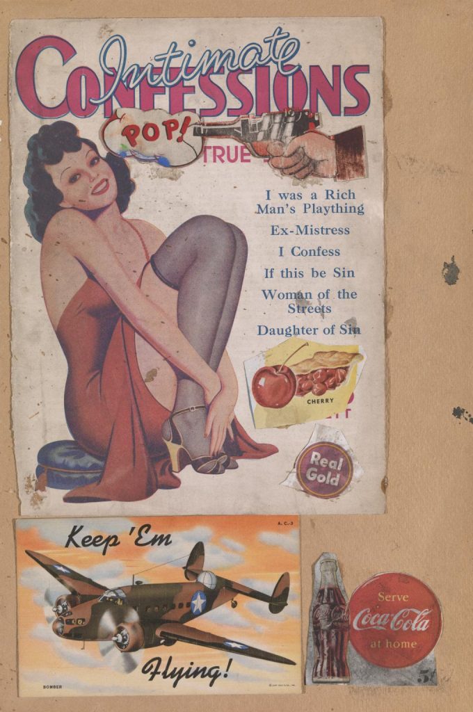
The Independent Group incorporated pop culture imagery into their works by reviving the collage, a form associated with early Modernism and Surrealism. Scottish artist Eduardo Paolozzi inadvertently gave the new movement its name, when his collage "I was a rich man's plaything", named after the headline of a True Confessions magazine, that was part of the collage, also included the word "Pop", fired out of a gun.
The collage "I was a Rich Man's Plaything" by Eduardo Paolozzi inadvertedly gave Pop Art its name
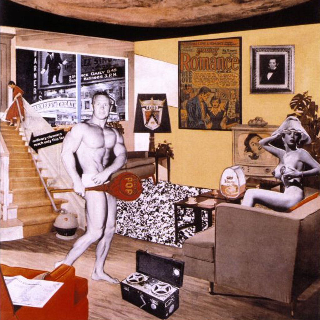
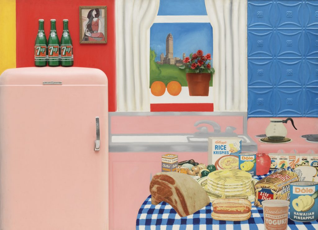
Meanwhile, British artist Richard Hamilton responded to the theme of an exhibition called This Is Tomorrow by cutting up some American magazines a friend had brought back from the US. The result was a collage called "Just what is it that makes today’s homes so different, so appealing?" which uses aspirational pop culture imagery to create a futuristic interior to brighten up the dreary postwar Britain. Across the pond in the US, Tom Wesselmann created a series of "Still Life" collages assembled from advertising images. Another American artist, Robert Indiana uses the typography and imagery of road signs and company logos to create his brightly coloured paintings.
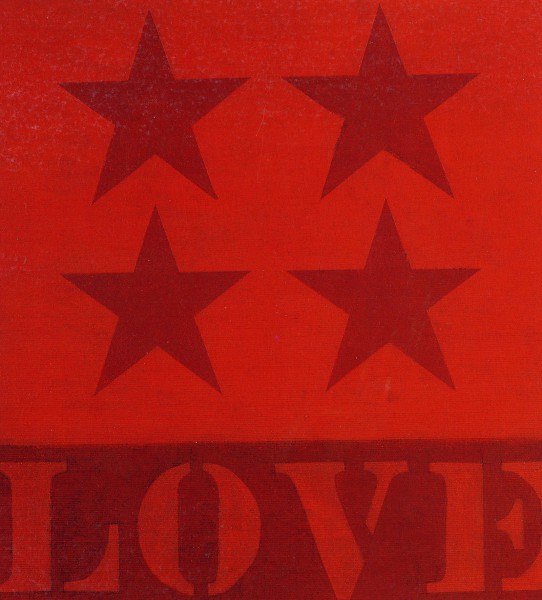
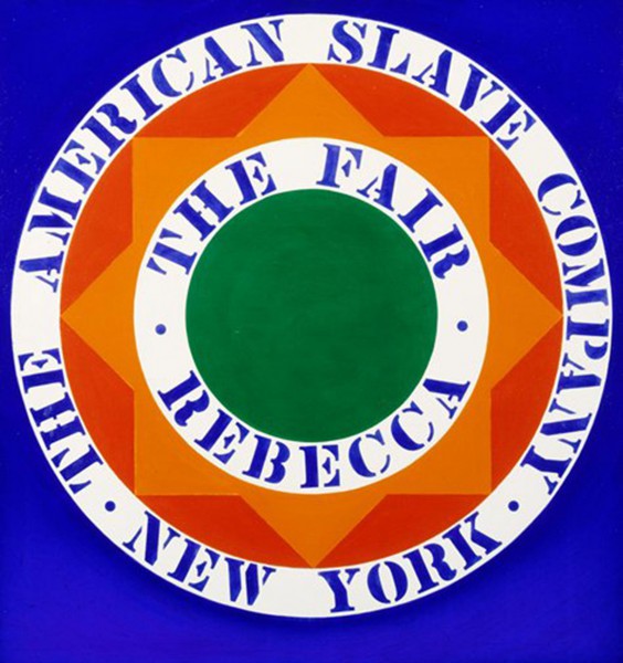
The collage "What is it that makes today's home so different, so appealing?" by Richard Hamilton. Could it be the bodybuilder with the strategically placed sign?"Still Life No. 30" by Tom Wesselmann"Four Star Love" by Robert Indiana"The Fair Rebecca" by Robert Indiana
On the wall of the apartment Hamilton pictured in "Just what is it that makes today’s homes so different, so appealing?", the framed cover of an American romance comic hangs next to works of fine art. And indeed comic book imagery plays a big role in the nascent pop art movement.
Finding Beauty in Everyday Imagery
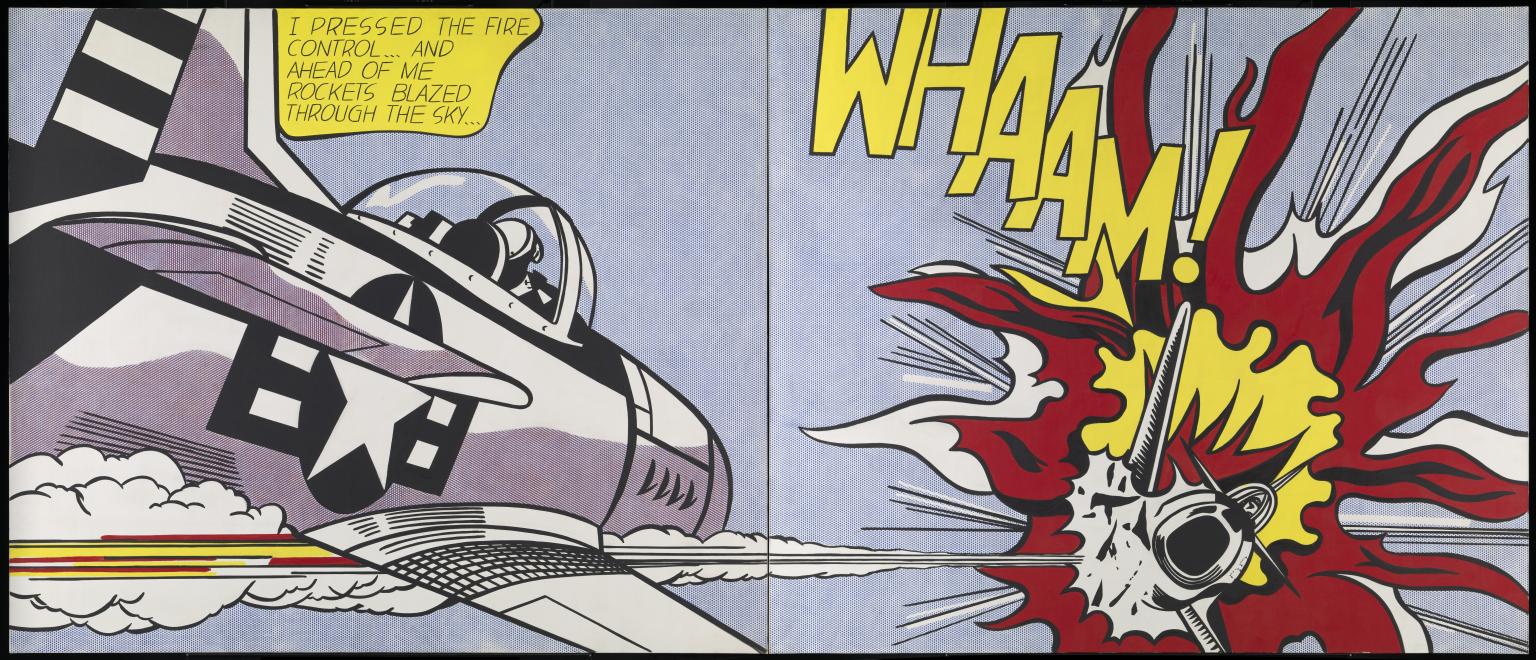
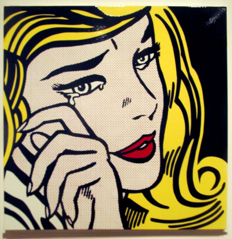
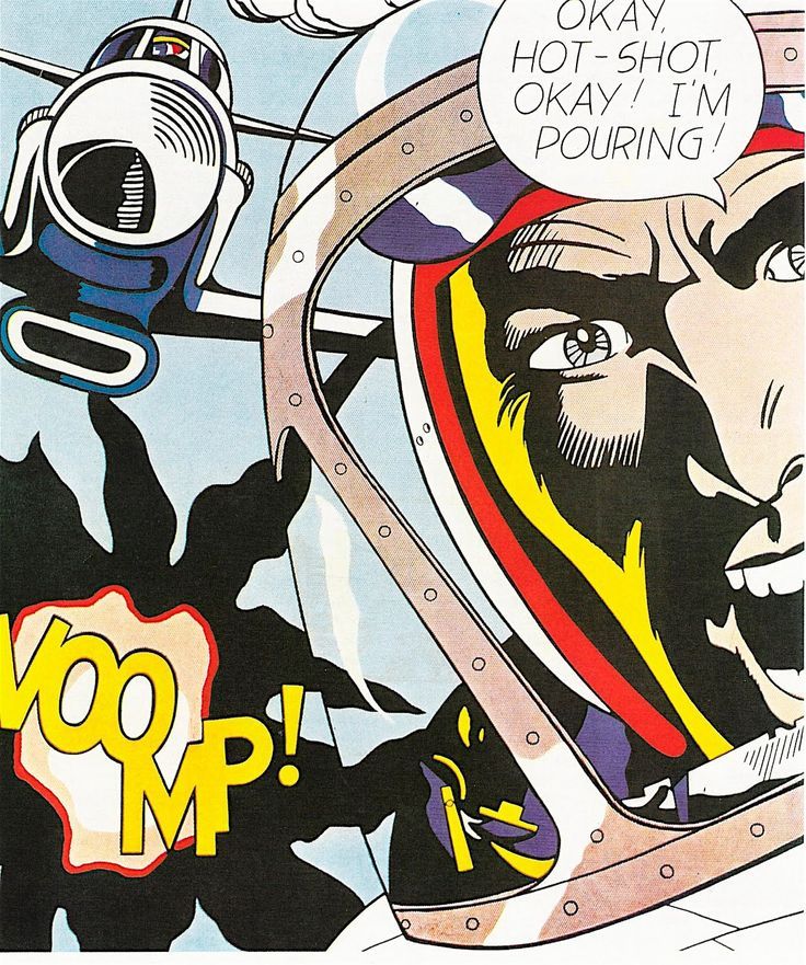
"Whaam!" by Roy Lichtenstein after Irv Novick
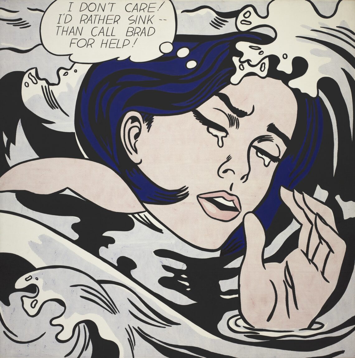
When his young son showed him a Mickey Mouse comic and said, "I bet you can't paint as good as that, eh, Dad?", American artist Roy Lichtenstein rose to the challenge and began copying and enlarging panels from comic books and even included the characteristic Ben Day dots of the printing process. Lichtenstein is clearly a fan of National/DC Comics and frequently copies panels from DC books such as Secret Hearts, Girls' Romance or All-American Men of War. And so Secret Hearts inspired the Lichtenstein paintings "Drowning Girl" and "Crying Girl", while All-American Men of War inspired "Whaam!", "As I Opened Fire" and "Okay, Hot-Shot". The comic book fan in me rejoices in seeing comic books elevated to fine art, though I wish that Lichtenstein would give credit to the artists whose work he copied, artists like Jack Kirby, Russ Heath, Tony Abruzzo, Irv Novick and Jerry Grandinetti.
"Drowning Girl" by Roy Lichtenstein after Tony Abruzzo"Crying Girl" by Roy Lichtenstein"Okay, Hot-Shot" by Roy Lichtenstein after Russ Heath
While Roy Lichtenstein finds inspiration in comic books, his fellow American pop artist Andy Warhol looks to his local supermarket, magazine photos and advertising imagery for inspiration, which is not surprising, since he began his career as a commercial artist, specialising in shoe ads. Shoes do not feature prominently in Warhol's art. Instead, he creates large silkscreen prints featuring product packaging such as cans of Campbell's soup, bottles of Coca Cola or packages of Brillo scouring pads.
"32 Campbell Soup Cans" by Andy Warhol"Green Coca Cola Bottles" by Andy Warhol
Reproductions and Originals
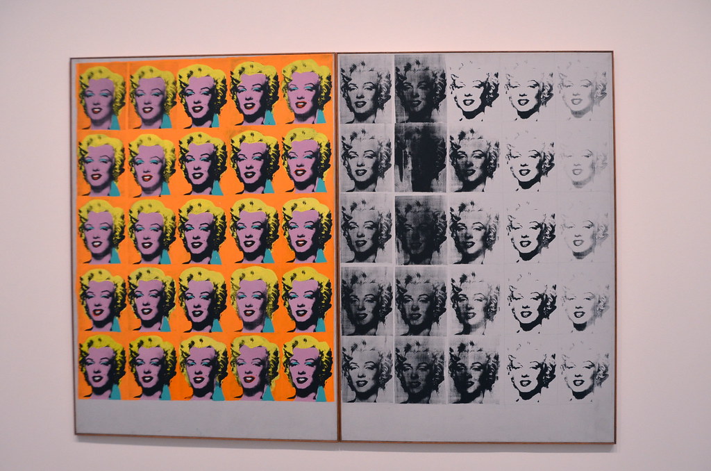
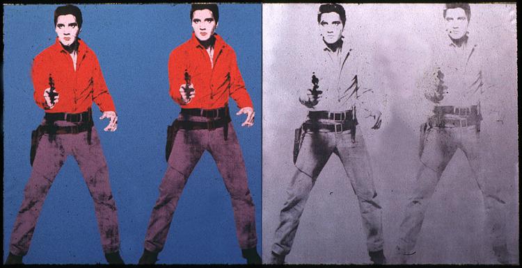
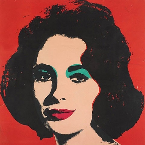
Magazine photographs are another source of inspiration for Warhol and so he transformed a publicity shot of Marilyn Monroe for Niagara into his so-called "Marilyn Diptych" and a publicity still of Elvis Presley for the western Flaming Star into prints with titles like "Eight Elvises" or "Double Elvis".
"Marilyn Diptych" by Andy Warhol, created shortly after Marilyn Monroe's untimely death."Double Elvis" by Andy Warhol
But Warhol also tackles more serious subjects in his art. His print series "Death and Disaster" uses magazine photographs of car crashes, race riots and suicides as well as the Sing Sing electric chair and a mushroom cloud and reproduces them over and over again, because – as Warhol said in a recent interview – "when you see a gruesome picture over and over again, it doesn’t really have an effect."
"Electric Chair" by Andy Warhol, part of his "Death and Disaster" series. The bright colours don't make the subject any more cheerful.
West German artist Gerhard Richter eschews the Pop Art moniker, but he also makes paintings based on photographs, slightly blurred to create an estrangement effect. Unlike Warhol and other American artists, Richter's paintings are based on snapshots and family photos such as "Tante Marianne", the haunting portrait of the artist as a baby posing with his then fourteen-year-old aunt Marianne Schönfelder. The portrait becomes even more haunting, if you know that Marianne Schönfelder was mentally ill and was murdered by the Nazis as part of their euthanasia program.
"Tante Marianne" by Gerhard Richter is based on a family photo showing the artist as a baby with his then 14-year-old aunt Marianne Schönfelder
The Democratisation of Art
In the beginning, many art critics were outraged by Pop Art's seemingly uncritical use of "low" subject matter such as comics, movies and advertising imagery. Furthermore, critics accused the Pop Artists of being mere copyists, incapable of creating something original. It seems those art critics have forgotten their art history, because using found objects in art is not exactly a new idea. Marcel Duchamp already did the same thing fifty years ago with his so-called "Readymades" such as his famous 1917 work "Fountain", a commercially produced urinal that Duchamp simply signed. Marcel Duchamp is still alive, though retired, and I like to think that he gets a smile out of the young Pop Artists taking up his methods.
Thirty years ago, philosopher Walter Benjamin wrote a notable essay entitled "The Work of Art in the Age of Mechanical Reproduction", wherein he postulates that a work of art loses its aura of uniqueness, when it can be infinitely reproduced via new filmic, photographic and printing technologies, and how this influences our perception of art. Benjamin also discusses the political dimensions of the then new mass media both as propaganda for Fascist (and Communist) regimes as well as its potential to democratise art.
"Liz" by Andy Warhol is a portrait of actress Elizabeth Taylor
The Pop Artists follow the latter path, because their art is both a reproduction of an existing work (comic books, magazine photographs, film stills, product packaging) as well as infinitely reproduceable in itself. Andy Warhol does not create individual paintings, but silk screen prints that he produces in his own workshop in New York City, the so-called "Factory". This makes his works much more affordable than traditional fine art to the point that a Warhol print is not out of reach of the middle classes who want to brighten their homes with some modern art. Though personally, I would go with Marilyn, Elvis, Liz or even the Campbell's soup can rather than the electric chair or a car crash. And if you cannot afford a Warhol print, Pop Artist Robert Indiana is creating a line of greeting cards for the Museum of Modern Art, so you can own a piece of Pop Art for less than a dollar.
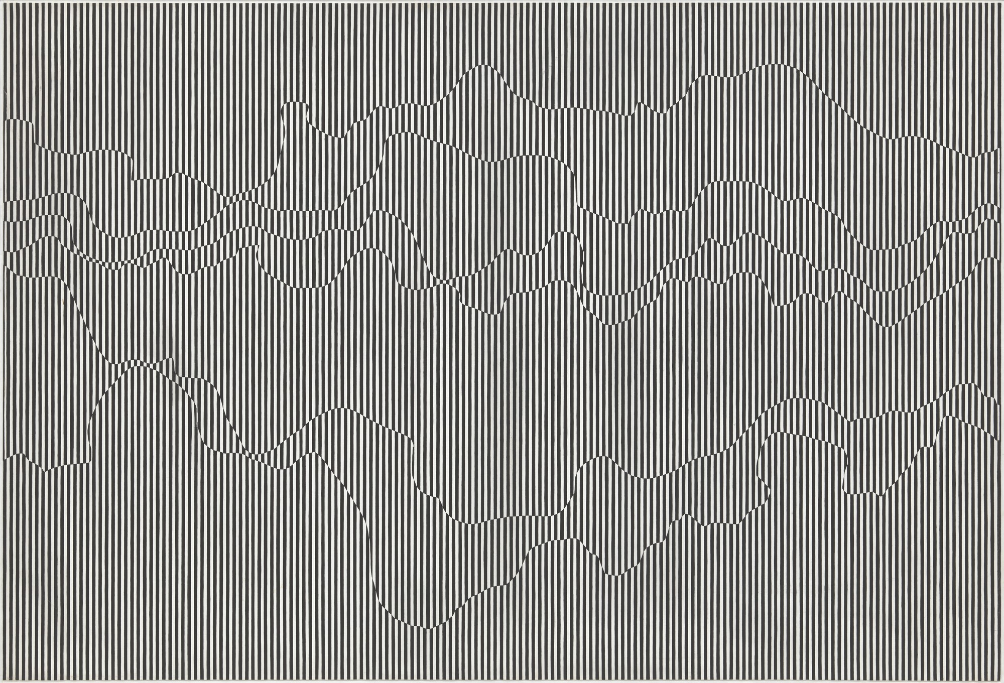
Black and White: Op Art
The latest movement to shake up the art world is Op Art, short for Optical Art. The movement got its name last year when the Martha Jackson Gallery in New York City exhibited the works of Polish-born artist Julian Stanczak in the show Julian Stanczak: Optical Paintings.
Julian Stanczak has a tragic history – he was incarcerated in a Soviet labour camp as a teenager and lost the use of his right arm. Now forced to paint with his non-dominant left hand, Stanczak turned to abstract art as a way to escape his painful past. At the show in New York City, he exhibited striking black and white paintings whose patterns seem to flash, blur and vibrate in front of the observer's eyes due to his use of optical illusions. Look too long at a Stanczak painting and you might well get dizzy.
"The Duel" by Julian Stanczak
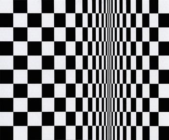
Meanwhile in the UK, a young artist named Bridget Riley chanced to see the painting "The Bridge at Courbevoie" by pointillist French painter Georges Seurat. The painting and its use of dots to create optical effects impressed Bridget Riley greatly, so much that she copied it and placed the copy in her studio.
"Movement in Squares" by Bridget Riley
Inspired by Seurat, Bridget Riley began to create pointillist paintings of her own. She started out with landscapes, but her paintings quickly turned abstract and also made use of black and white contrasts and optical effects.
Artist Bridget Riley with one of her striking Op Art paintings
Another Op Art pioneer, Hungarian-French artist Victor Vasarely was inspired both by the Bauhaus and Russian Constructivism and began to create abstract geometric artworks, which also exploit optical illusions much like the works of Julian Stanczak and Bridget Riley.
"Supernovae" by Victor Vasarely
It is not known whether Stanczak, Riley and Vasarely were aware of each other's work, but curator William C. Seitz brought their work and those of other optical artists together in an exhibition at the Museum of Modern Art in New York City entitled The Responsive Eye. The exhibition concluded two weeks ago and should help to bring Op Art into the mainstream.
Beyond Modernism: The Future of Art
Whether you prefer Pop Art, Op Art or Minimalism, contemporary art has not been so exciting since the heady avantgarde days of the interwar period.
But unlike the avantgarde of the first few decades of the 20th century, today's contemporary art is a lot more accessible and democratic. You don't need to be wealthy to purchase a print by Andy Warhol, a greeting card by Robert Indiana or the work one of the other exciting new artists. And who knows, if those artists take off, you may find yourself in possession of a very valuable piece someday.
Furthermore, you might even be inspired to create some art of your own. At any rate, the pop art collages by Richard Hamilton, Eduardo Paolozzi and Tom Wesselmann inspired me to grab a stack of magazines as well as some scissors and glue and make some collages of my own. Maybe I'll share them here someday!
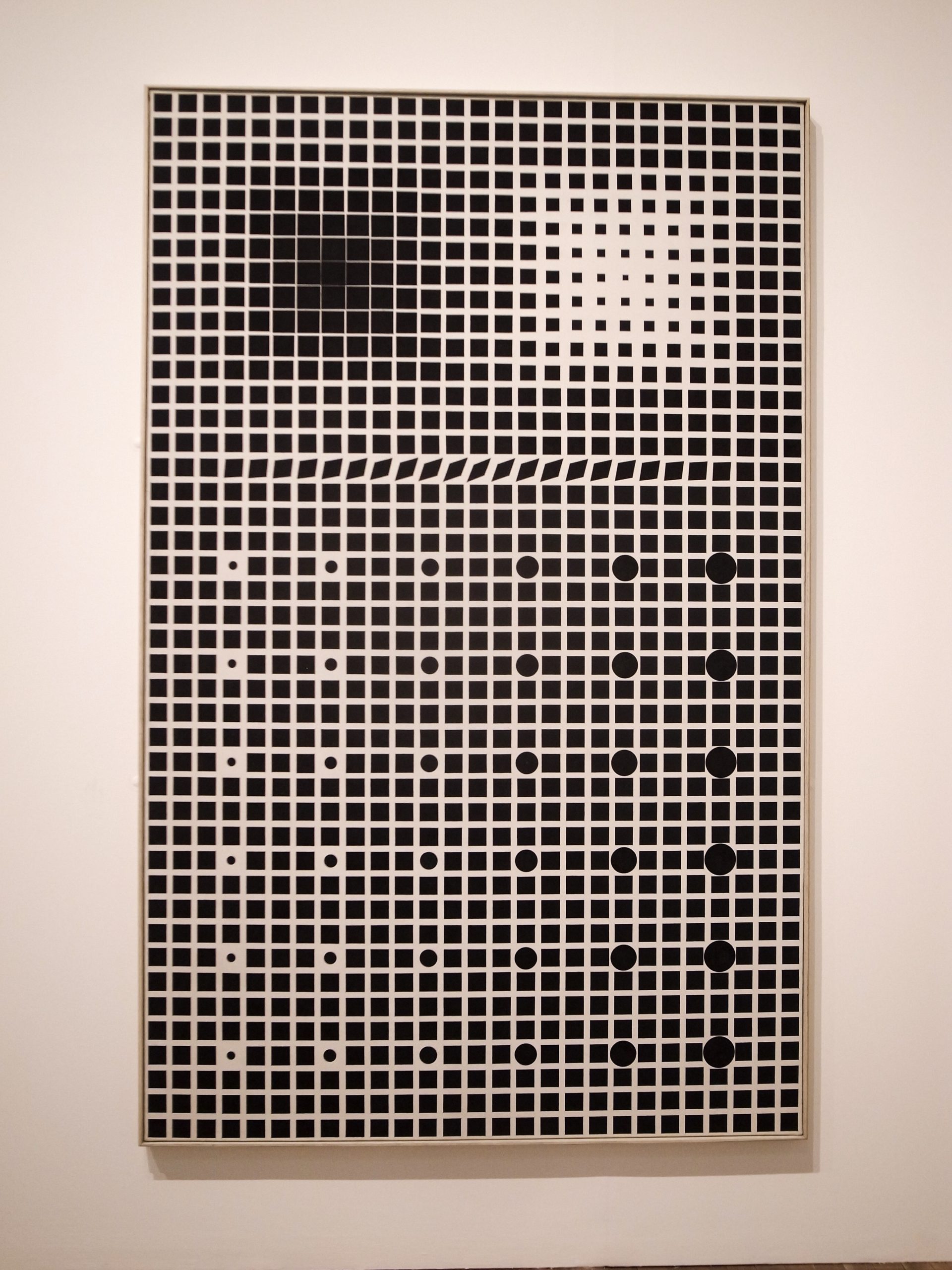
Hyena Stomp by Frank Stella
Our last three Journey shows were a gas! You can watch the kinescope reruns here). You don't want to miss the next episode, May 9 at 1PM PDT, a special Arts and Entertainment edition featuring Arel Lucas, Cora Buhlert, Erica Frank…and Dr. Who producer, Verity Lambert! Register today and we'll make sure you don't forget.

![[October 16th, 1965] The World According to Bonnie Cashin](https://galacticjourney.org/wp-content/uploads/2020/10/69b37edc295dde7c6eead66b33f10802-672x372.jpg)


![[October 12, 1965] Gaming Across the Pond (Wargaming in Britain)](https://galacticjourney.org/wp-content/uploads/2020/10/651012cricket-672x372.jpg)


![[September 28, 1965] Of Art and Freedom: The Rolling Stones Riots and the <i>Mephisto</i> Case](https://galacticjourney.org/wp-content/uploads/2020/09/1018-672x372.jpg)


![[August 18, 1965] The Riots in Watts](https://galacticjourney.org/wp-content/uploads/2020/08/650820first-620x372.jpg)


![[August 4th, 1965] Queenly Fashion: The Style of the Powerful Women of South Asia](https://galacticjourney.org/wp-content/uploads/2020/07/queen-sirikit-wearing-boromphiman-attire-and-jewels-1960s-564x372.jpg)


![[July 10, 1965] "Since I fell for you" (a Young Traveler's crush)](https://galacticjourney.org/wp-content/uploads/2020/07/650710randall-480x372.jpg)


![[June 16, 1965] The International Poetry Incarnation](https://galacticjourney.org/wp-content/uploads/2020/05/Poster-550x372.jpg)

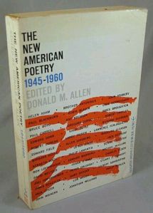
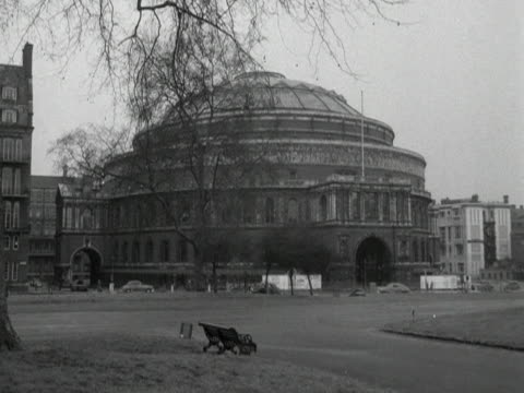
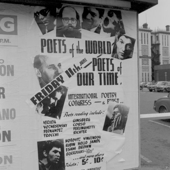
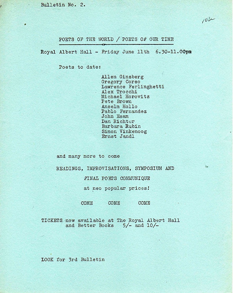

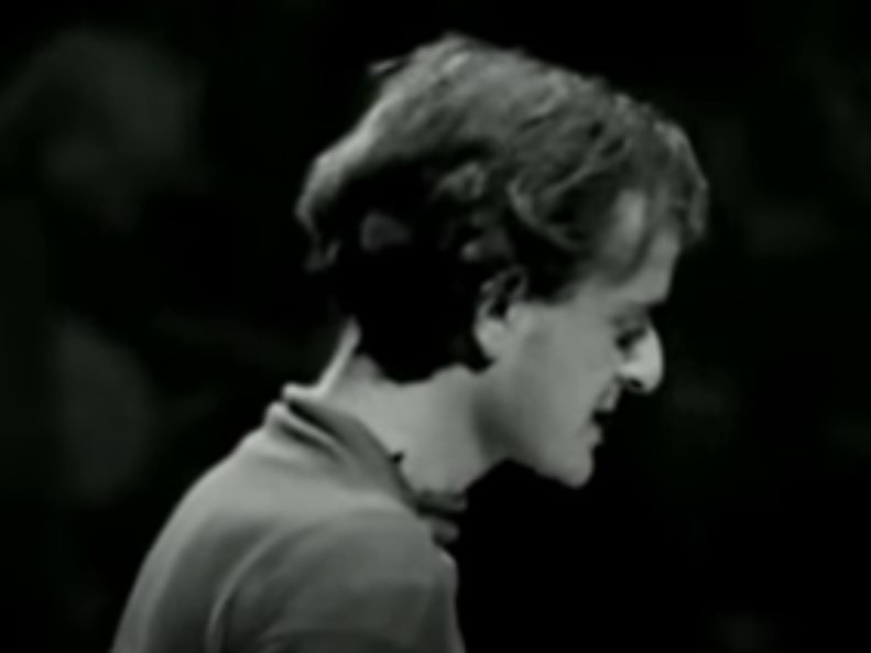
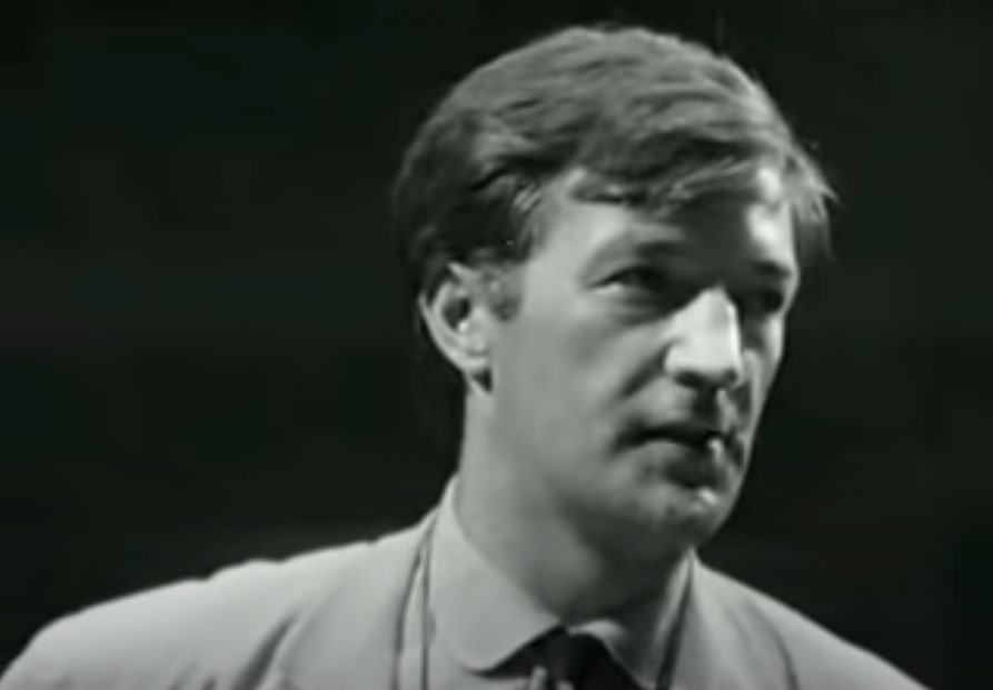

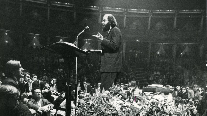
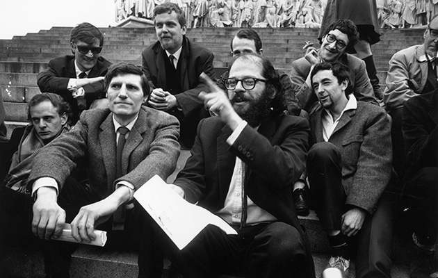

![[June 4, 1965] Below the Ramparts](https://galacticjourney.org/wp-content/uploads/2020/06/650604mag-672x372.jpg)

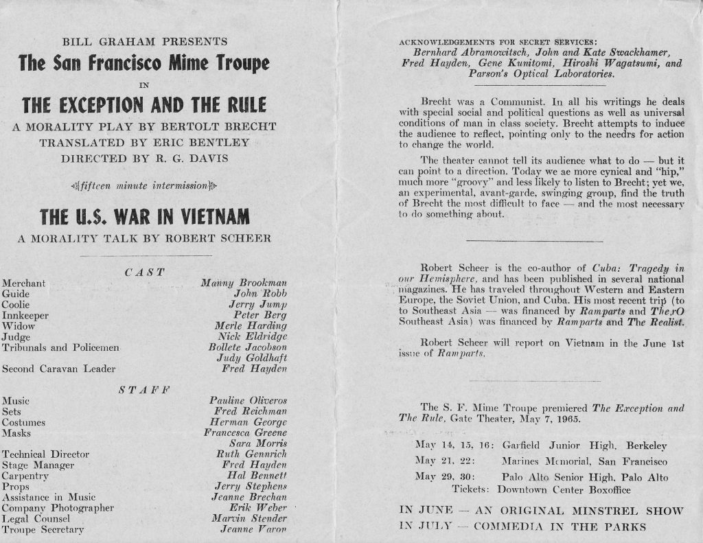
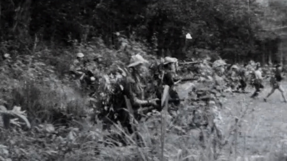


![[May 20th, 1965] Monokini: The Madness Continues!](https://galacticjourney.org/wp-content/uploads/2020/05/https___blogs-images.forbes.com_tomteicholz_files_2019_05_Claxton_Topless-bathing-suit-by-Gernreich-1200x1217-2-672x372.jpg)


![[May 4, 1965] The Op and the Pop: New Movements in Modern Art](https://galacticjourney.org/wp-content/uploads/2020/05/cri_000000237355-1140x1150-1-672x372.jpg)