
by Cora Buhlert
[From Seattle's Sky Needle, to Chicago's Marina Towers, to the soon to be built World Trade Center in New York, the country is finally getting science fiction's buildings of the future. But the United States isn't the only nation undergoing an architectural revolution. Cora Buhlert is here with a report from Germany on what's going up…]
From the Ashes
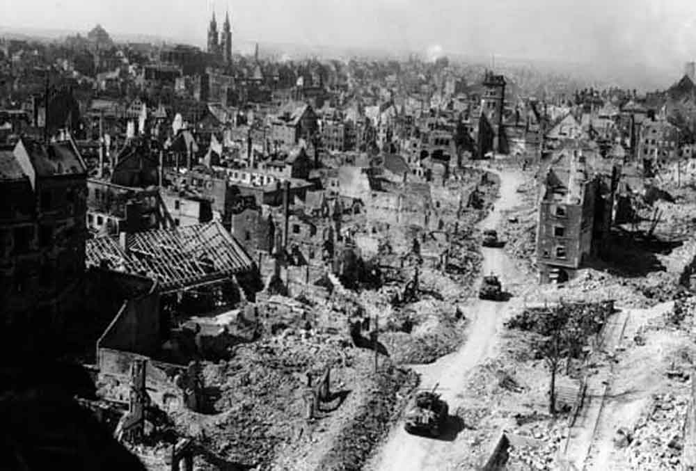
Not quite twenty years ago, World War II left much of Europe in ruin. Bombing raids and ground fighting destroyed much of the infrastructure and reduced most cities to rubble.
Rebuilding Europe's cities after World War II posed both a challenge and an opportunity: architects could realise their vision of the ideal city of the future on a blank or almost blank canvas. Some of the most famous architects of our time rose to the task and created buildings both functional and unique.
The Bauhaus and the International Style
The dominant architectural movement of our time is the so-called International Style, characterised by unadorned rectangles of concrete, glass and steel. The name is certainly apt, for the International Style has spread across the globe from Europe to the Americas to the emerging nations of Asia and Africa. But its origins lie in Germany, in the provincial East German towns of Weimar and Dessau, home to the legendary Bauhaus school of architecture, art and design.
Under founder Walter Gropius, the Bauhaus took the maxim "form follows function", coined by Chicago architect Louis Sullivan in 1896, and reinterpreted it as purely functional architecture and design eschewing all ornamentation. The results, whether buildings, furniture or household goods, still look remarkably modern some forty years later. Even if you've never heard of the Bauhaus, I can guarantee you have seen and probably used some of their iconic designs.
Founded in Weimar in 1919, the Bauhaus moved to Dessau in 1925 and finally to Berlin in 1932, before the school was shut down by the Nazis. Many of the professors and alumni, including Gropius himself, left Germany, spreading the Bauhaus ideas all over the world, and eventually created the International Style, with some input from the Dutch De Stijl movement and Frenchman Le Corbusier.
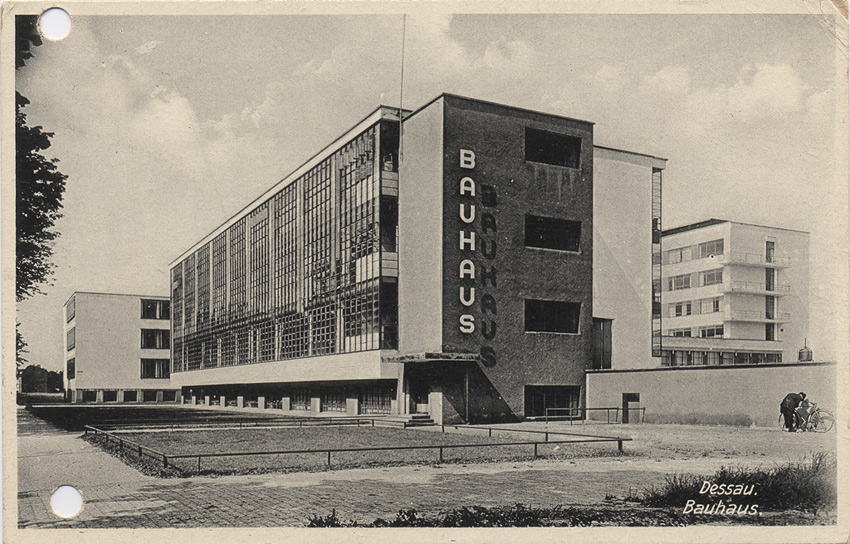
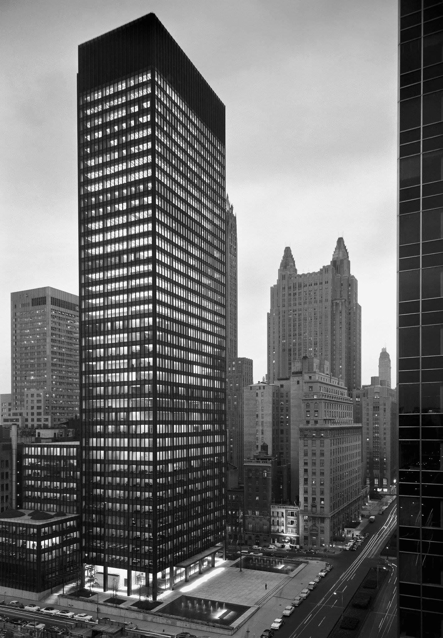
The Bauhaus building in Dessau, designed by Walter Gropius in 1925, is an early example of a glass curtain wall construction, a technique Gropius himself had pioneered at the Fagus shoe last factory in the West German town of Alfeld an der Leine in 1911. Fifty years later, glass curtain wall constructions can be found all over the world and are the favoured architectural style for American skyscrapers such as the Seagram Building in New York, designed by Bauhaus alumnus Ludwig Mies van der Rohe and completed in 1958.
I had the chance to visit the Bauhaus building in Dessau a few years ago. It is still a vocational school, though the building itself was badly damaged in World War II and has been heavily altered since. However, there are plans to restore it to its original glory for the fortieth anniversary next year.
Housing for the masses
The main application of the architectural principles of the Bauhaus and the International Style lies not in representative office buildings, but in new housing estates that are going up all over Europe to provide desperately needed homes for the masses of refugees, displaced persons and people rendered homeless by World War II.
The solutions to the postwar housing crisis vary from city to city. Some municipalities prefer more traditional designs such as row houses with slanted roofs, built from traditional materials like red brick. Other cities go for high rise apartment blocks that can house thousands of people.
In 1957, West Berlin ran the Interbau exhibition, and invited world famous architects including Walter Gropius, Le Corbusier, Alvar Aalto and Oscar Niemeyer to design and build their vision of the apartment block of the future. The resulting Hansaviertel neighbourhood is a housing estate that doubles as a showcase of modern architecture.

Meanwhile, a very exciting housing project, the Neue Vahr, was recently completed in my hometown Bremen. Like many other German cities, Bremen was badly damaged by World War II bombings and was missing about one hundred thousand homes by the early 1950s. The solution was to build a completely new neighbourhood for thirty thousand people on what had up to then been agricultural land on the edge of the city.
This new neighbourhood was designed by architects Ernst May and Hans Bernhard Reichow according to the "garden city" principle developed by Englishman Ebenezer Howard in the late nineteenth century, which involves housing tracts interspersed with extensive green belts and separation of functions such as housing, work, shopping and traffic.
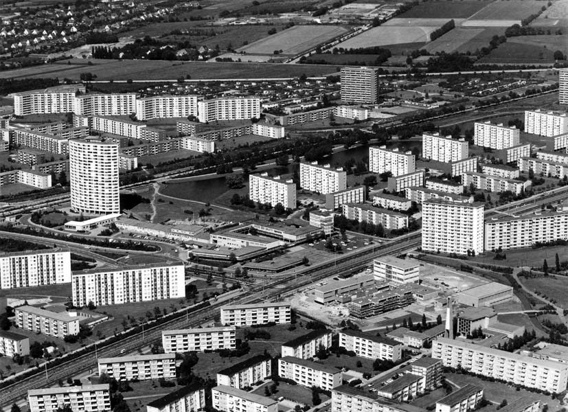
The modern interpretation of a garden city implemented by the Neue Vahr project involves apartment blocks varying in size from four to fourteen stories interspersed with green belts. Two multi-lane roads cut through the neighbourhood, dividing it into four sub-neighbourhoods. Pedestrian bridges connect the sub-neighbourhoods to each other, keeping motorised traffic and pedestrians separated and accidents down.
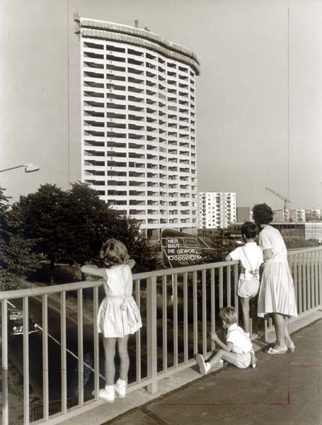
At the centre of the Neue Vahr, there is a signature building, a sixty metre high, twenty-two storey apartment block designed by celebrated Finnish architect Alvar Aalto. Known as the Aalto building, it currently the tallest residential building in Bremen and towers above the Berliner Freiheit (Berlin freedom) shopping precinct that serves as a town centre for the new neighbourhood.
New approaches to shopping
Talking of shopping, retail buildings such as shops and department stores are another area where modern architecture asserts itself. World War II left in ruins the town centres of many European cities. Gone were their open air markets, narrow streets lined with small shops and grand department stores But this made room for new approaches.
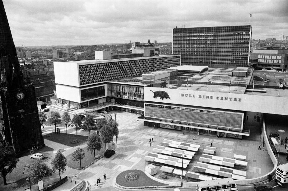
Probably the most characteristic type of commercial architecture in the postwar era is the shopping centre or – as Americans prefer to call it – the shopping mall. These malls that are currently popping up like the proverbial weeds in the suburbs of American cities are usually enclosed indoor complexes, air-conditioned against weather extremes. Indoor malls exist in Europe, but they are rare. One example is the soon to be finished Bull Ring shopping centre in Birmingham, which combines an American style indoor mall with an outdoor market. But most of the time, Europeans prefer open air shopping precincts in the centre of old and new towns.
The prototype for many European shopping precincts is the Lijnbaan (rope makers' street) in Rotterdam. The Dutch port city of Rotterdam was almost completely destroyed by German bombs in May 1940. Designed by architects Jo van den Broek and Jaap Bakema and built between 1949 and 1953, the Lijnbaan is a street lined by sixty-six two-storey shops with apartment blocks set further back. Unusual for the otherwise car-friendly architecture of the postwar era, the Lijnbaan is a pedestrian zone and completely car-free. Delivery traffic has been moved to the back of the shops, allowing shoppers to promenade among flower beds, sculptures and bird cages and enjoy a cup of coffee or a glass of beer in one of the many outdoor cafés.

The Lijnbaan was an instant sensation. "Lijnbaanen" is now a Dutch verb. In 1960, the shopping street and the youth gangs who hang out at the cafés there even became the subject of a novel by John den Admirant fittingly entitled Lijnbaan Djungel (Lijnbaan Jungle). The idea of a pedestrian shopping precinct was soon copied all over Europe. One example is the Treppenstraße (staircase street) in the German town of Kassel, which was completed in 1953 a few months after the Lijnbaan.

These days, Lijnbaan architects Jo van den Broek and Jaap Bakema have established themselves as masters of retail architecture. Two other projects of theirs, the Ter Meulen department store and the H.H. De Klerk furniture store, both in Rotterdam, look like fairly unremarkable concrete boxes from the outside. Inside, both stores feature an arrangement of mezzanines connected by staircases that make the buildings seem much bigger than they look from the outside.
Department stores are the other great challenge of postwar retail architecture. For while the great department stores of the late nineteenth and early twentieth century – Harrod's and Liberty's in London, Galeries Lafayette in Paris or À L'Innovation in Brussels – are beautiful, their design with open atriums surrounded by retail space is not very efficient. Modern department stores do not have atriums and so offer more retail space – not to mention modern amenities such as escalators, elevators and safety features like sprinkler systems. However, the downside is that they tend to look like windowless concrete boxes from the outside.
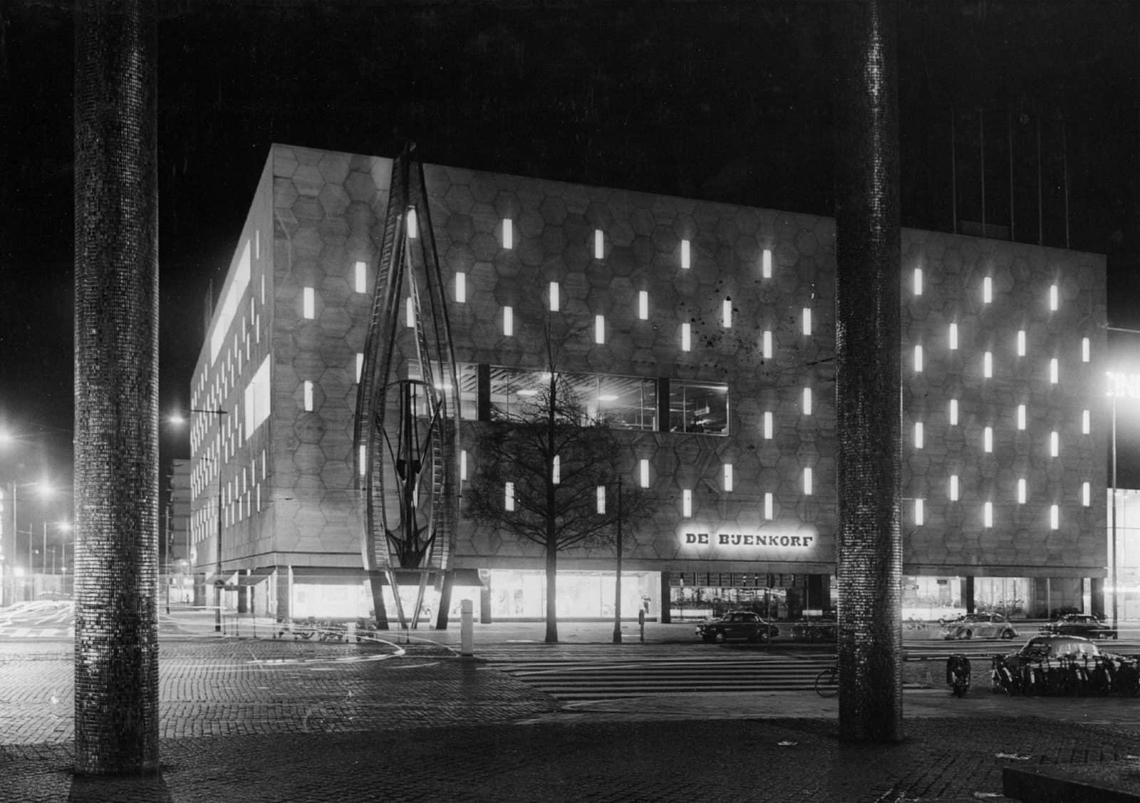
There have been several attempts to make department store exteriors more visually interesting. For the De Bijenkorf department store in Rotterdam (completed in 1957), Bauhaus alumnus Marcel Breuer took a cue from the name, which means "beehive" in Dutch, and covered the façade with travertine tiles shaped like honeycombs. Combined with a 26-metre tall abstract steel sculpture by artist Gabo, affectionately named "Het Ding" (The Thing) by the people of Rotterdam, the result is spectacular.
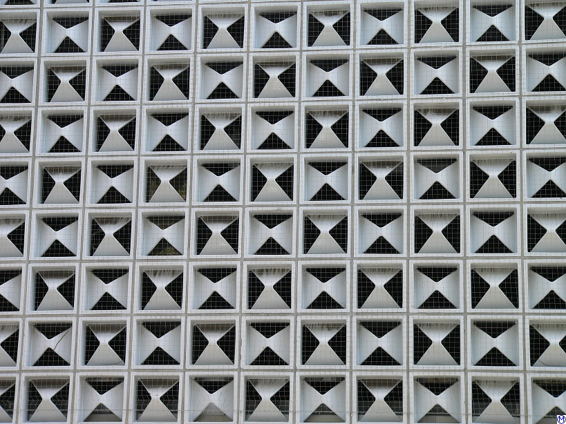
German architect Egon Eiermann came up with a similar solution for the German department store chain Horten and developed white ceramic tiles in the shape of a stylized H, which are currently being applied to the façades of Horten stores all over West Germany for an iconic space age look.
Breaking out of boxes
The attempts to make department stores more visually interesting highlight a major problem with modern architecture and the International Style. Rectangular buildings may be functional, but they are also boring. And so we are increasingly seeing attempts to break out of the pervasive box shape of postwar architecture. Many of those attempts involve representative buildings such as theatres, events centres and churches, where architects have more leeway than with residential or retail buildings.
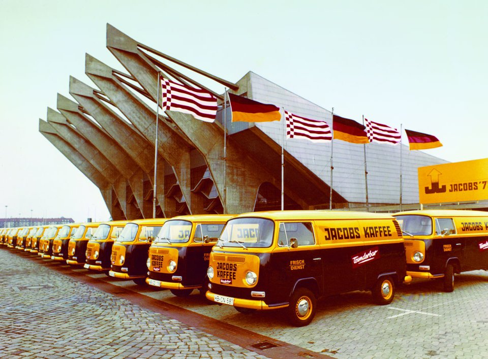
One of my favourite new buildings in my hometown Bremen is the Stadthalle, a multi-purpose arena for exhibitions, sports events and concerts. Designed by Roland Rainer and completed only this year, the Stadthalle is notable by the six concrete struts which jut out of the front of the building and hold both the stands as well as the roof in a design reminiscent of tents and sailing ships.
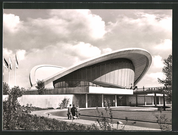
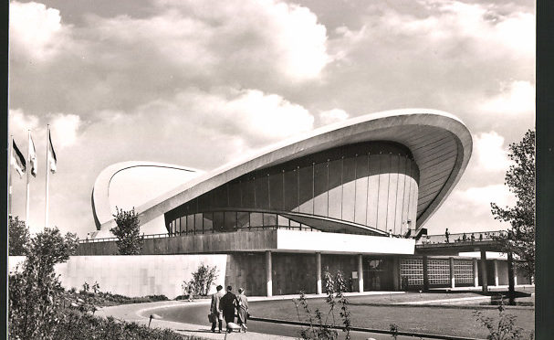
For the Kongresshalle conference centre in Berlin, built for the Interbau exhibition of 1957, American architect Hugh Stubbins designed a spectacular hyperbolic paraboloid saddle roof, inspired by the Dorton Arena in Raleigh, North Carolina. The people of Berlin quickly nicknamed the organic structure the "pregnant oyster".
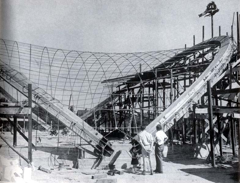
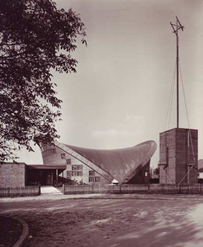
Last year, Bremen got its very own "pregnant oyster" with the St. Lukas church in the Grolland neighbourhood. Designed by architects Carsten Schöck and Frei Otto, a specialist for lightweight roof constructions, the St. Lukas church has a saddle roof consisting of two frames of glued laminated timber which hold a net of steel wires, on which the actual roof rests. I recently had the chance to attend a service at St. Lukas and the stunning interior makes even the most boring of sermons exciting.
Indeed, some of the most exciting architecture of our secular times can be found in churches. When Egon Eiermann won the competition to rebuild the Kaiser Wilhelm Memorial Church in West Berlin, he was faced with a problem. The ruins of the original church, which had been destroyed by bombing in 1943, were still standing and could not be torn down because of massive protests. So Eiermann decided to keep the bombed out tower of the old church and built his new church, consisting of a hexagonal clocktower and an octagonal nave, all rendered in a concrete honeycomb design with glass inlays, around it. From the outside, the new church doesn't look like much, but once you step inside, the blue glass inlays, designed by French artist Gabriel Loire, light up with a truly otherworldly glow.
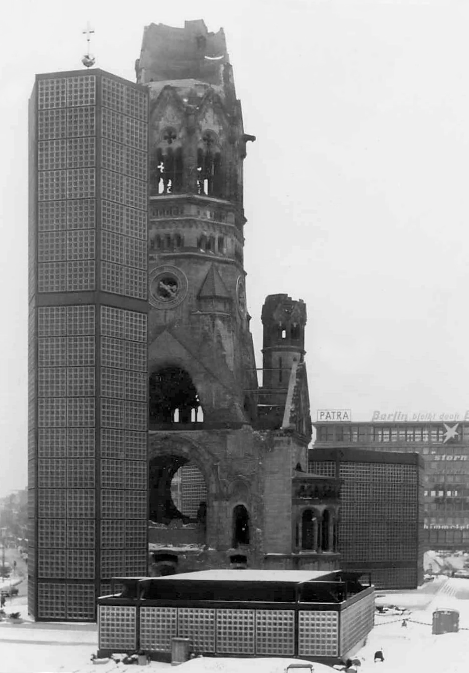
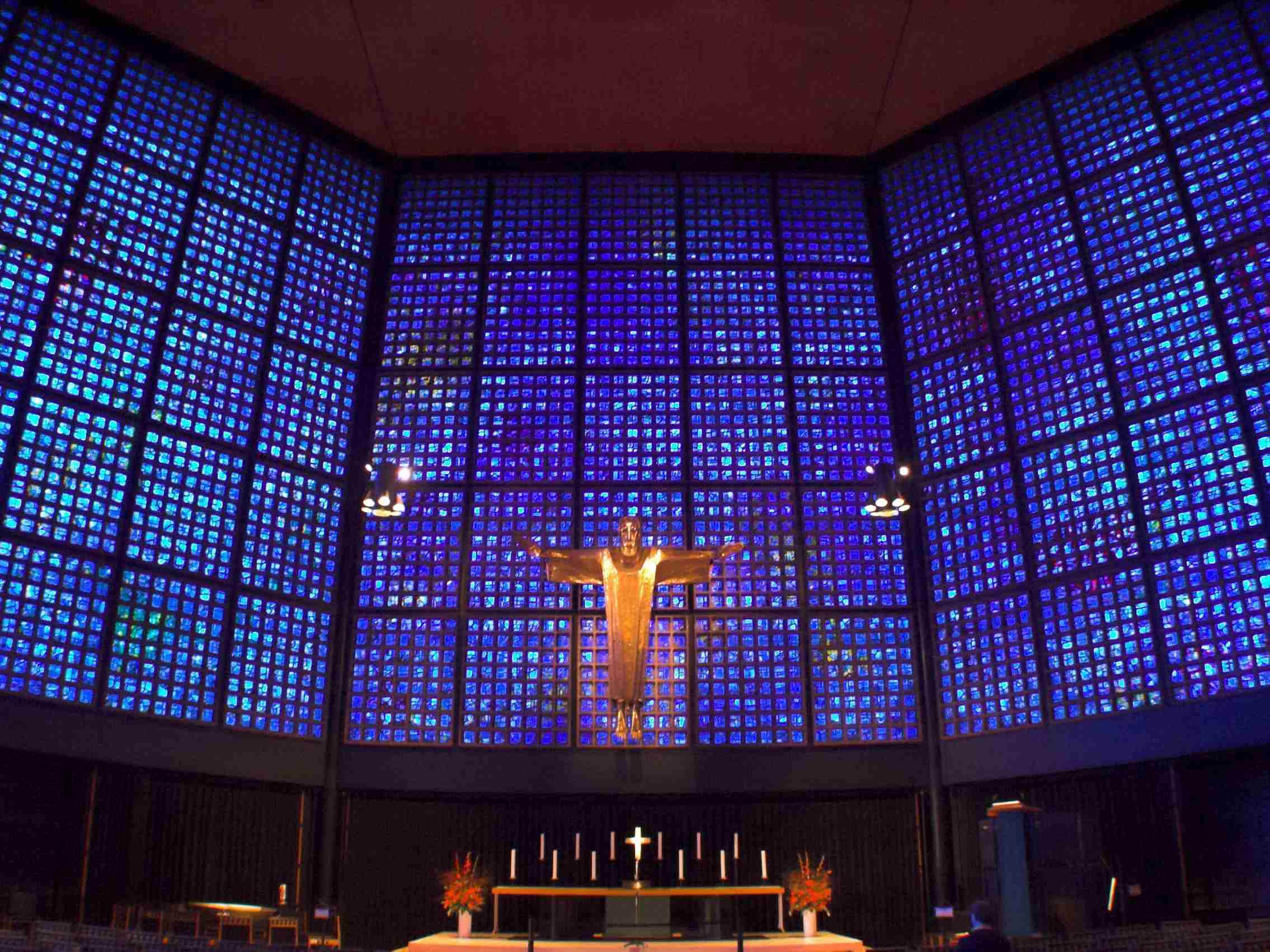
Completed in 1961, the new Kaiser Wilhelm Memorial Church became an instant landmark. The old church is nicknamed "hollow tooth" by the people of Berlin, the new church "powder box and lipstick".
Next stop: The World
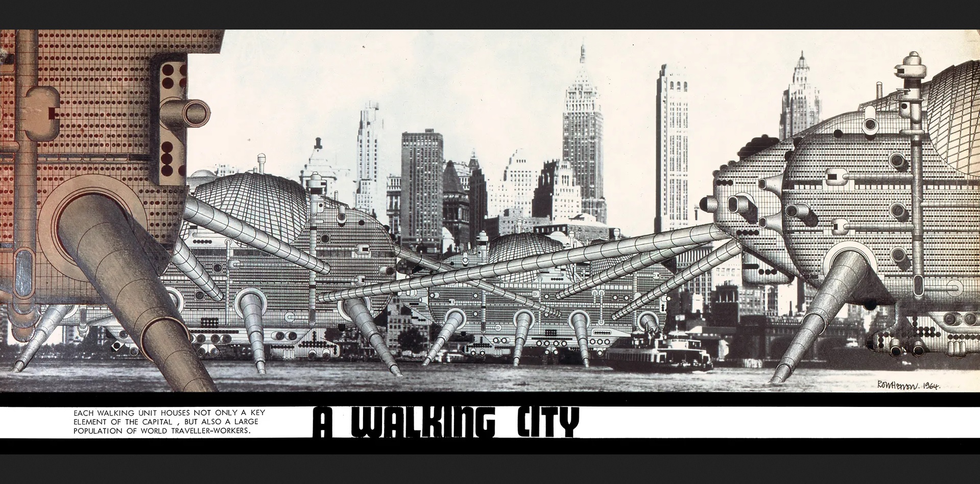
It seems as if the spectacular designs described above are merely a harbinger of things to come, as architecture finally moves beyond the all-pervasive rectangular shapes of the International Style. New and exciting movements are emerging such as the British Archigram group, who have proposed such positively science fictional designs as the Plug-in City or the Walking City. So far, these are still concepts, but they might well be the cities of our future.

[Come join us at Portal 55, Galactic Journey's real-time lounge! Talk about your favorite SFF, chat with the Traveler and co., relax, sit a spell…]


I certainly won't be sorry to see the International style go out of style, but I hear around a couple of corners that Brutalism is likely to be the coming thing. That's not inherently bad, unless you really don't like bare concrete.
It sounds like Bremen has managed to avoid the worst representative of architecture in post-war Germany: Plattenbau. This is the use of prefabricated prestressed concrete slabs to throw up tall buildings (mostly apartment blocks) very quickly. It's mostly found in the east, but the west isn't immune.
One of the worst things I'm aware of is the insistence on flat roofs in many places. They're terrible for rainy places, because they're hard to make fully watertight. I know that some of the towns in the Ruhr valley have mandated flat roofs so that new floors can be added as needed.
As I understand it, one of Ebenezer Howard's inspirations for the garden city concept was the German city of Rothenburg ob der Tauber. So it's nice to see the concept coming home.
Prefabricated building modules like the "Plattenbau" principle are increasingly being employed, because it's quick and cheap. In East Germany, they love those things. Just outside Halle/Saale, they're planning to build a completely new city for the workers of the Buna and Tschorpau chemistry plants. The buildings will be consturcted heavily from prefabricated modules. It will be interesting to see if our neighbours beyond the wall can pull it off and what the result will look like.
The Neue Vahr blocks are actually pretty nice from the inside. My aunt lives in one of them and they have modern amenities like garbage chutes, which were previously unknown in Germany. And the shopping centre is in walking distance, which is nice for a woman who does not drive.
The fact that slanted roofs have lasted so long in Northern and Central Europe, even though flat roofs aren't as new as the Bauhaus people liked to believe (pueblo villages in the American Southwest had them centuries ago), suggests that in climates with a lot of rain and snow they may be the better alternative. And indeed, I've heard that surviving Bauhaus architecture from the 1920s is very difficult to renovate in the spirit of the original, because the flat roofs tend to leak badly after approx. forty years. We'll see how today's housing estates, office blocks and shopping malls fare in forty or fifty years.
The glass curtain wall of the Bauhaus building in Dessau also had the problem that it heated up badly inside, whenever the sun was shining, since the building was basically a huge greenhouse, which is why newer glass curtain wall constructions like the Seagram Building use tinted class. It's all trial and error, even for architects.